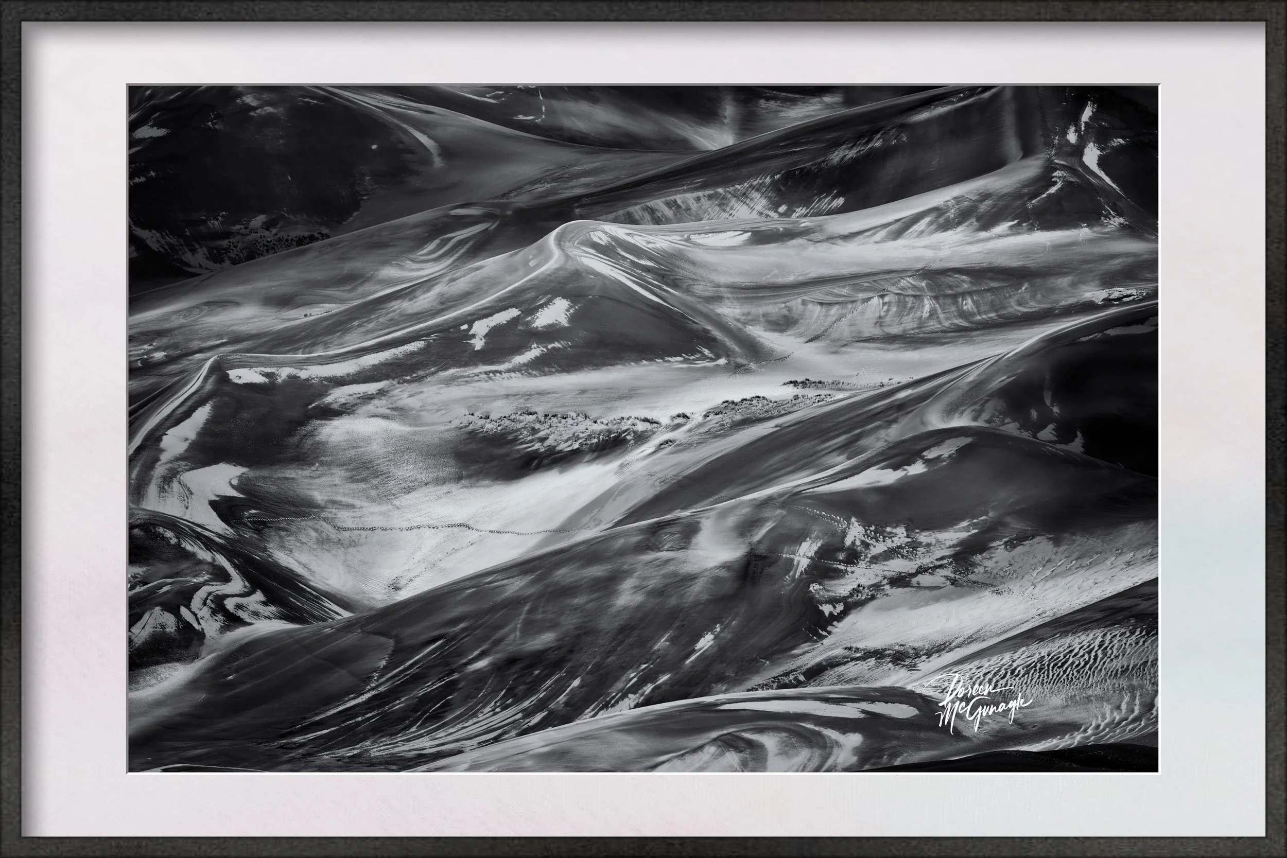
CO2261-56Fiery Horizon Over Quiet Ridges GSDNP c2025
Large Wall Art, Fine Art Photography, Limited Edition 20
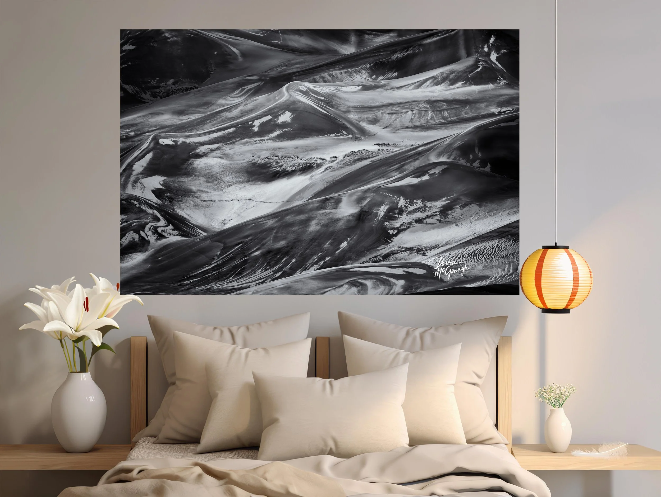
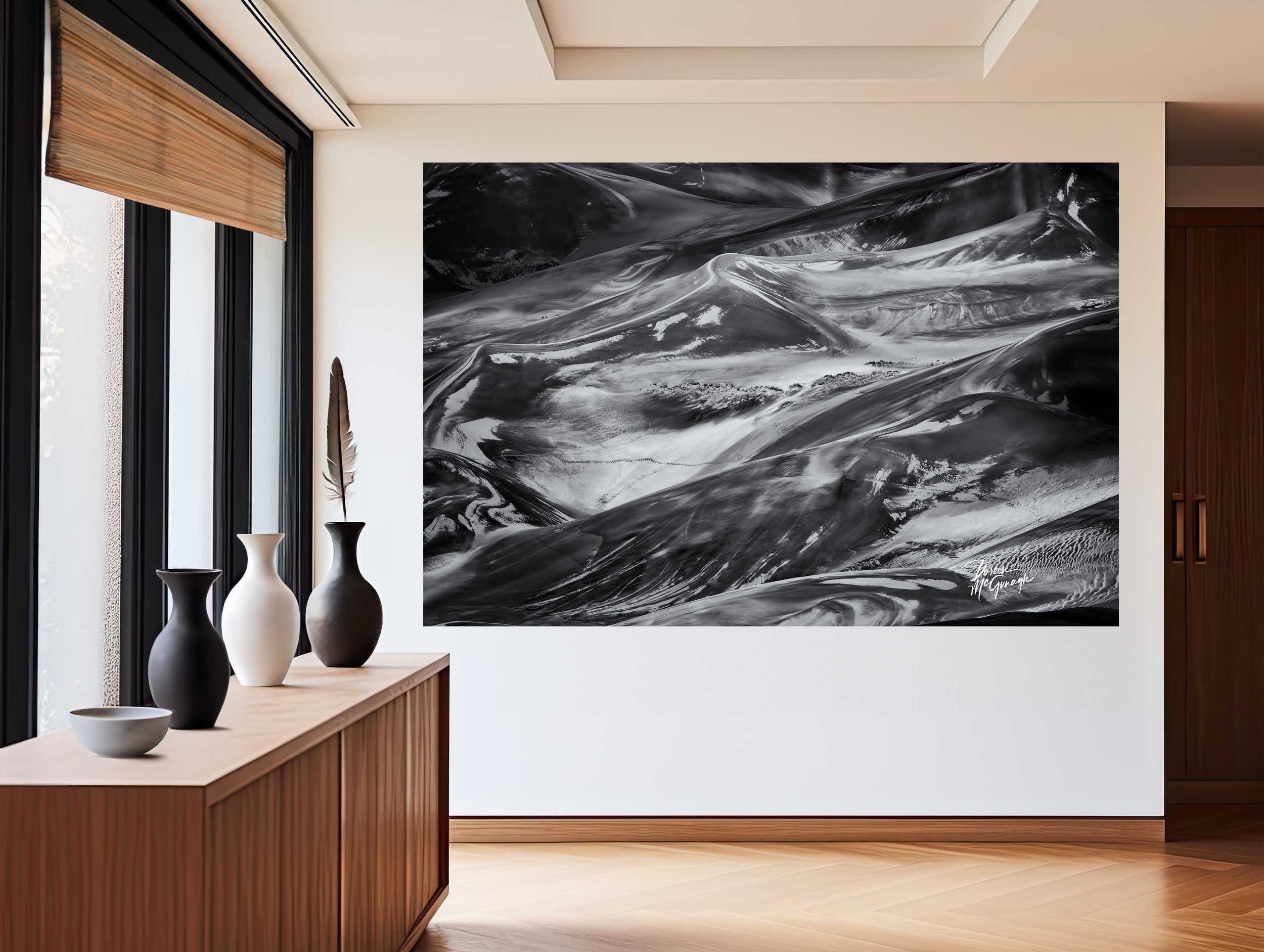
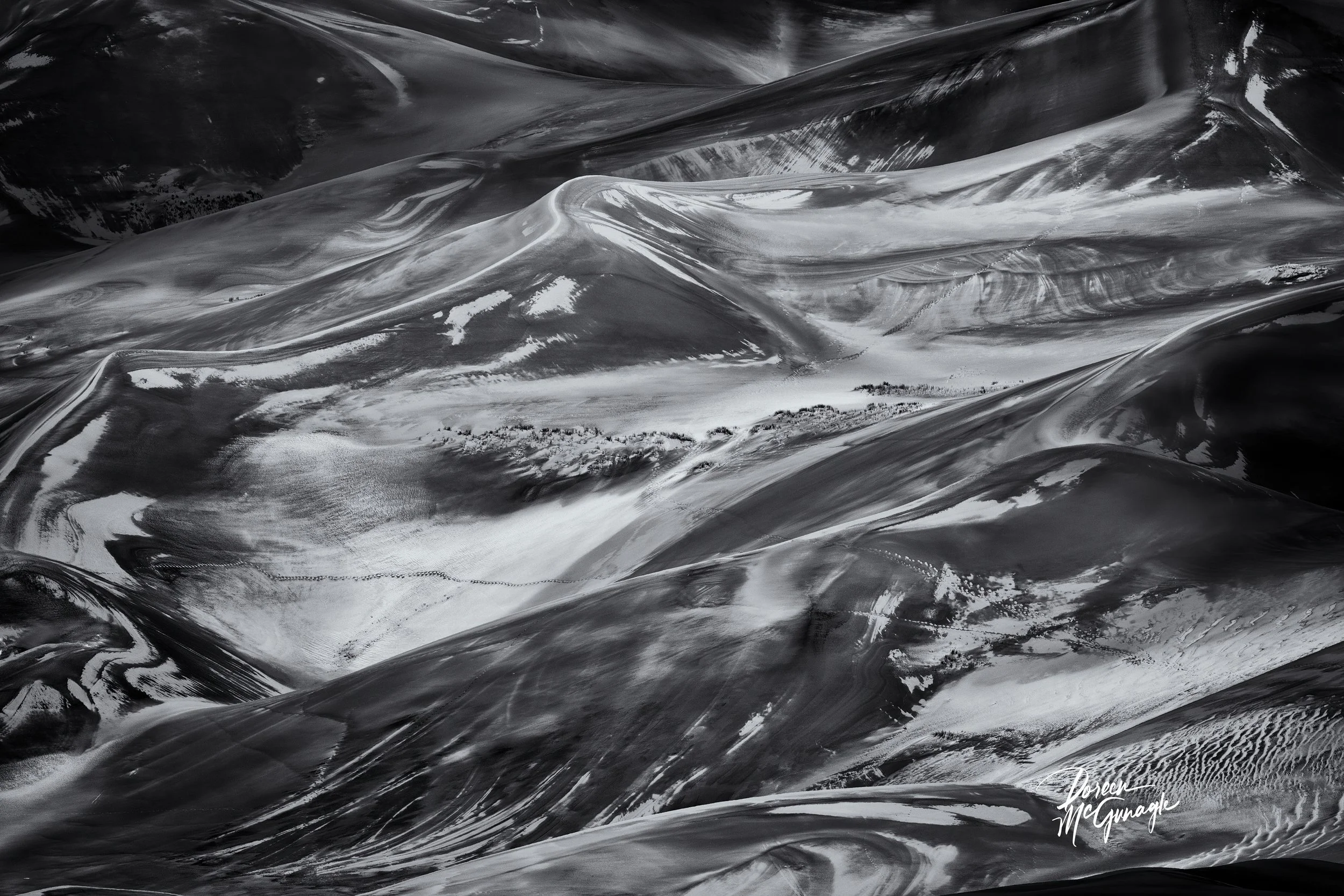
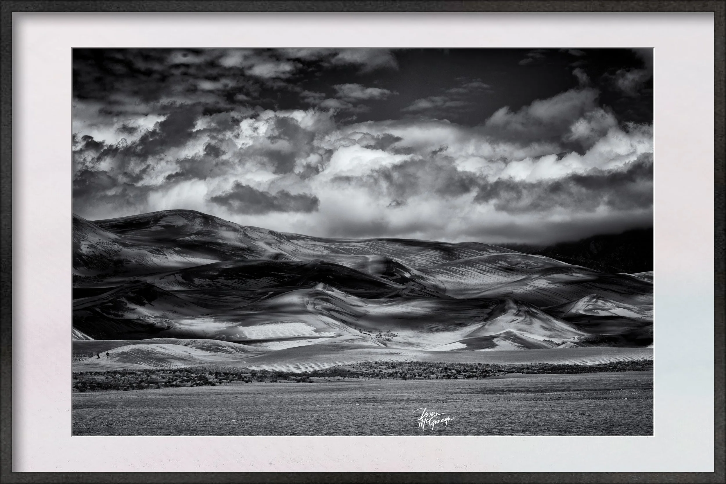
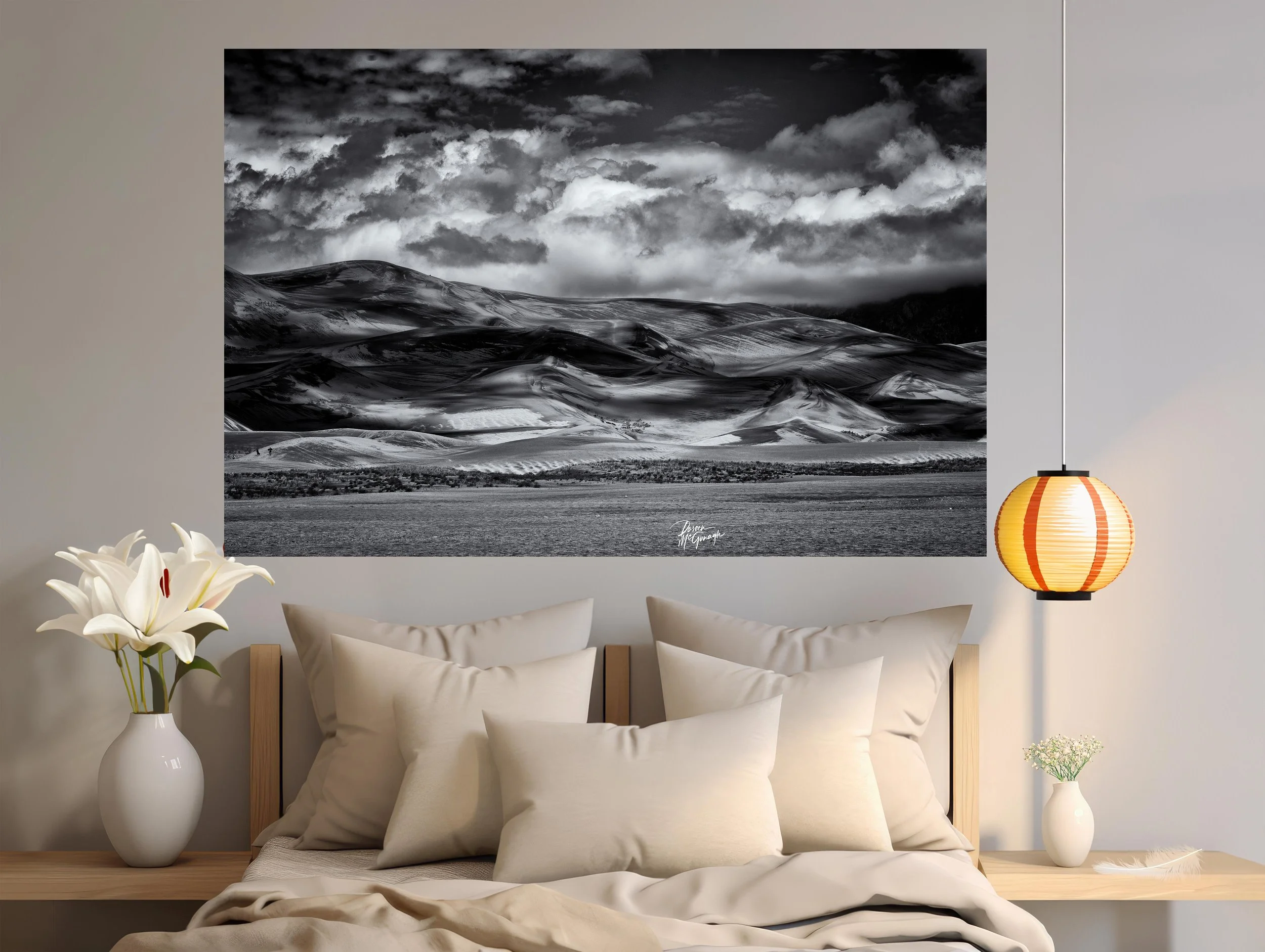
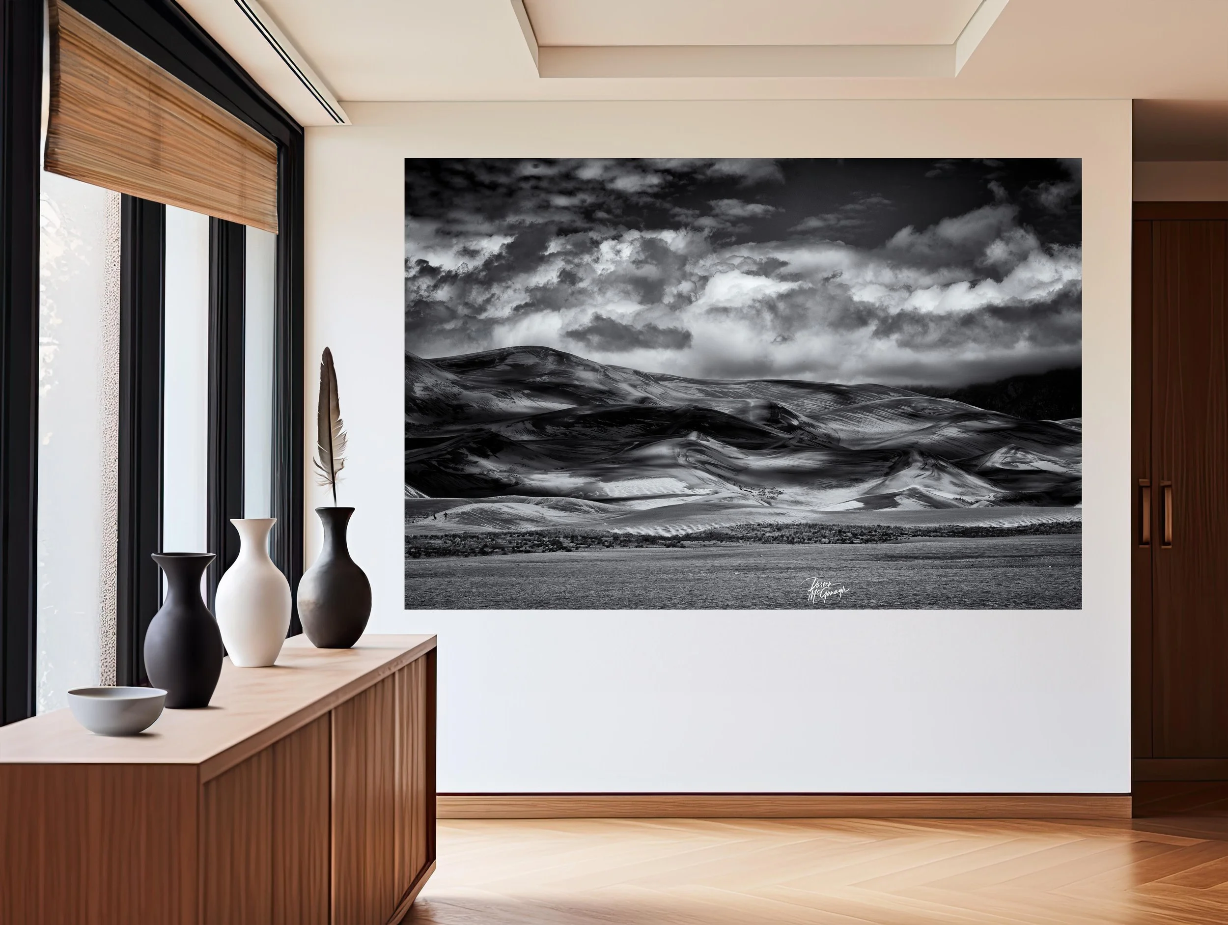
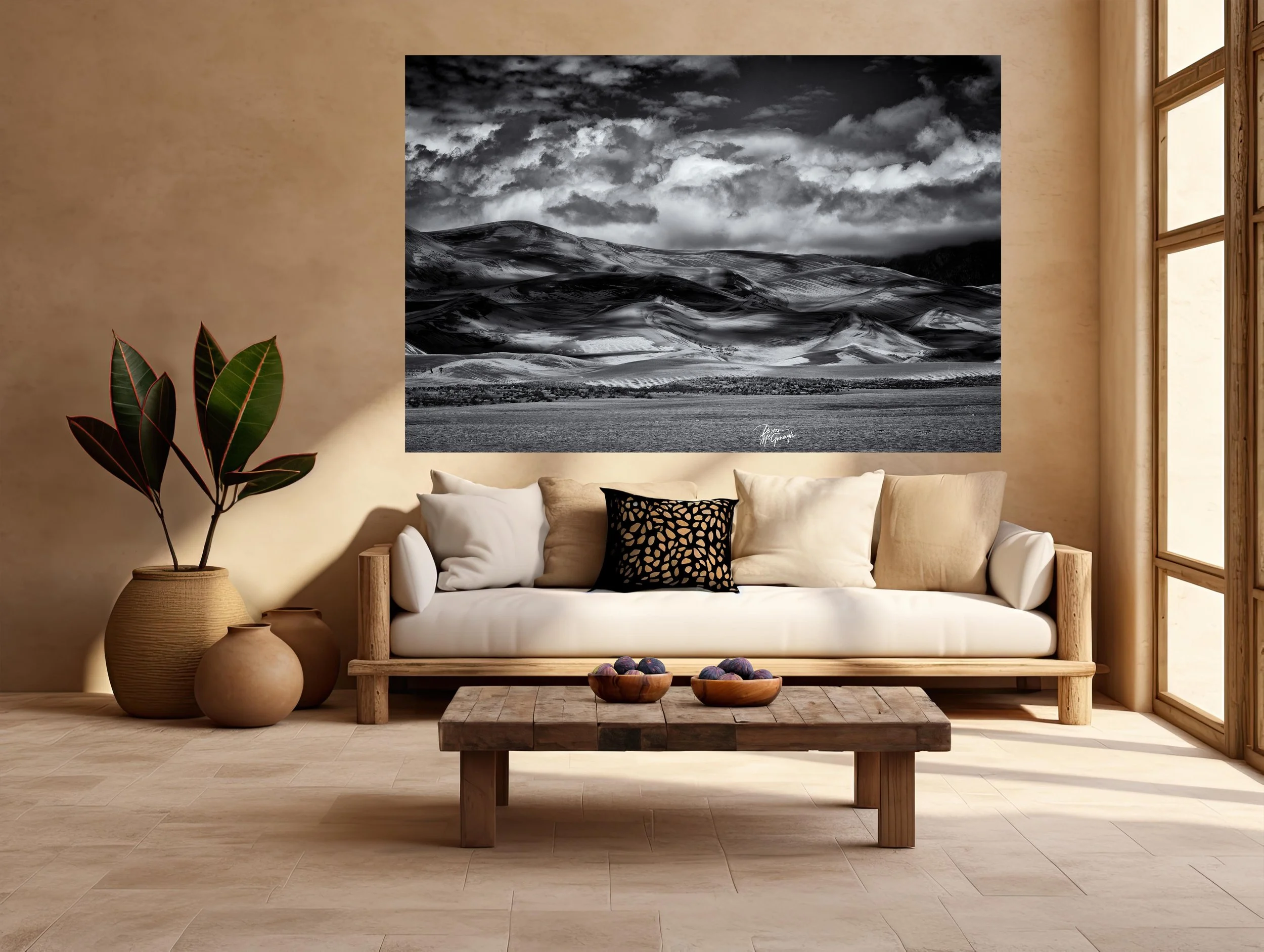
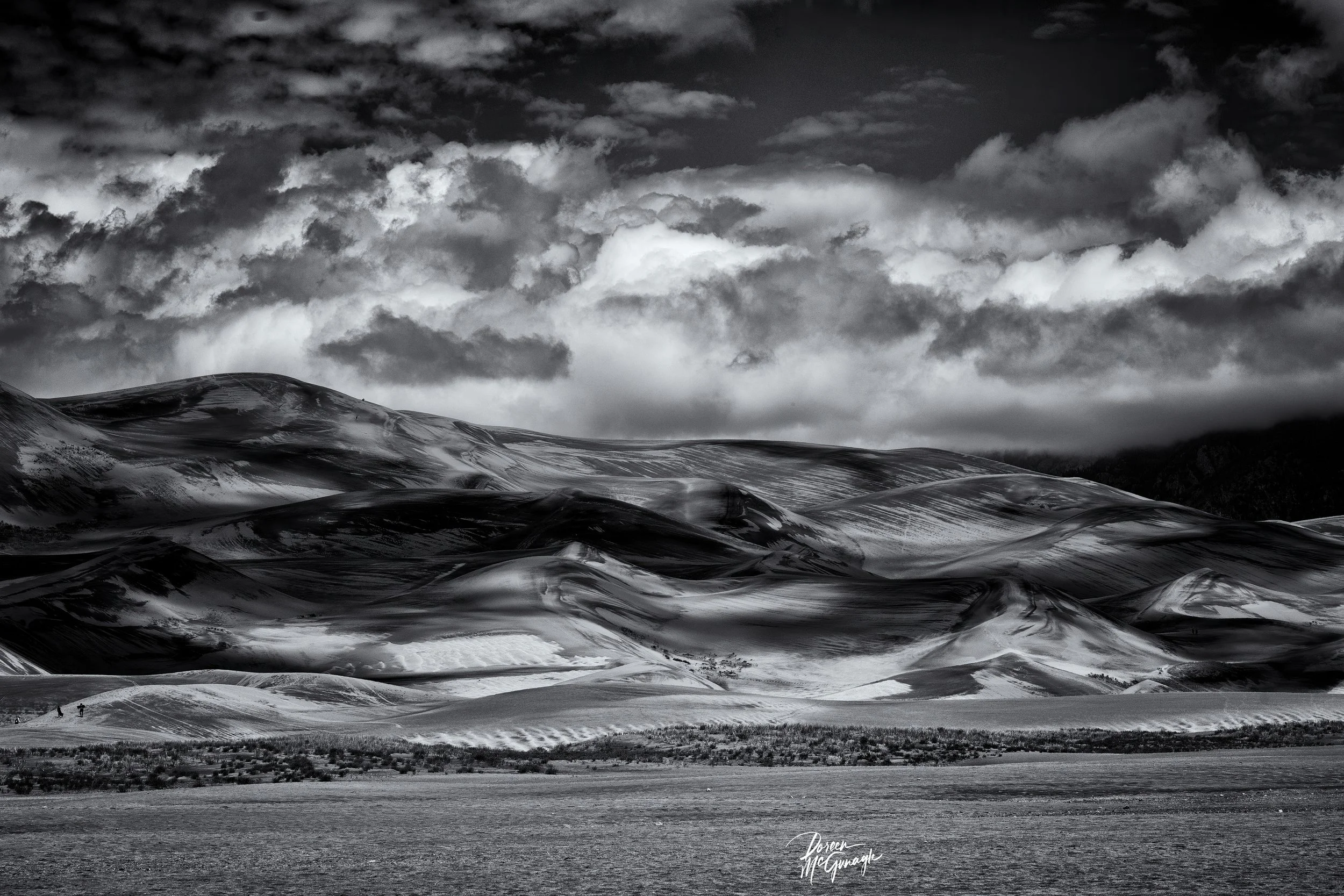
In Fiery Horizon Over Quiet Ridges, the sky carries the story. A band of incandescent color—yellows shifting to oranges and reds—rises from the horizon and dissolves into deep purples and blues, its radiance tempered by the measured silhouette of rolling hills. The foreground holds steady and dark, a quiet foundation that allows the atmosphere to unfold with deliberate drama. What emerges is a composition that balances intensity and calm: the afterglow of a storm translated into layered light.
From across the room, the image reads as a clear architecture of bands: earth in near-black, a horizon line held with confidence, and a sky composed of luminous strata. Step closer and nuance gathers. Thin veils of color overlap like brushstrokes—warm tones shifting by degrees, cool tones settling into the upper register. Subtle vignetting at the edges gently focuses the gaze, while small textural cues within the cloud field suggest motion without chaos. The result is a scene that feels both expansive and intimate—grand in scale, precise in detail, and grounded by restraint.
Light is the conductor here. Highlights hover in the warm zone just above the ridges, tapering upward as the spectrum cools; mid-tones bridge these transitions so the eye moves unhurried from heat to hush; deeper notes settle into the foreground and highest cloud bands, anchoring the frame. These relationships—bright to subdued, warm to cool—create a slow visual crescendo. You sense the storm’s retreat not through spectacle but through the sky’s soft re-ordering, a choreography of calm that follows weather’s release.
Compositionally, the photograph is spare and assured. The ridge line establishes a horizontal cadence that steadies the scene, while gentle undulations add character without breaking the frame’s poise. Negative space is used with care; it gives the most radiant passages room to breathe and lets darker fields carry weight without heaviness. The piece sustains prolonged looking because it is built for it: clear in structure, generous in tonal subtlety, and precise in how it invites attention.
Thematically, Fiery Horizon Over Quiet Ridges is about resilience and renewal. The land remains—quiet, patient—while the sky transforms around it. The storm’s turbulence has passed, but its energy lingers as saturated color, a visible memory that fades upward into calm. This is not a dramatic climax so much as a measured exhale, a reminder that change in nature often resolves into equilibrium. The photograph encourages reflection on that rhythm: intensity giving way to steadiness, brilliance settling into rest.
Color is integral to this experience. The warm-to-cool gradient does more than please the eye; it sets the emotional temperature of the piece. Warm tones carry immediacy and presence; cool tones open space and invite contemplation. Their balance—never garish, always deliberate—ensures that the image reads as luminous rather than loud, vivid yet composed.
On Acrylic, the work reaches a striking clarity. High-gloss Acrylic enriches color depth and extends tonal range: warm hues glow without blooming, cool blues and purples remain saturated yet tranquil, and the silhouetted ridges retain crisp edge definition. Fine atmospheric transitions render with near-tactile precision, while Acrylic’s subtle depth creates the impression that the sky recedes just beyond the surface. For collectors who prefer a softer, painterly presence, Canvas Pro delivers the same fidelity with a matte calm that complements the piece’s contemplative mood. Optional floating frames, handmade in Italy, complete either presentation with quiet elegance.
Collectors and curators value the photograph’s formal discipline and its capacity for daily viewing. Designers appreciate its versatility: the warm-to-cool palette bridges both wood and concrete, daylight and evening light, minimal and layered interiors. Scaled modestly, it anchors a reading nook or office with a sense of renewal; at larger sizes, it becomes a confident statement that organizes a room without overpowering it. As ambient light shifts throughout the day, new relationships emerge within the sky’s bands, renewing the image while preserving its steady center.
Each print is part of a limited edition, produced to archival standards for longevity and fidelity. A signed Certificate of Authenticity accompanies every piece, affirming its place within Doreen McGunagle Fine Art’s portfolio.
Giveback
A portion of proceeds from this artwork supports Global Voices for Nature Foundation Inc., advancing education and conservation initiatives that protect the landscapes and wildlife that inspire this work.
Edition & Finish
Limited-edition fine art print
Archival production on Acrylic (luminous, high-gloss) or Canvas Pro (matte, painterly)
Optional Italian handmade floating frame
Signed Certificate of Authenticity
CO2261-56Fiery Horizon Over Quiet Ridges GSDNP c2025
Large Wall Art, Fine Art Photography, Limited Edition 20
In Fiery Horizon Over Quiet Ridges, the sky carries the story. A band of incandescent color—yellows shifting to oranges and reds—rises from the horizon and dissolves into deep purples and blues, its radiance tempered by the measured silhouette of rolling hills. The foreground holds steady and dark, a quiet foundation that allows the atmosphere to unfold with deliberate drama. What emerges is a composition that balances intensity and calm: the afterglow of a storm translated into layered light.
From across the room, the image reads as a clear architecture of bands: earth in near-black, a horizon line held with confidence, and a sky composed of luminous strata. Step closer and nuance gathers. Thin veils of color overlap like brushstrokes—warm tones shifting by degrees, cool tones settling into the upper register. Subtle vignetting at the edges gently focuses the gaze, while small textural cues within the cloud field suggest motion without chaos. The result is a scene that feels both expansive and intimate—grand in scale, precise in detail, and grounded by restraint.
Light is the conductor here. Highlights hover in the warm zone just above the ridges, tapering upward as the spectrum cools; mid-tones bridge these transitions so the eye moves unhurried from heat to hush; deeper notes settle into the foreground and highest cloud bands, anchoring the frame. These relationships—bright to subdued, warm to cool—create a slow visual crescendo. You sense the storm’s retreat not through spectacle but through the sky’s soft re-ordering, a choreography of calm that follows weather’s release.
Compositionally, the photograph is spare and assured. The ridge line establishes a horizontal cadence that steadies the scene, while gentle undulations add character without breaking the frame’s poise. Negative space is used with care; it gives the most radiant passages room to breathe and lets darker fields carry weight without heaviness. The piece sustains prolonged looking because it is built for it: clear in structure, generous in tonal subtlety, and precise in how it invites attention.
Thematically, Fiery Horizon Over Quiet Ridges is about resilience and renewal. The land remains—quiet, patient—while the sky transforms around it. The storm’s turbulence has passed, but its energy lingers as saturated color, a visible memory that fades upward into calm. This is not a dramatic climax so much as a measured exhale, a reminder that change in nature often resolves into equilibrium. The photograph encourages reflection on that rhythm: intensity giving way to steadiness, brilliance settling into rest.
Color is integral to this experience. The warm-to-cool gradient does more than please the eye; it sets the emotional temperature of the piece. Warm tones carry immediacy and presence; cool tones open space and invite contemplation. Their balance—never garish, always deliberate—ensures that the image reads as luminous rather than loud, vivid yet composed.
On Acrylic, the work reaches a striking clarity. High-gloss Acrylic enriches color depth and extends tonal range: warm hues glow without blooming, cool blues and purples remain saturated yet tranquil, and the silhouetted ridges retain crisp edge definition. Fine atmospheric transitions render with near-tactile precision, while Acrylic’s subtle depth creates the impression that the sky recedes just beyond the surface. For collectors who prefer a softer, painterly presence, Canvas Pro delivers the same fidelity with a matte calm that complements the piece’s contemplative mood. Optional floating frames, handmade in Italy, complete either presentation with quiet elegance.
Collectors and curators value the photograph’s formal discipline and its capacity for daily viewing. Designers appreciate its versatility: the warm-to-cool palette bridges both wood and concrete, daylight and evening light, minimal and layered interiors. Scaled modestly, it anchors a reading nook or office with a sense of renewal; at larger sizes, it becomes a confident statement that organizes a room without overpowering it. As ambient light shifts throughout the day, new relationships emerge within the sky’s bands, renewing the image while preserving its steady center.
Each print is part of a limited edition, produced to archival standards for longevity and fidelity. A signed Certificate of Authenticity accompanies every piece, affirming its place within Doreen McGunagle Fine Art’s portfolio.
Giveback
A portion of proceeds from this artwork supports Global Voices for Nature Foundation Inc., advancing education and conservation initiatives that protect the landscapes and wildlife that inspire this work.
Edition & Finish
Limited-edition fine art print
Archival production on Acrylic (luminous, high-gloss) or Canvas Pro (matte, painterly)
Optional Italian handmade floating frame
Signed Certificate of Authenticity
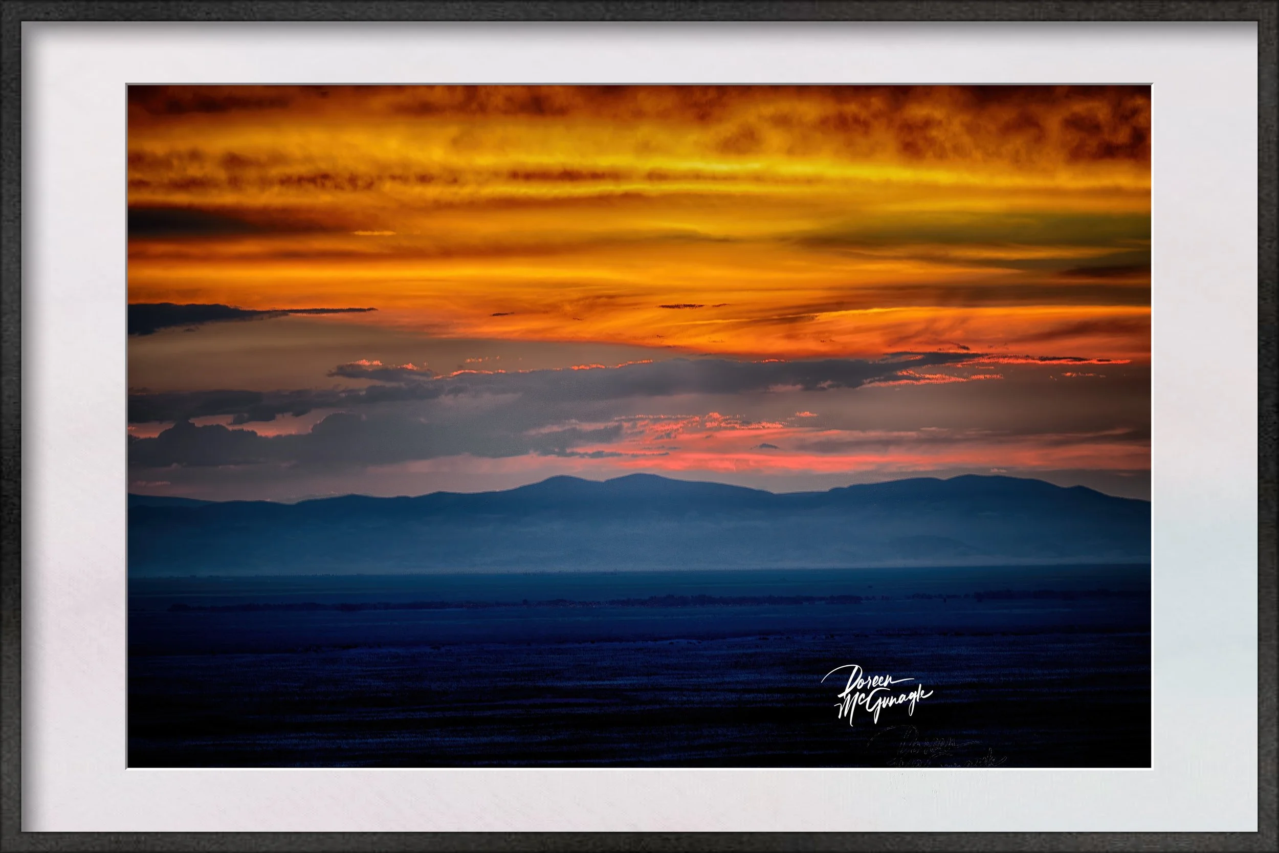 Image 1 of 5
 Image 2 of 5
 Image 3 of 5
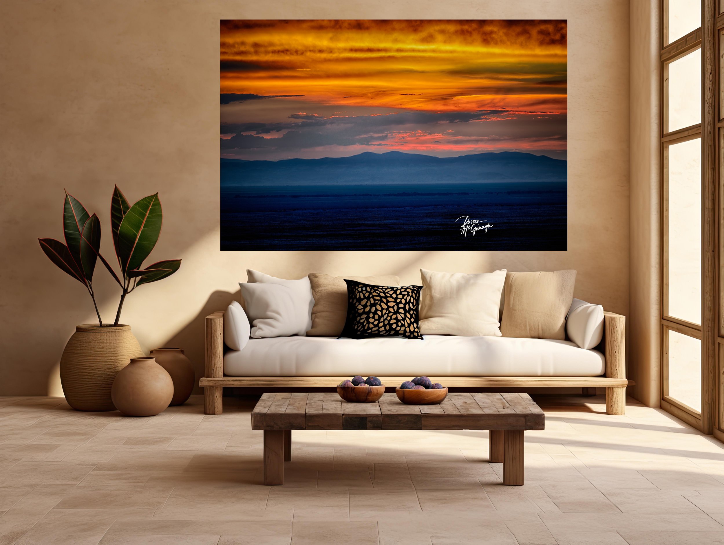 Image 4 of 5
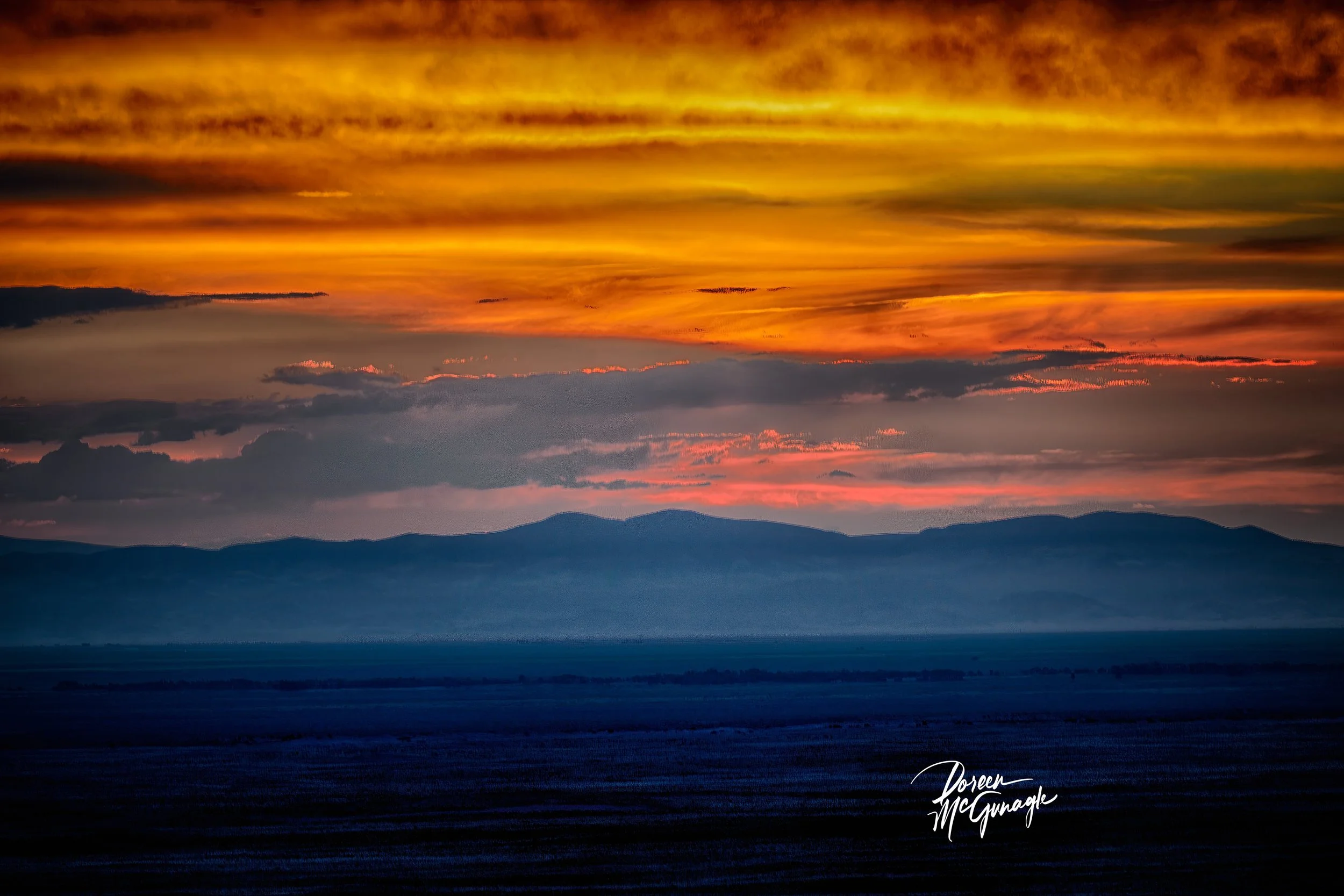 Image 5 of 5