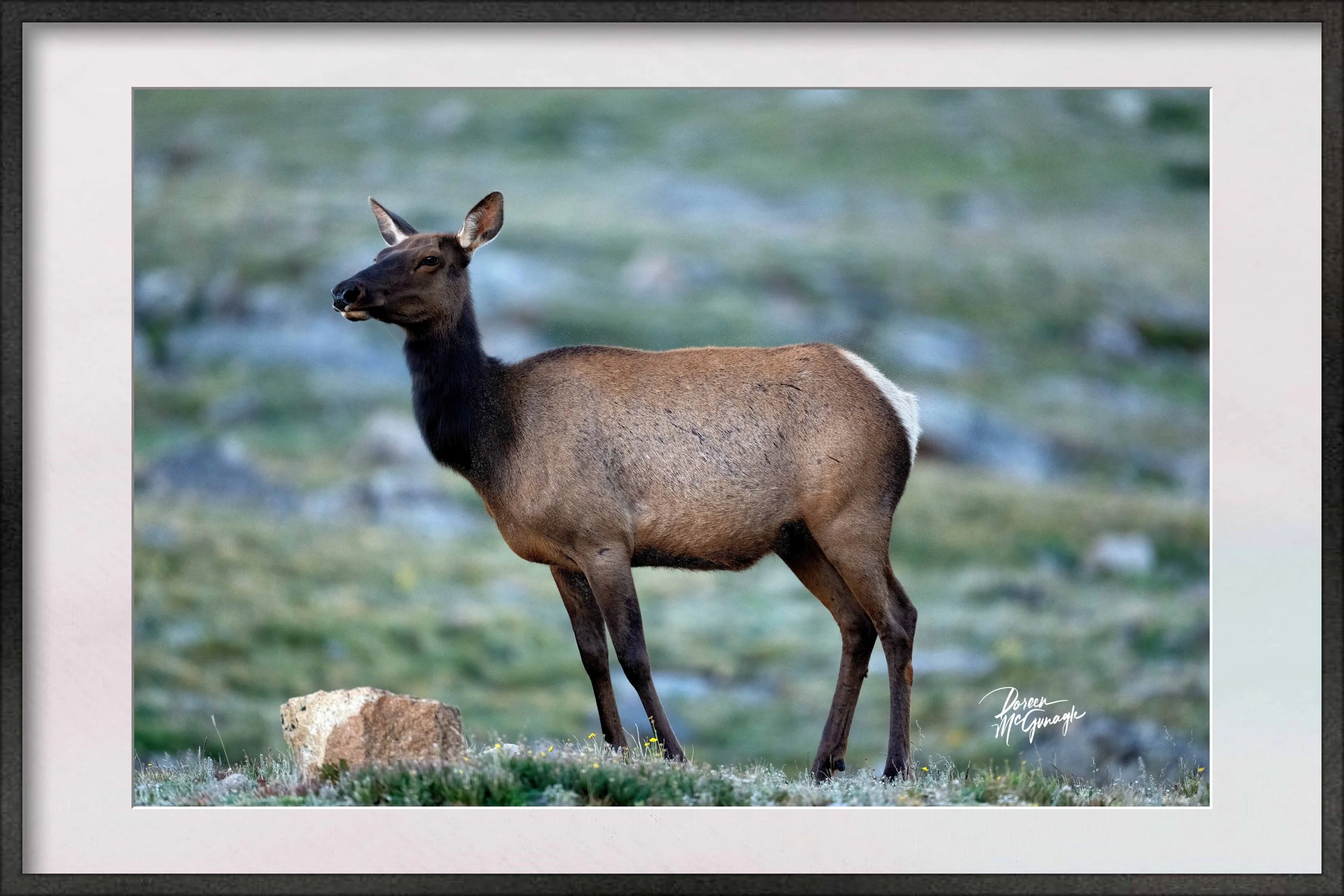
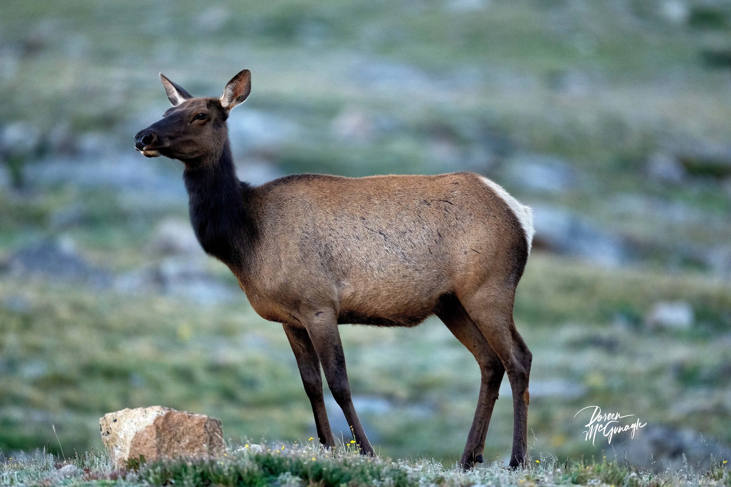
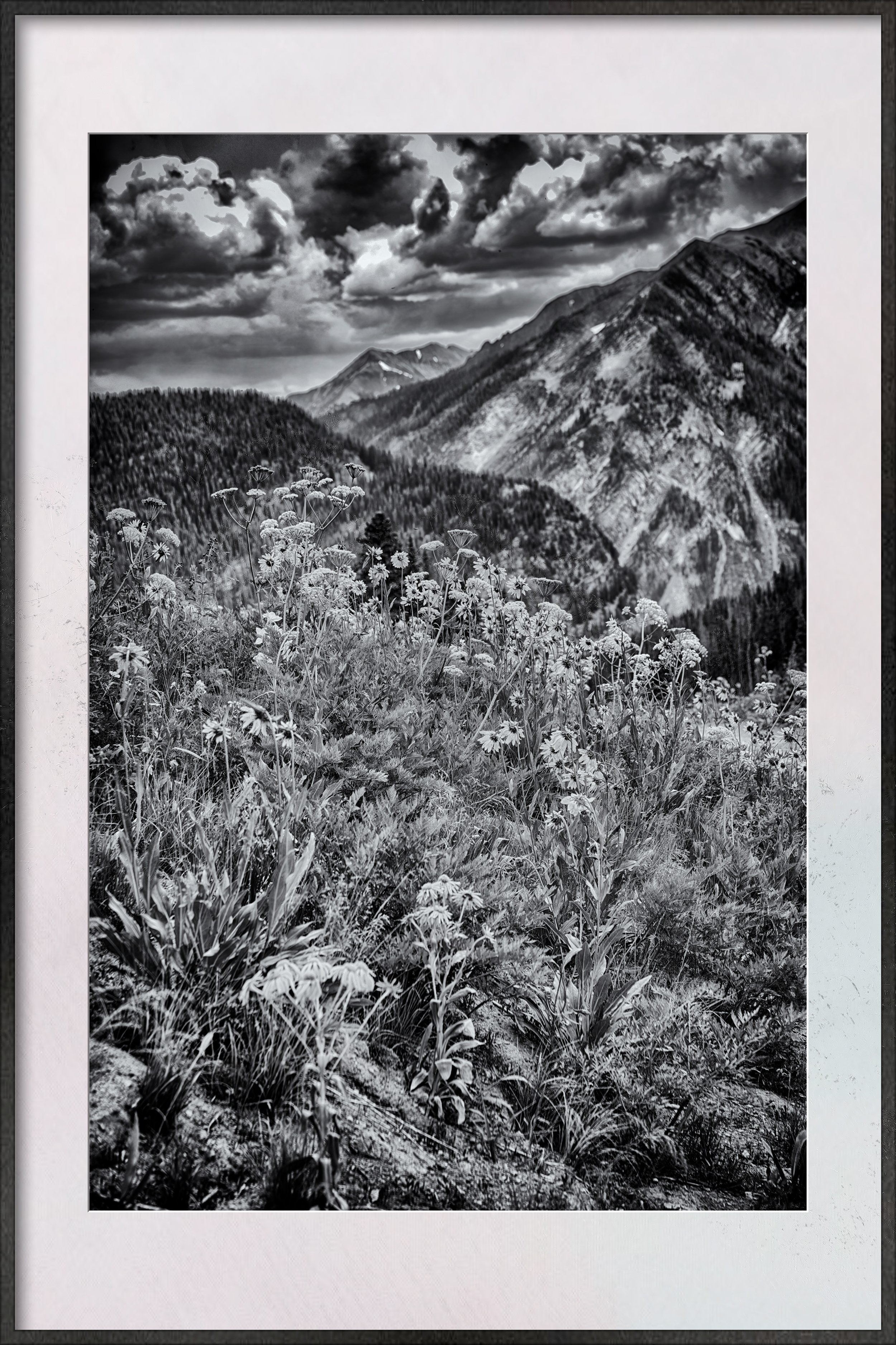
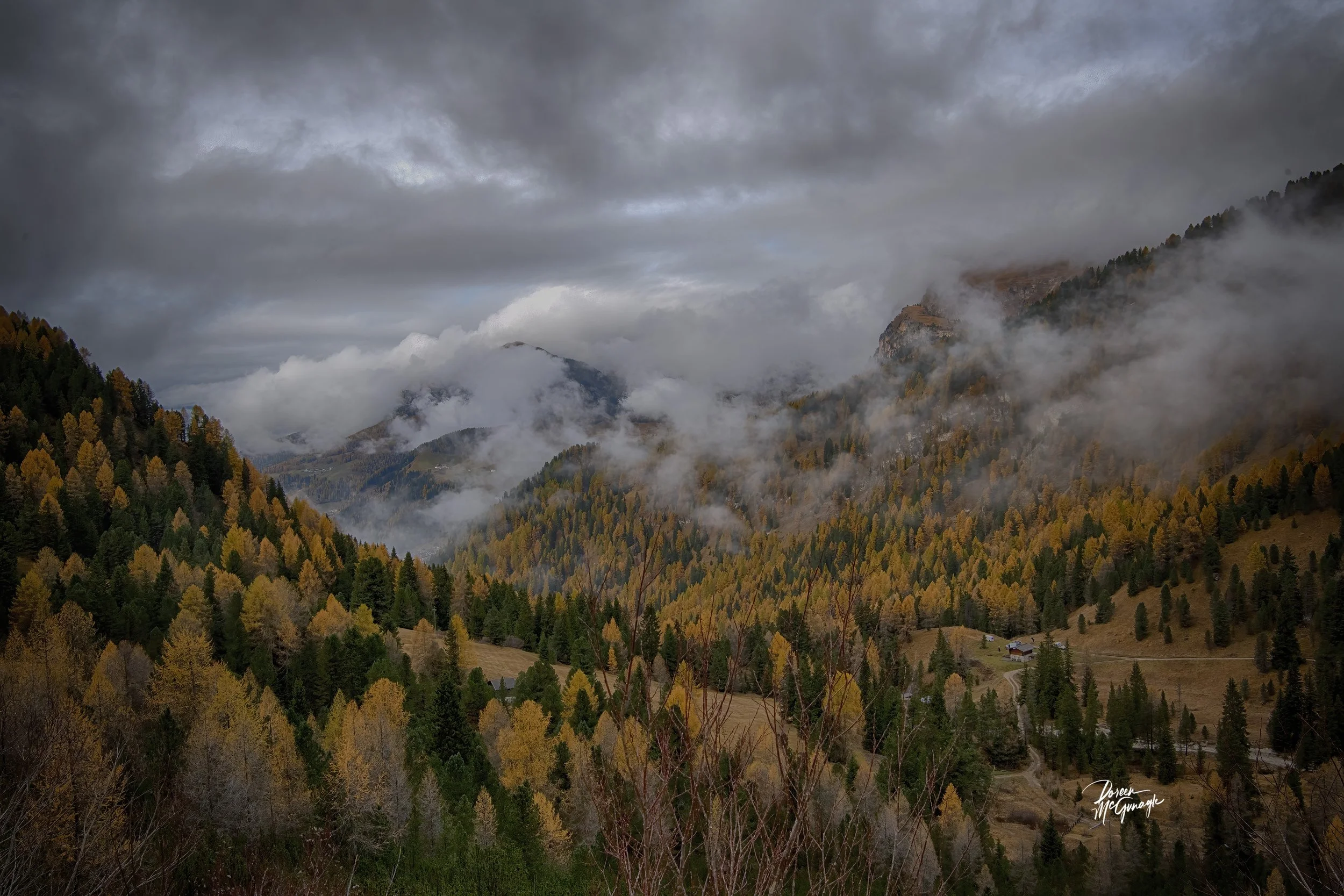
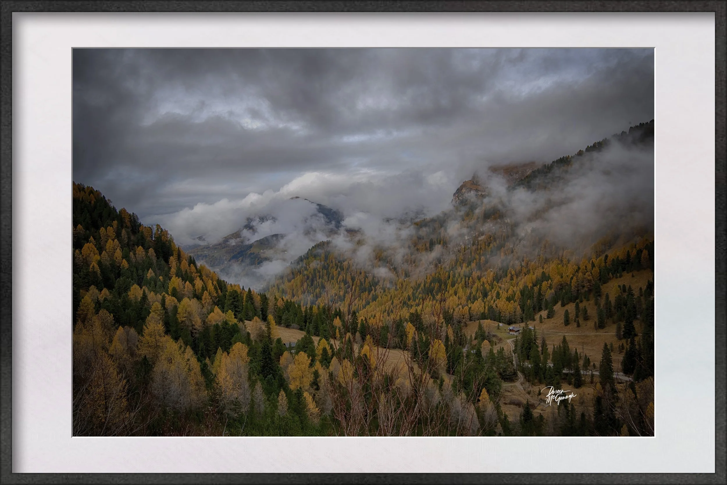
CO1086-35 Island of Quiet Reflection Crested Butte c2025
Large Wall Art, Fine Art Photography, Limited Edition 20
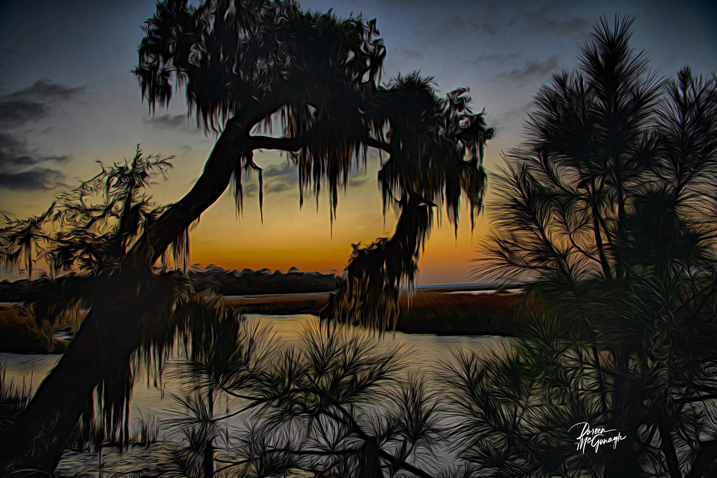
You don’t just hang this piece—you set the ambiance. Island of Quiet Reflection turns a room into morning hush: a slender, tree-crowned island resting in glass-calm water, its mirrored silhouette doubling the stillness; beyond, layered hills and forest recede into soft shadow. Rendered in black and white, the scene is distilled to light, form, and space—an atmosphere that steadies the mind the moment you enter.
Field notes — the story behind the image
I arrived before the breeze, when the lake read like polished stone. A faint band of light slid under the cloud deck and found the island first; the hills held their shadows a little longer. In that pause, the reflection locked perfectly into place—as if the landscape were taking a measured breath. What I felt most was quiet balance: brightness nested inside calm, delicacy held by resilience. That feeling anchors this photograph and the rooms it inhabits.
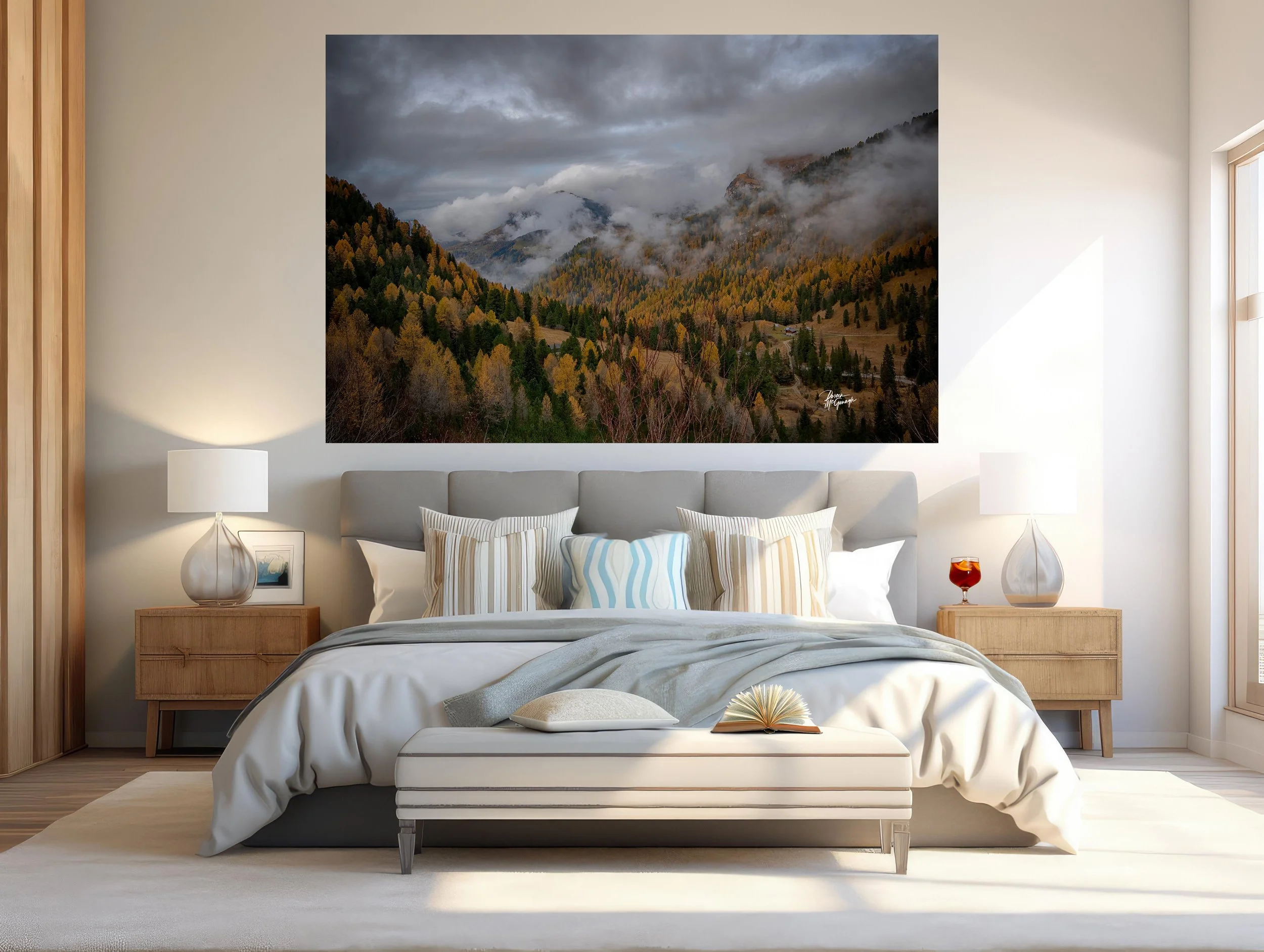
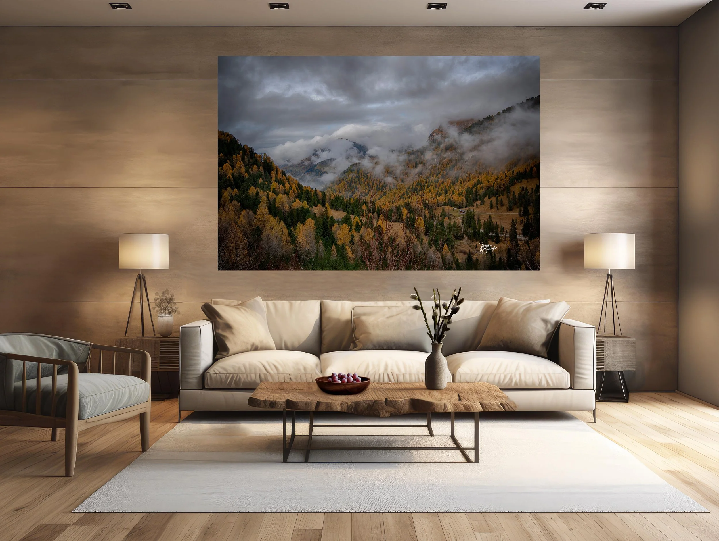
From “art” to ambiance: how it transforms your space
Designers speak in the language of focal points, colour palettes, and bringing the outside in. This work answers all three.
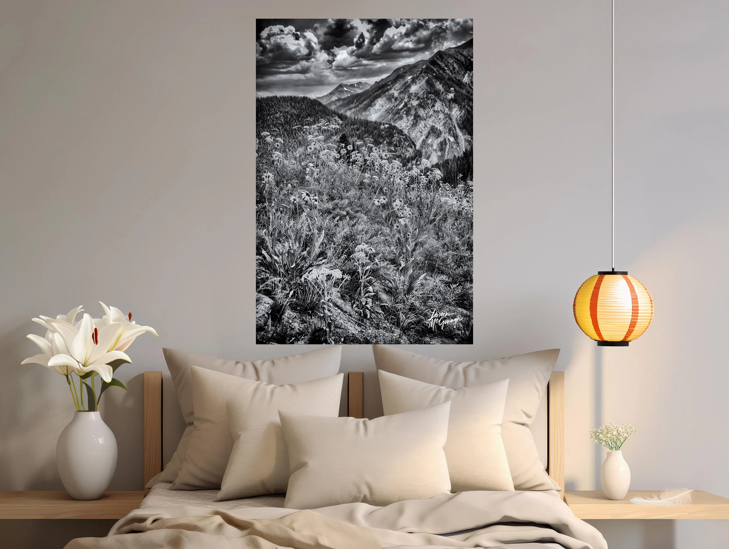
Focal point: The island + its mirror form a strong vertical axis that organizes the wall. Your eye lands on the bright silhouette, then drifts outward to the forested hills and sky. It’s a natural centrepiece over a sofa, mantel, credenza, or headboard.
Tonal palette (monochrome): Ink black, charcoal, graphite, pewter, silver, and cloud white. This restrained scale reads composed and modern—easy to echo with a single blackened-steel accent, a charcoal throw, or a pale linen cushion.
Bringing the outside in: Foreground reflection → island glow → layered hills → quiet sky builds real depth—the interior equivalent of opening a window to still water.
Why the words matter
People buy the story as much as the photograph. The image carries the feeling; these words share the where, light, and mood—so the piece becomes more than décor. It becomes a calm you can return to.
Design notes — placement, materials, scale
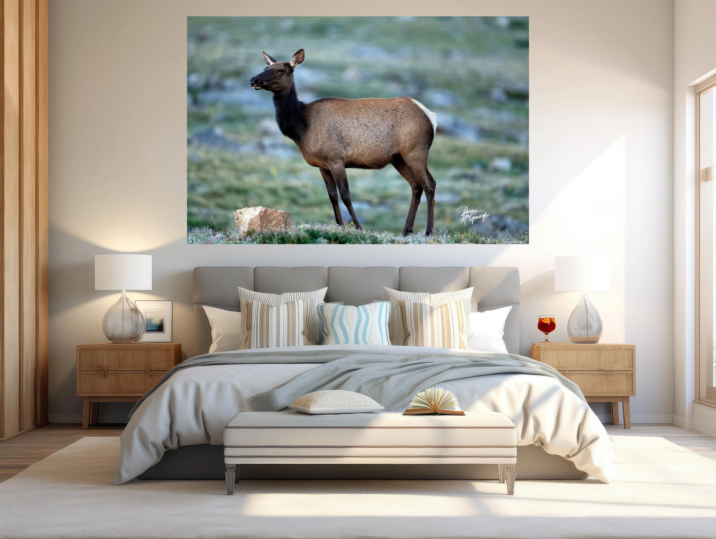
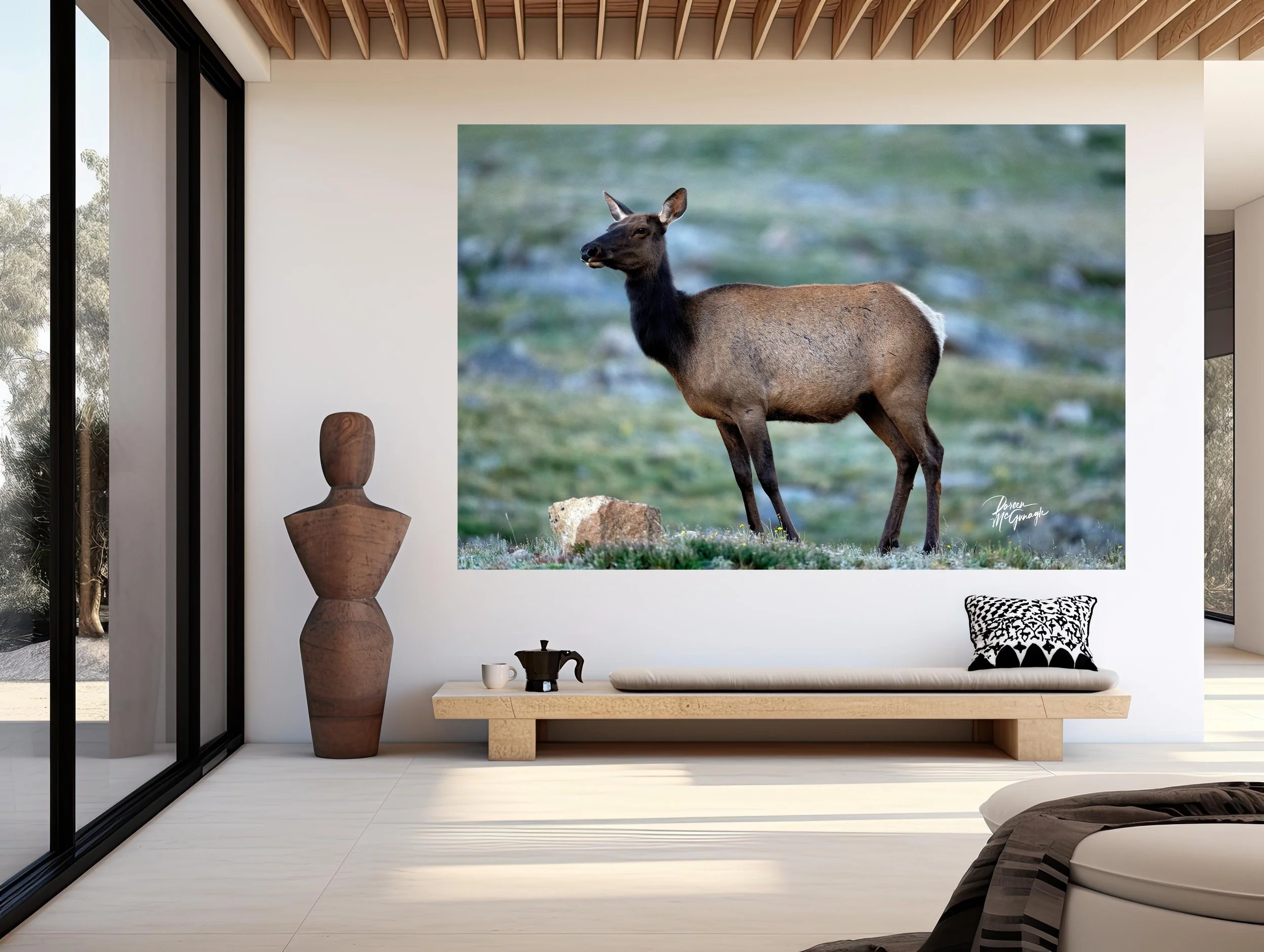
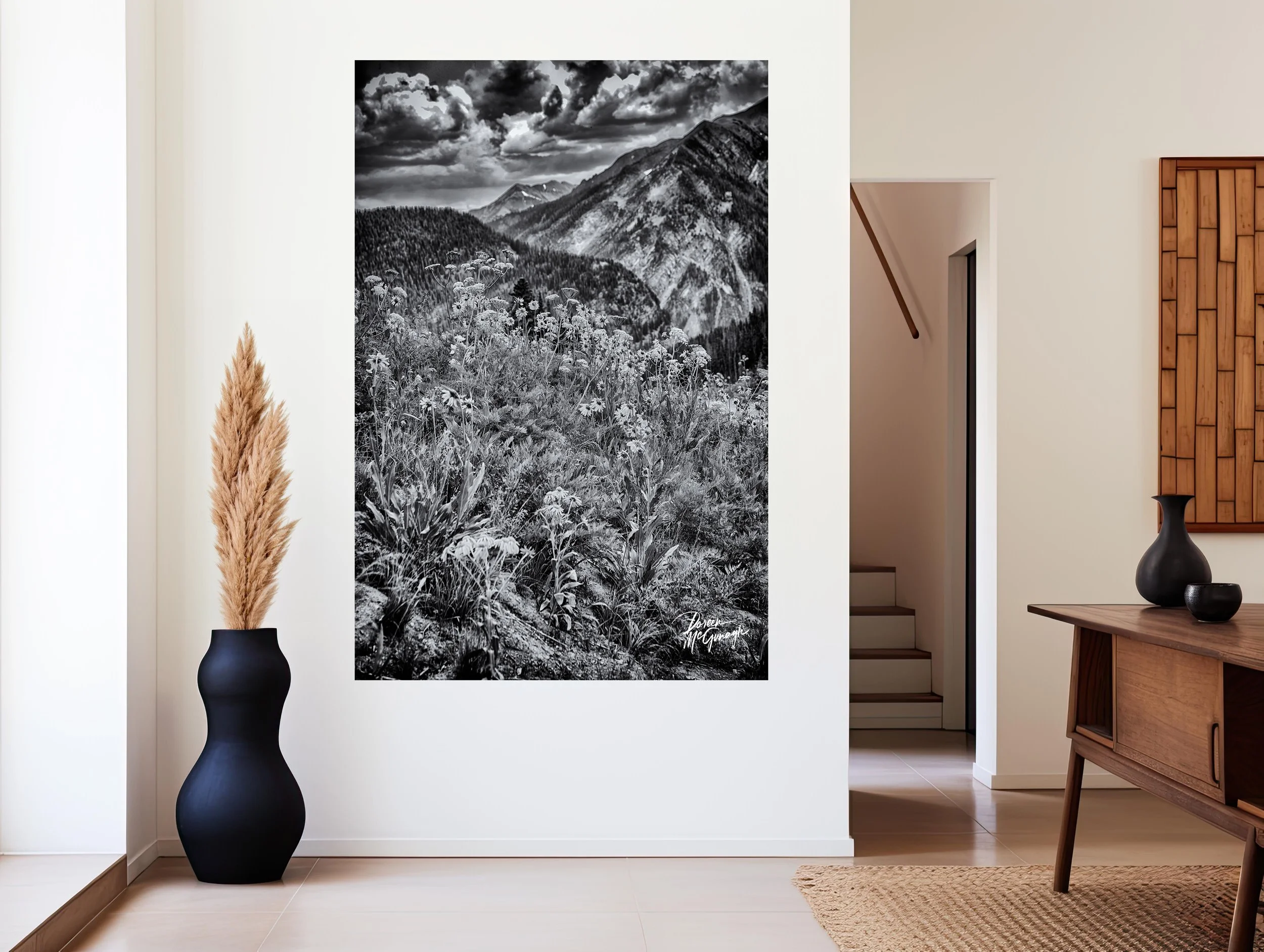
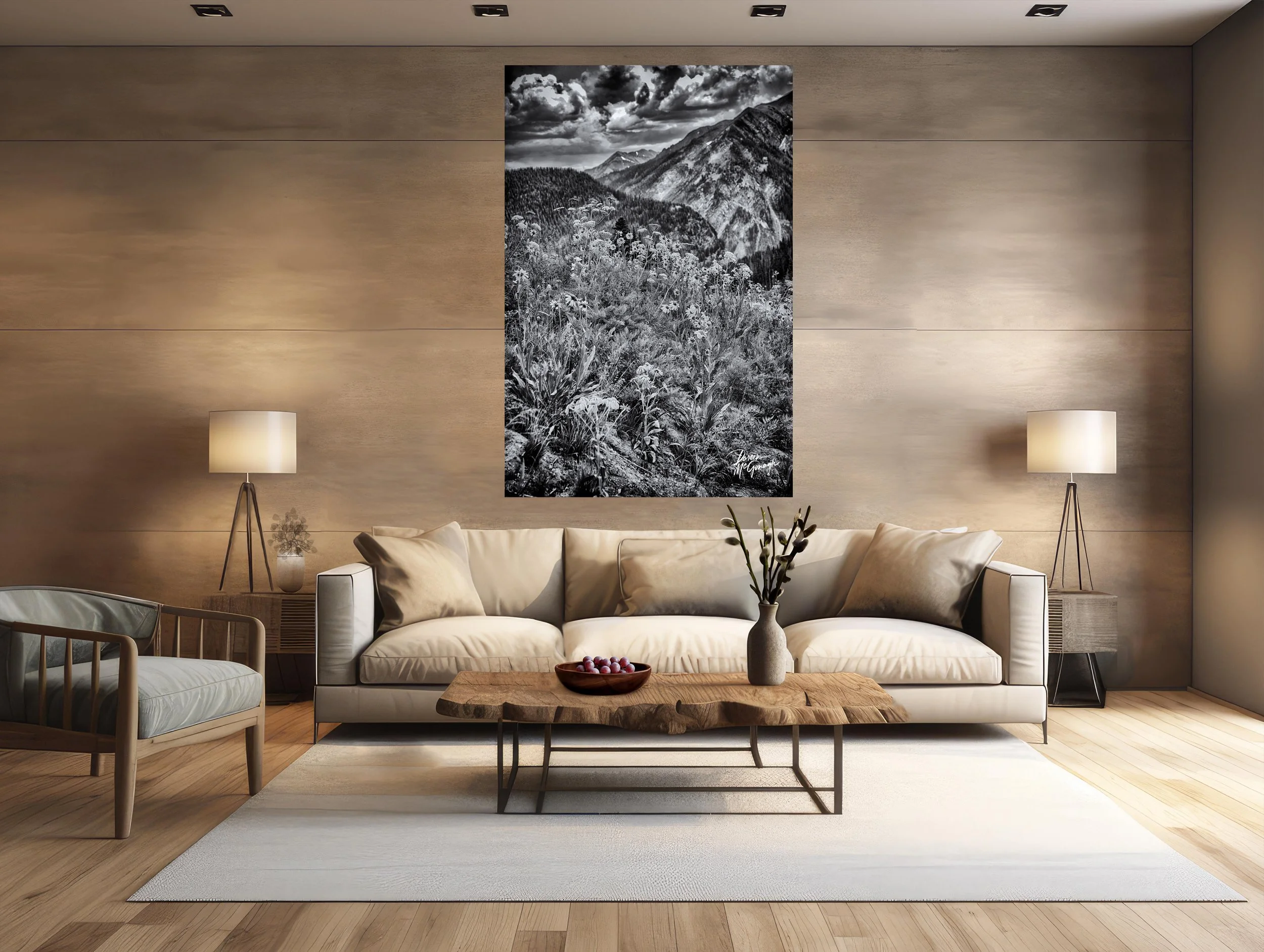
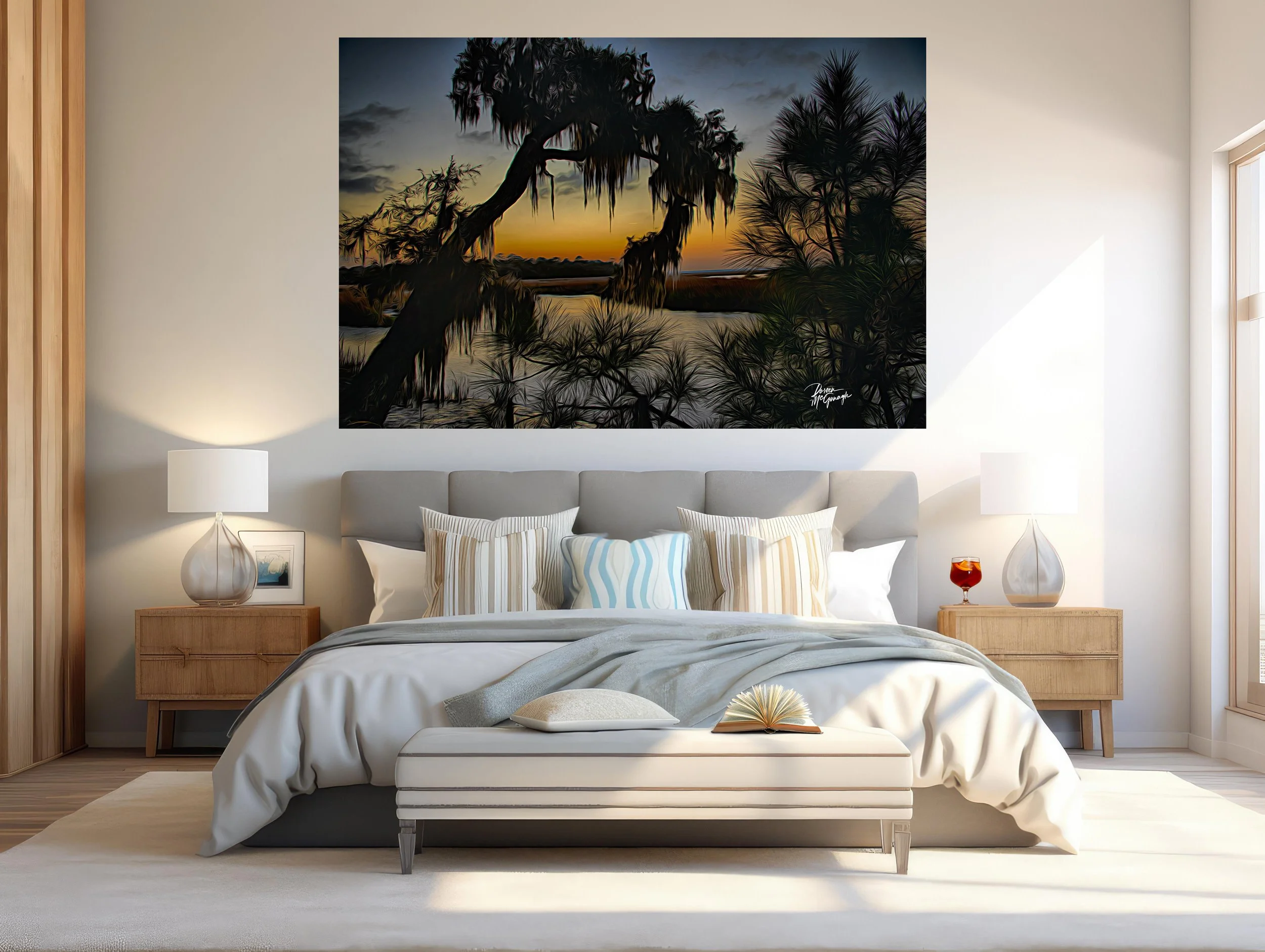
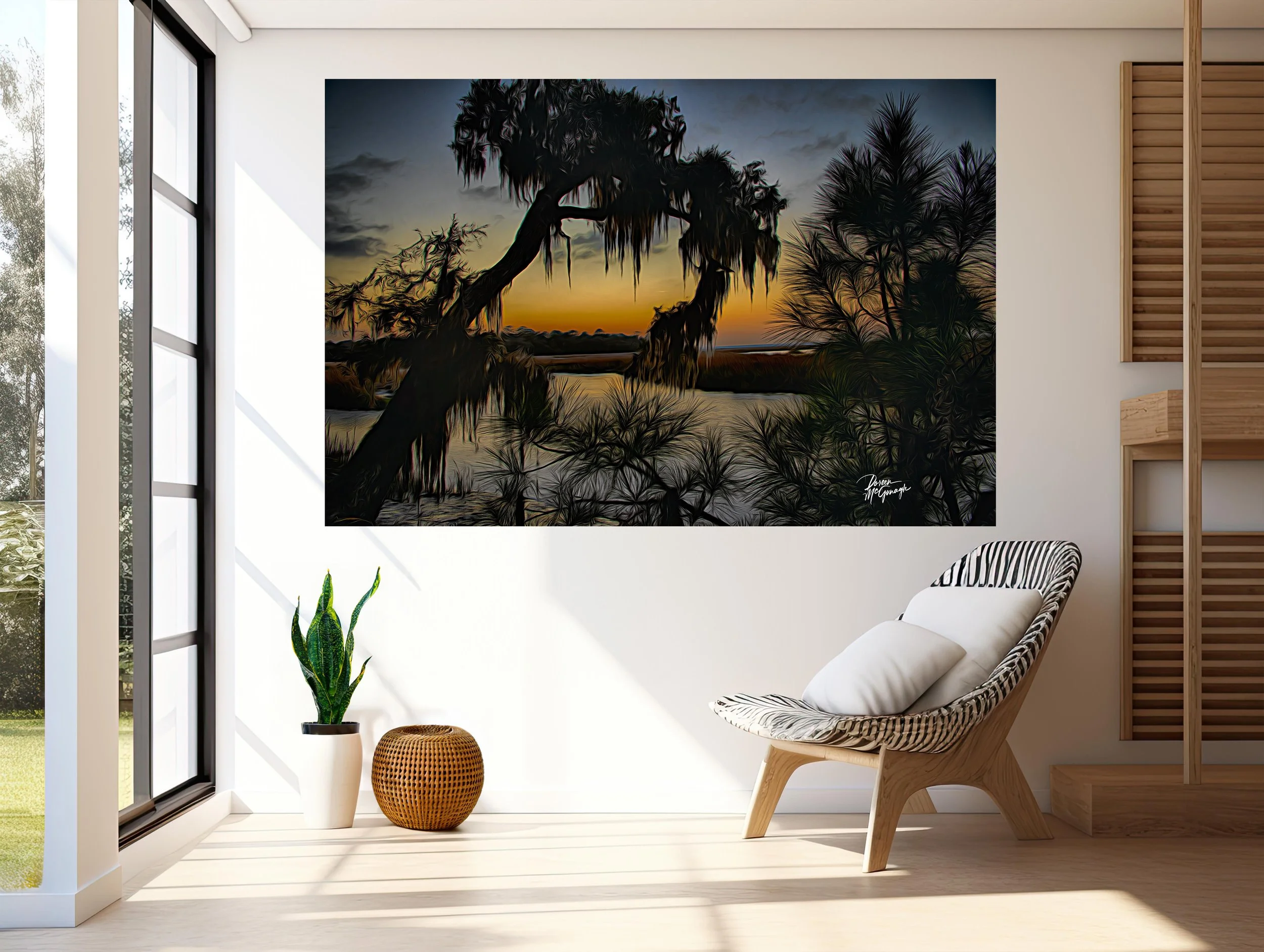
Where it sings: living-room feature wall • bedroom headboard wall • entry reveal • end-of-hall vista • dining wall opposite natural light • behind a desk for focused calm.
Materials that love this print: oiled oak or walnut, linen and wool boucle, honed soapstone/travertine, ceramic stoneware, blackened steel, brushed nickel.
Scale guidance: mid sizes create a contemplative anchor; statement sizes make it the centrepiece that sets the room’s rhythm.
Lighting tip: a dimmable picture light at 2700–3000K deepens blacks, keeps highlights clean, and reveals the micro-texture in water and trees after dark.
Craft & presentation
Limited-edition fine art print produced to museum standards for fidelity and longevity.
Acrylic (luminous, high-gloss, recommended for B&W): extends tonal range so blacks settle with plush conviction and highlights lift with crisp clarity; reflections feel dimensional. (Acrylic only for this edition.)
Signed Certificate of Authenticity included.
Our commitment to the places that inspire this work
With every edition collected, a portion of the sale supports Global Voices for Nature Foundation Inc., helping fund conservation and education projects that keep wild watersheds and forest habitats—like this—thriving.
CO1086-35 Island of Quiet Reflection Crested Butte c2025
Large Wall Art, Fine Art Photography, Limited Edition 20
You don’t just hang this piece—you set the ambiance. Island of Quiet Reflection turns a room into morning hush: a slender, tree-crowned island resting in glass-calm water, its mirrored silhouette doubling the stillness; beyond, layered hills and forest recede into soft shadow. Rendered in black and white, the scene is distilled to light, form, and space—an atmosphere that steadies the mind the moment you enter.
Field notes — the story behind the image
I arrived before the breeze, when the lake read like polished stone. A faint band of light slid under the cloud deck and found the island first; the hills held their shadows a little longer. In that pause, the reflection locked perfectly into place—as if the landscape were taking a measured breath. What I felt most was quiet balance: brightness nested inside calm, delicacy held by resilience. That feeling anchors this photograph and the rooms it inhabits.
From “art” to ambiance: how it transforms your space
Designers speak in the language of focal points, colour palettes, and bringing the outside in. This work answers all three.
Focal point: The island + its mirror form a strong vertical axis that organizes the wall. Your eye lands on the bright silhouette, then drifts outward to the forested hills and sky. It’s a natural centrepiece over a sofa, mantel, credenza, or headboard.
Tonal palette (monochrome): Ink black, charcoal, graphite, pewter, silver, and cloud white. This restrained scale reads composed and modern—easy to echo with a single blackened-steel accent, a charcoal throw, or a pale linen cushion.
Bringing the outside in: Foreground reflection → island glow → layered hills → quiet sky builds real depth—the interior equivalent of opening a window to still water.
Why the words matter
People buy the story as much as the photograph. The image carries the feeling; these words share the where, light, and mood—so the piece becomes more than décor. It becomes a calm you can return to.
Design notes — placement, materials, scale
Where it sings: living-room feature wall • bedroom headboard wall • entry reveal • end-of-hall vista • dining wall opposite natural light • behind a desk for focused calm.
Materials that love this print: oiled oak or walnut, linen and wool boucle, honed soapstone/travertine, ceramic stoneware, blackened steel, brushed nickel.
Scale guidance: mid sizes create a contemplative anchor; statement sizes make it the centrepiece that sets the room’s rhythm.
Lighting tip: a dimmable picture light at 2700–3000K deepens blacks, keeps highlights clean, and reveals the micro-texture in water and trees after dark.
Craft & presentation
Limited-edition fine art print produced to museum standards for fidelity and longevity.
Acrylic (luminous, high-gloss, recommended for B&W): extends tonal range so blacks settle with plush conviction and highlights lift with crisp clarity; reflections feel dimensional. (Acrylic only for this edition.)
Signed Certificate of Authenticity included.
Our commitment to the places that inspire this work
With every edition collected, a portion of the sale supports Global Voices for Nature Foundation Inc., helping fund conservation and education projects that keep wild watersheds and forest habitats—like this—thriving.
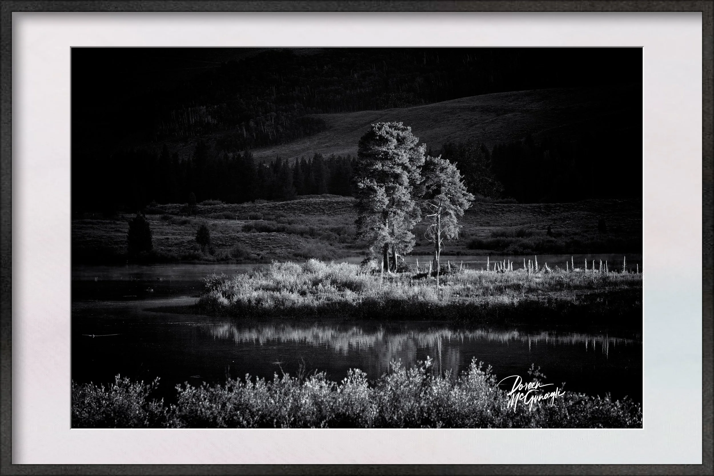 Image 1 of 5
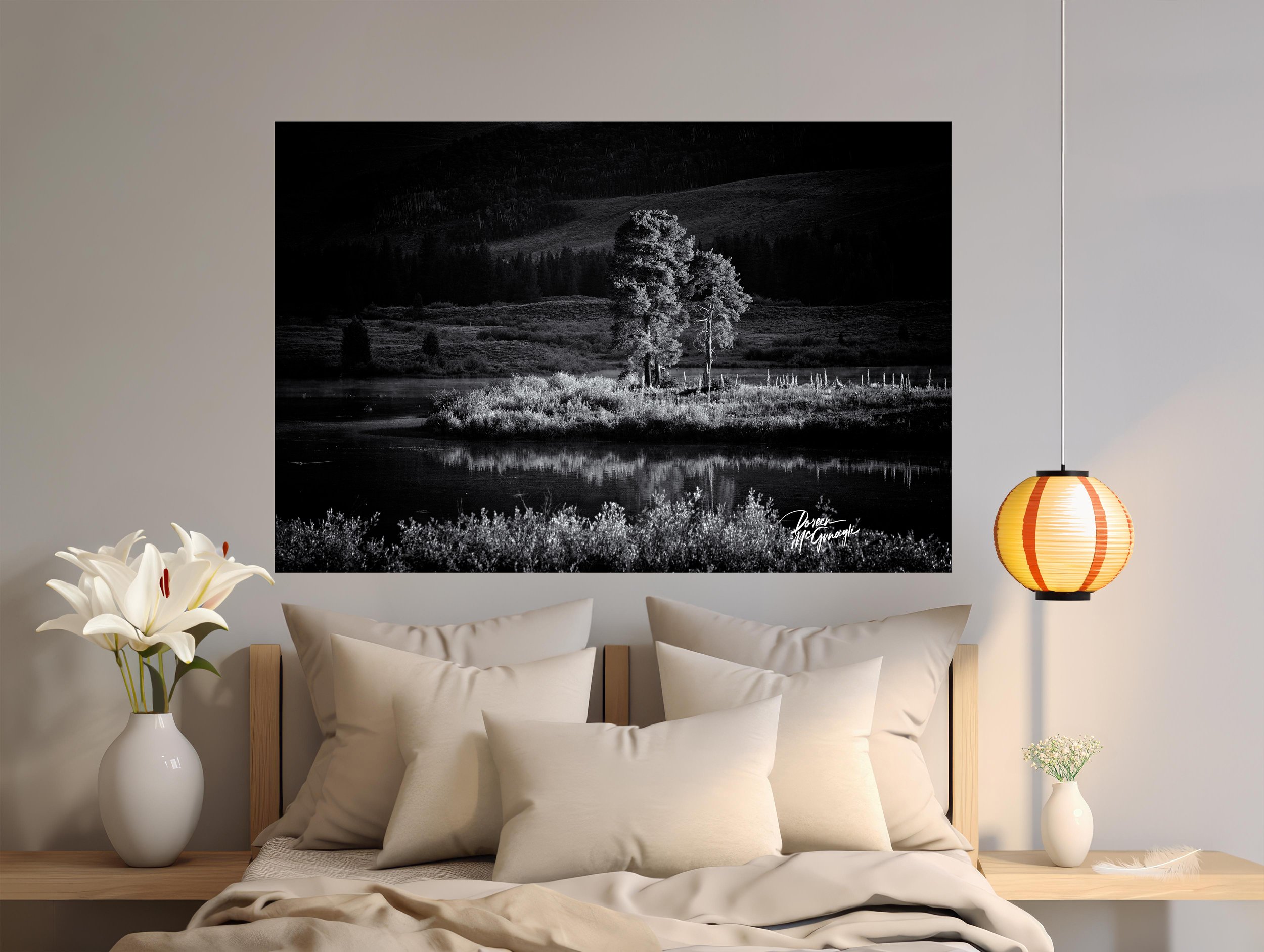 Image 2 of 5
 Image 3 of 5
 Image 4 of 5
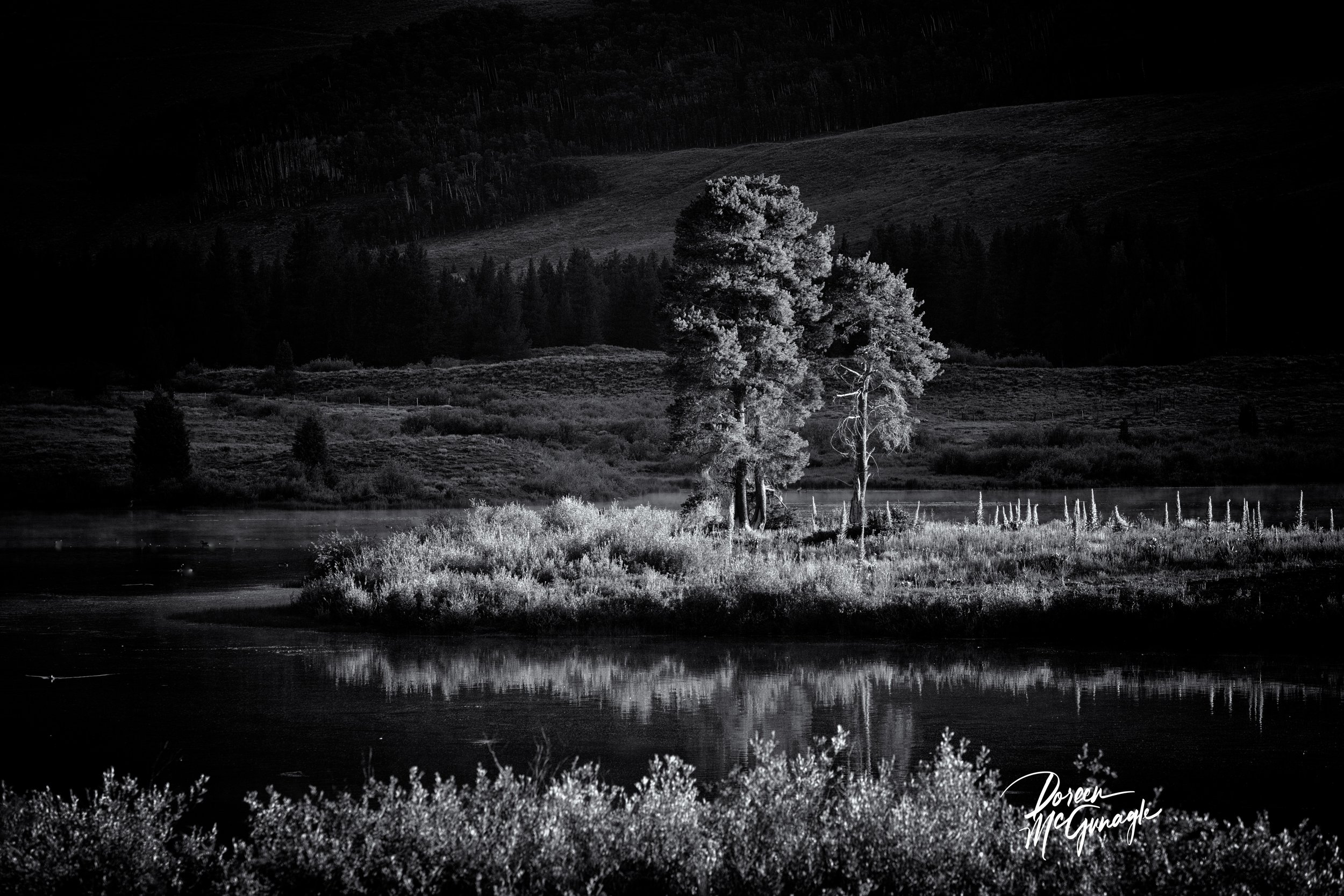 Image 5 of 5