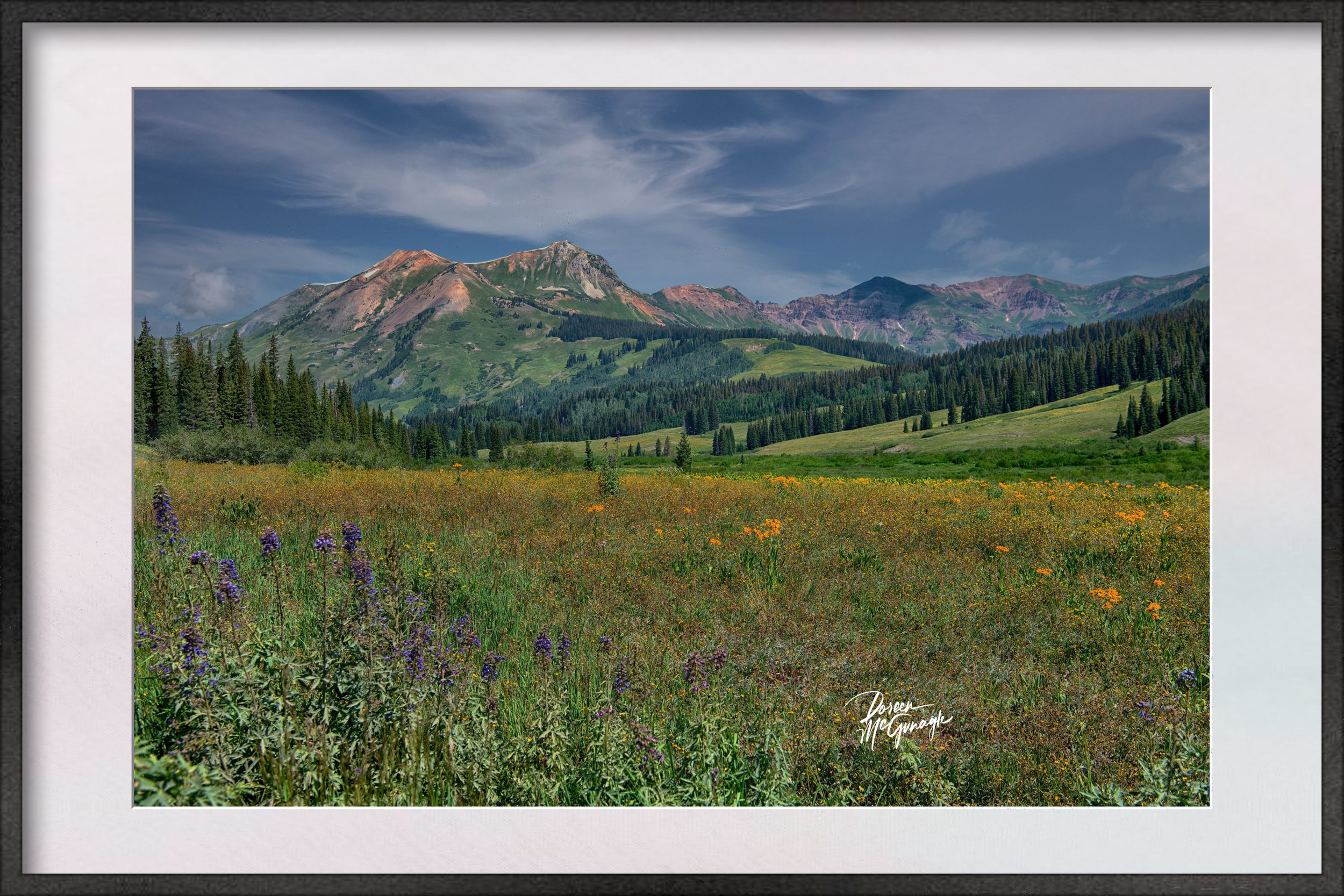
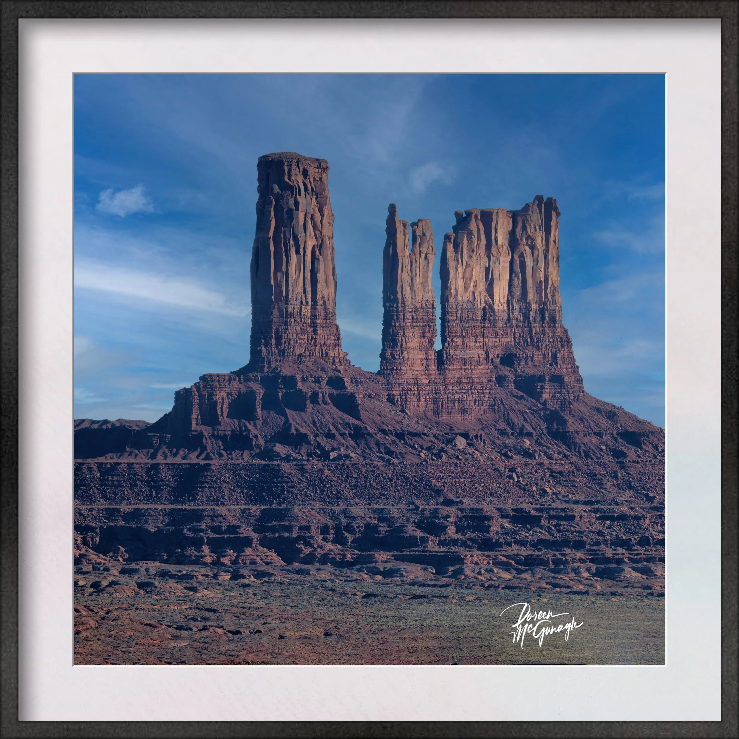
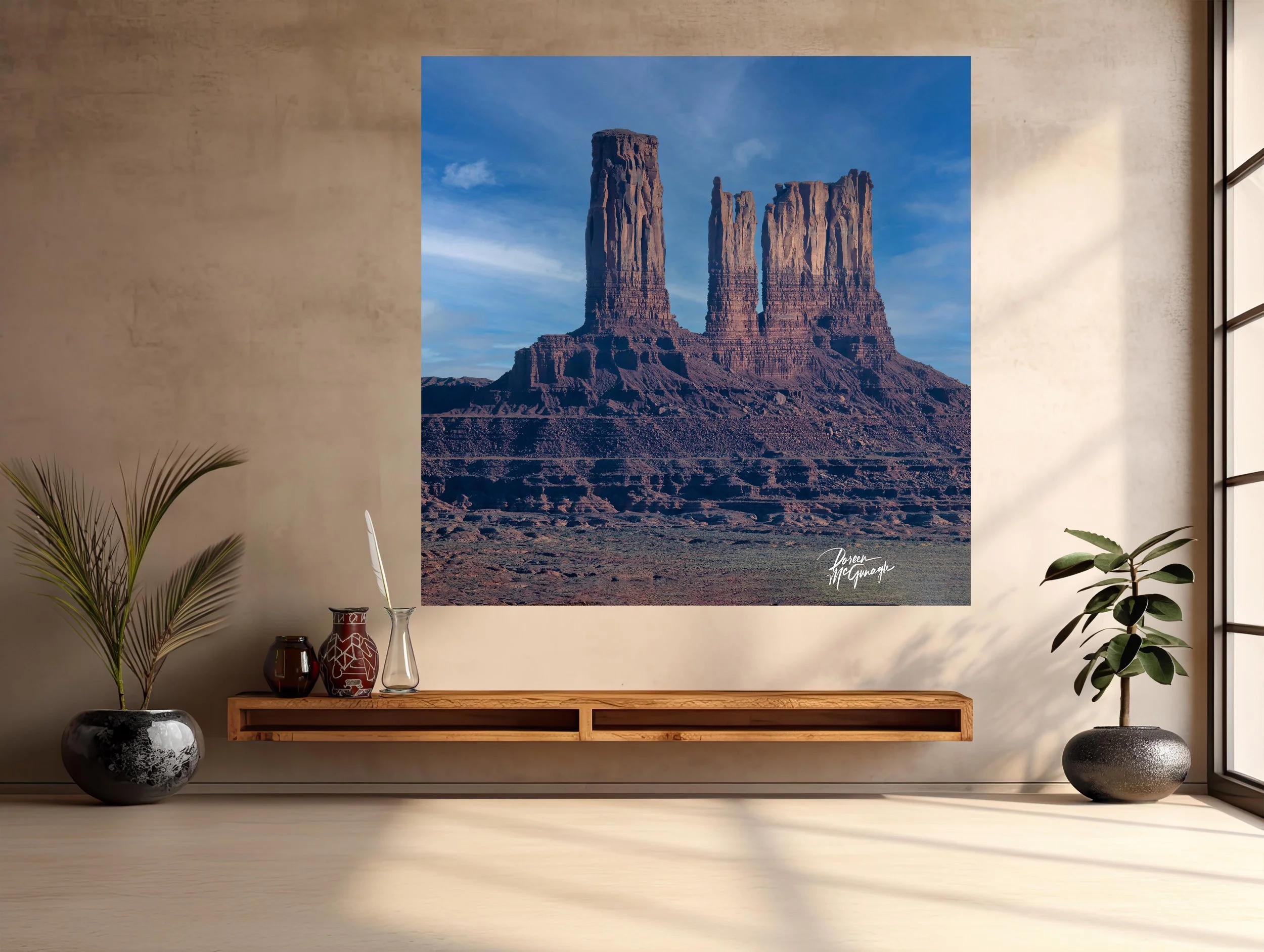
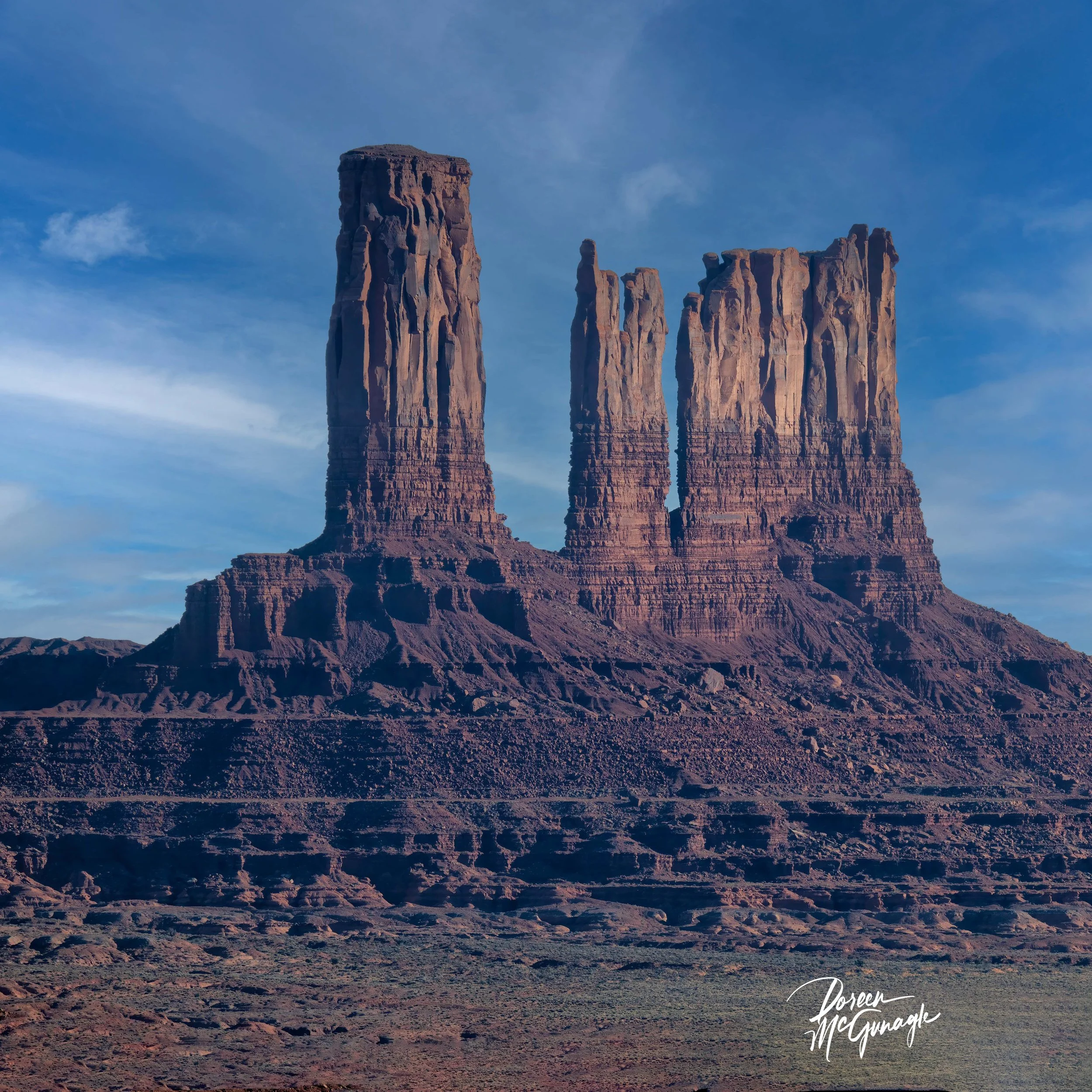
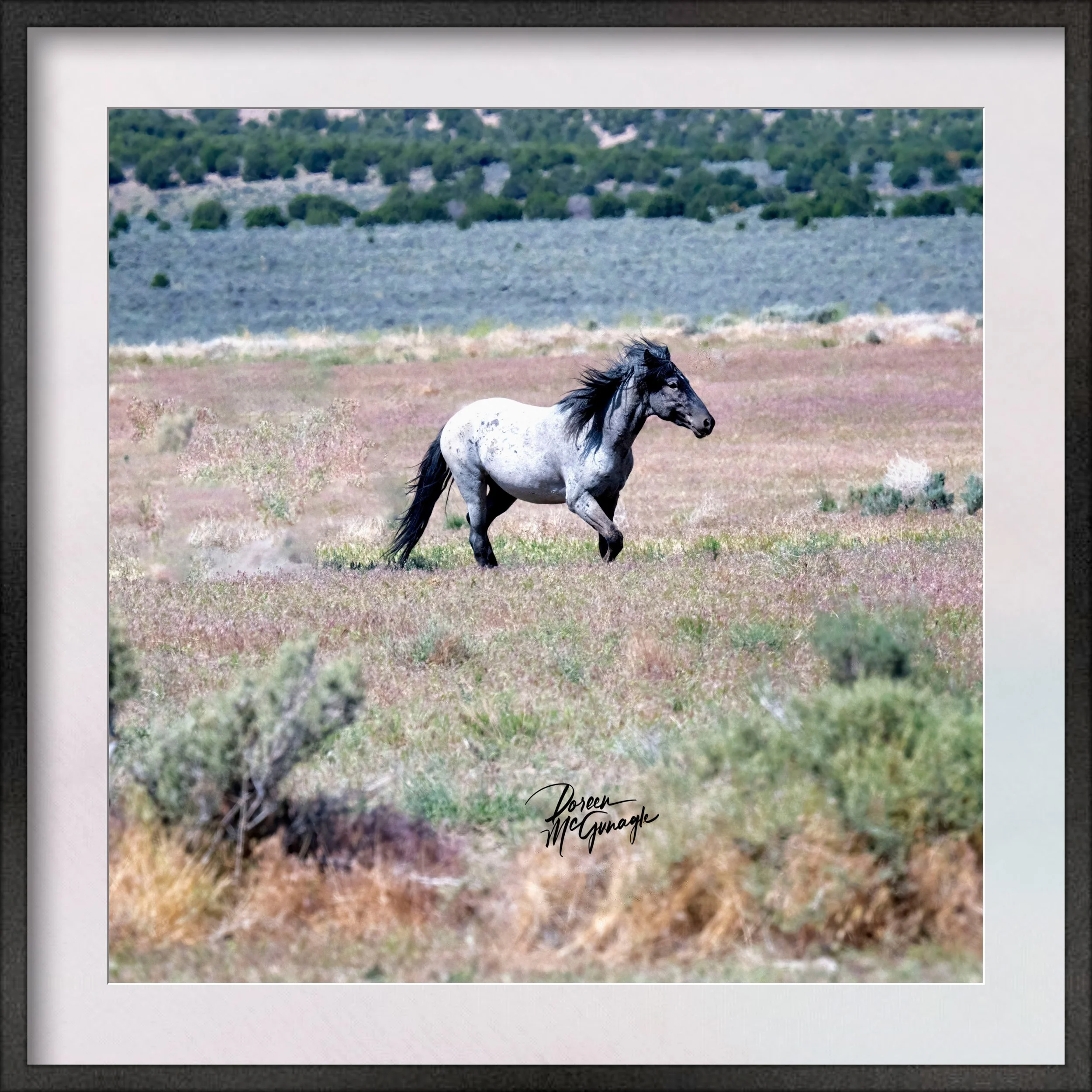
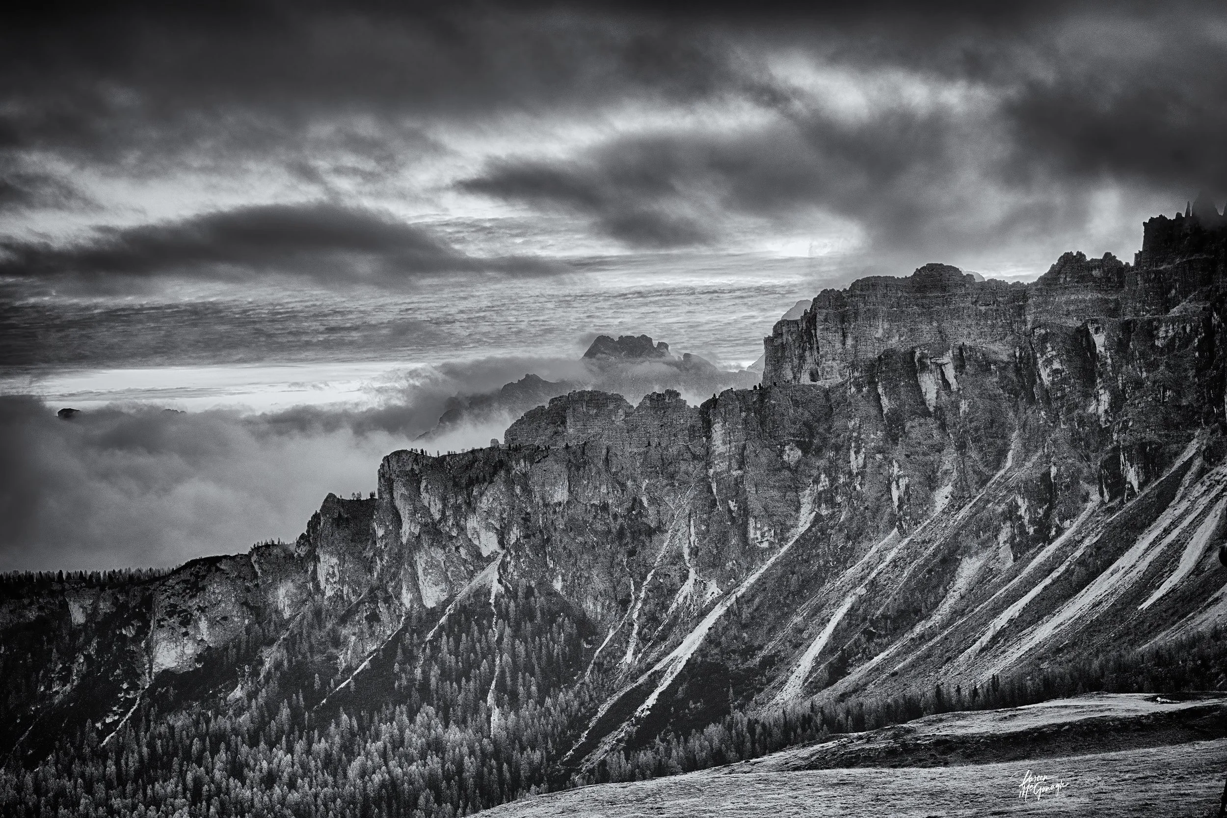
Large Wall Art, Fine Art Photography
OR 4084-77BW SR c2025 | Oregon Coast | Limited Edition 20
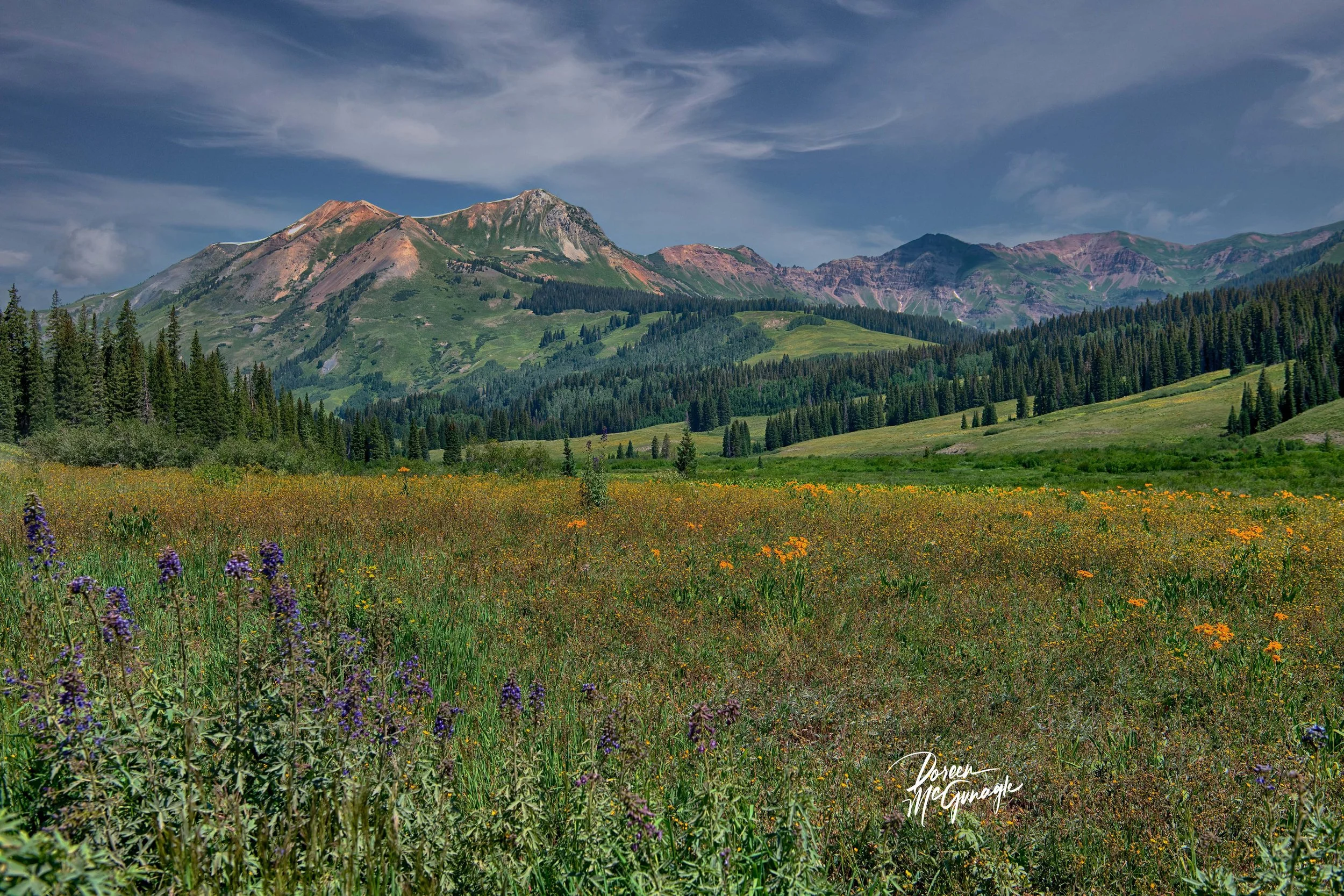
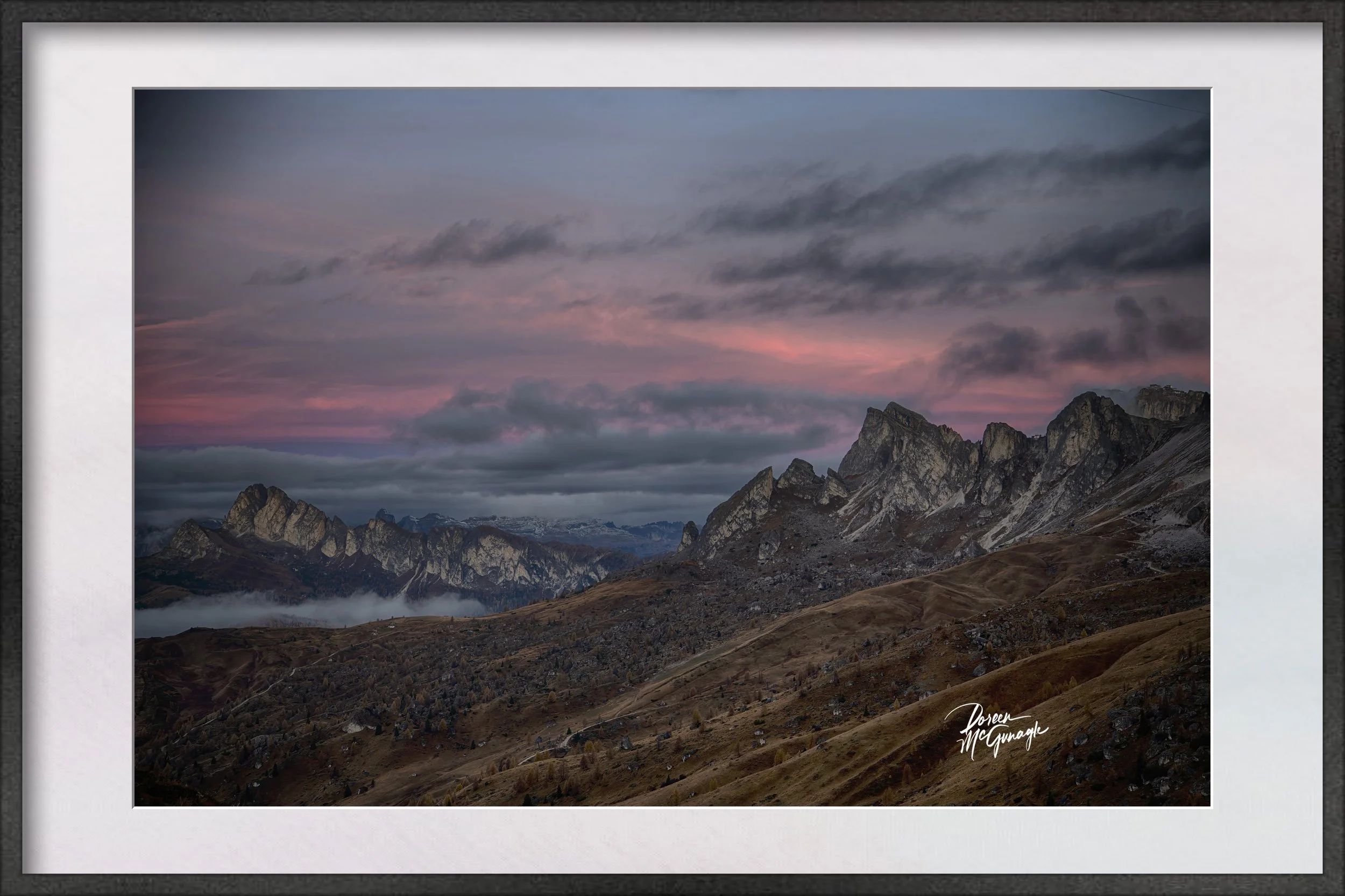
You don’t just hang this piece—you set the atmosphere. Monochrome Roar of the Oregon Shore channels the coast’s living power into your room: jagged rock formations carved like obsidian, waves foaming and breaking in bright spray, distant outcrops punctuating the horizon, and a sky of textured cloud that tightens the drama. In black and white, the scene is distilled to form, force, and tone—energy without clutter, presence without noise.
Field notes — the story behind the image
I worked on the backside of a storm when swells kept their cadence. Between gusts I timed the exposure to hold motion with detail—the moment the wave shouldered the rock, the lace of spindrift, the dark seam of water gathering for the next strike. The cloud field moved like a slow engine, banding light and shadow across the surface. What I felt most was gravity and rhythm: the shore receiving the sea’s voice, again and again.
From “art” to ambiance: how it transforms your space
Designers speak in the language of focal points, tonal palettes, and bringing the outside in. This photograph answers all three.
Focal point: The collision line—white surf against black rock—anchors first glance, then releases the eye along the rocky diagonals to the far outcrops and sky. It becomes a natural centrepiece over a sofa, mantel, credenza, or headboard.
Tonal palette (monochrome): Ink black, charcoal, slate, pewter, silver spray, and cloud white. Architectural and composed, easy to echo with blackened steel, brushed nickel, pale linen, and warm walnut.
Bringing the outside in: Foreground surge → rock rampart → horizon outcrops → storm ceiling builds real depth—the visual equivalent of opening a window to weather.
Why the words matter
People buy the story as much as the photograph. The image carries the feeling; these words share the where, light, and mood—so the work becomes more than décor. It becomes a place to return to: strength meeting motion.
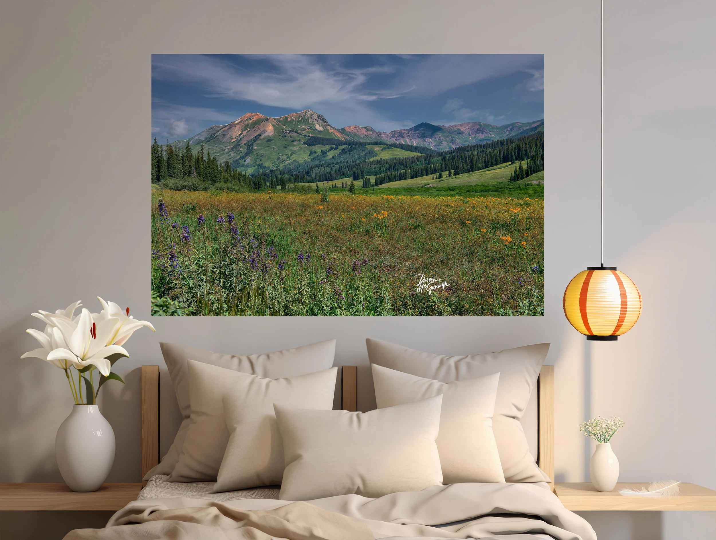
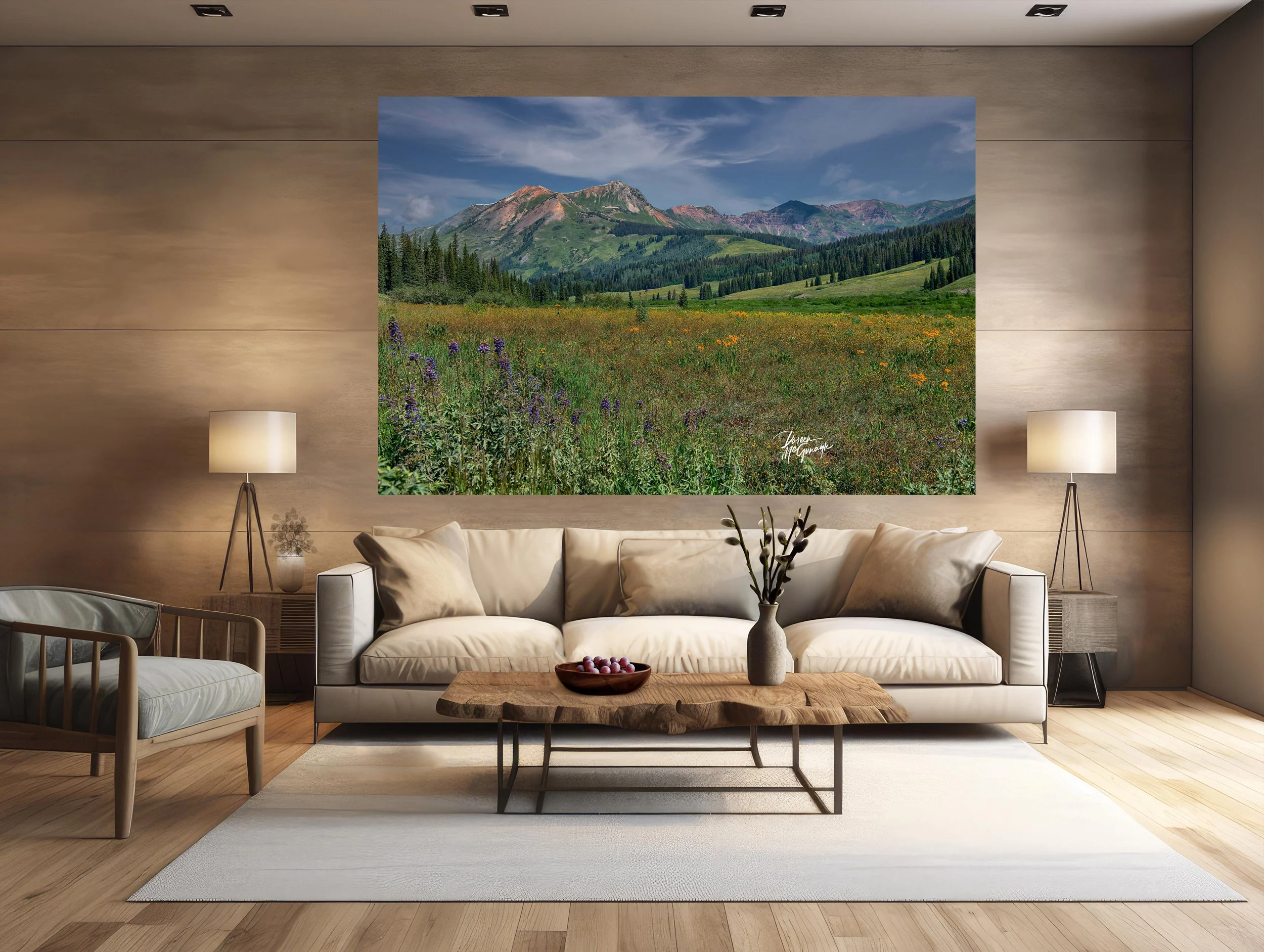
Design notes — placement, materials, scale
Where it sings: living-room feature wall • dining wall opposite natural light • entry reveal • media room needing a bold, steady anchor • behind a desk for focused presence.
Material companions: oiled walnut or oak, raked plaster or limewash, linen and wool boucle, honed soapstone/slate, ceramic stoneware, blackened steel or brushed metals.
Styling tip: let micro-textures—stone, weave, wood grain—echo the photograph; keep patterns minimal so the tonal architecture leads.
Lighting: a dimmable picture light at 2700–3000K deepens blacks, crisps spray highlights, and reveals cloud gradations after dark.
Scale guidance: mid sizes create a contemplative anchor; statement sizes turn it into the centrepiece that sets the room’s rhythm.
Craft & presentation
Limited-edition fine art print produced to museum standards for fidelity and longevity.
Acrylic (luminous, high-gloss — B&W edition is Acrylic only): extends tonal range so blacks settle with plush conviction and highlights lift with crisp clarity; textures read almost tactile and water feels dimensional.
Signed Certificate of Authenticity included.
Optional floating frames, handmade in Italy, provide a clean, contemporary finish without visual weight.
Our commitment to the places that inspire this work
With every edition collected, a portion of the sale supports Global Voices for Nature Foundation Inc., funding coastal conservation and education projects that keep marine ecosystems—and the life within them—thriving.
Large Wall Art, Fine Art Photography
OR 4084-77BW SR c2025 | Oregon Coast | Limited Edition 20
You don’t just hang this piece—you set the atmosphere. Monochrome Roar of the Oregon Shore channels the coast’s living power into your room: jagged rock formations carved like obsidian, waves foaming and breaking in bright spray, distant outcrops punctuating the horizon, and a sky of textured cloud that tightens the drama. In black and white, the scene is distilled to form, force, and tone—energy without clutter, presence without noise.
Field notes — the story behind the image
I worked on the backside of a storm when swells kept their cadence. Between gusts I timed the exposure to hold motion with detail—the moment the wave shouldered the rock, the lace of spindrift, the dark seam of water gathering for the next strike. The cloud field moved like a slow engine, banding light and shadow across the surface. What I felt most was gravity and rhythm: the shore receiving the sea’s voice, again and again.
From “art” to ambiance: how it transforms your space
Designers speak in the language of focal points, tonal palettes, and bringing the outside in. This photograph answers all three.
Focal point: The collision line—white surf against black rock—anchors first glance, then releases the eye along the rocky diagonals to the far outcrops and sky. It becomes a natural centrepiece over a sofa, mantel, credenza, or headboard.
Tonal palette (monochrome): Ink black, charcoal, slate, pewter, silver spray, and cloud white. Architectural and composed, easy to echo with blackened steel, brushed nickel, pale linen, and warm walnut.
Bringing the outside in: Foreground surge → rock rampart → horizon outcrops → storm ceiling builds real depth—the visual equivalent of opening a window to weather.
Why the words matter
People buy the story as much as the photograph. The image carries the feeling; these words share the where, light, and mood—so the work becomes more than décor. It becomes a place to return to: strength meeting motion.
Design notes — placement, materials, scale
Where it sings: living-room feature wall • dining wall opposite natural light • entry reveal • media room needing a bold, steady anchor • behind a desk for focused presence.
Material companions: oiled walnut or oak, raked plaster or limewash, linen and wool boucle, honed soapstone/slate, ceramic stoneware, blackened steel or brushed metals.
Styling tip: let micro-textures—stone, weave, wood grain—echo the photograph; keep patterns minimal so the tonal architecture leads.
Lighting: a dimmable picture light at 2700–3000K deepens blacks, crisps spray highlights, and reveals cloud gradations after dark.
Scale guidance: mid sizes create a contemplative anchor; statement sizes turn it into the centrepiece that sets the room’s rhythm.
Craft & presentation
Limited-edition fine art print produced to museum standards for fidelity and longevity.
Acrylic (luminous, high-gloss — B&W edition is Acrylic only): extends tonal range so blacks settle with plush conviction and highlights lift with crisp clarity; textures read almost tactile and water feels dimensional.
Signed Certificate of Authenticity included.
Optional floating frames, handmade in Italy, provide a clean, contemporary finish without visual weight.
Our commitment to the places that inspire this work
With every edition collected, a portion of the sale supports Global Voices for Nature Foundation Inc., funding coastal conservation and education projects that keep marine ecosystems—and the life within them—thriving.
 Image 1 of 4
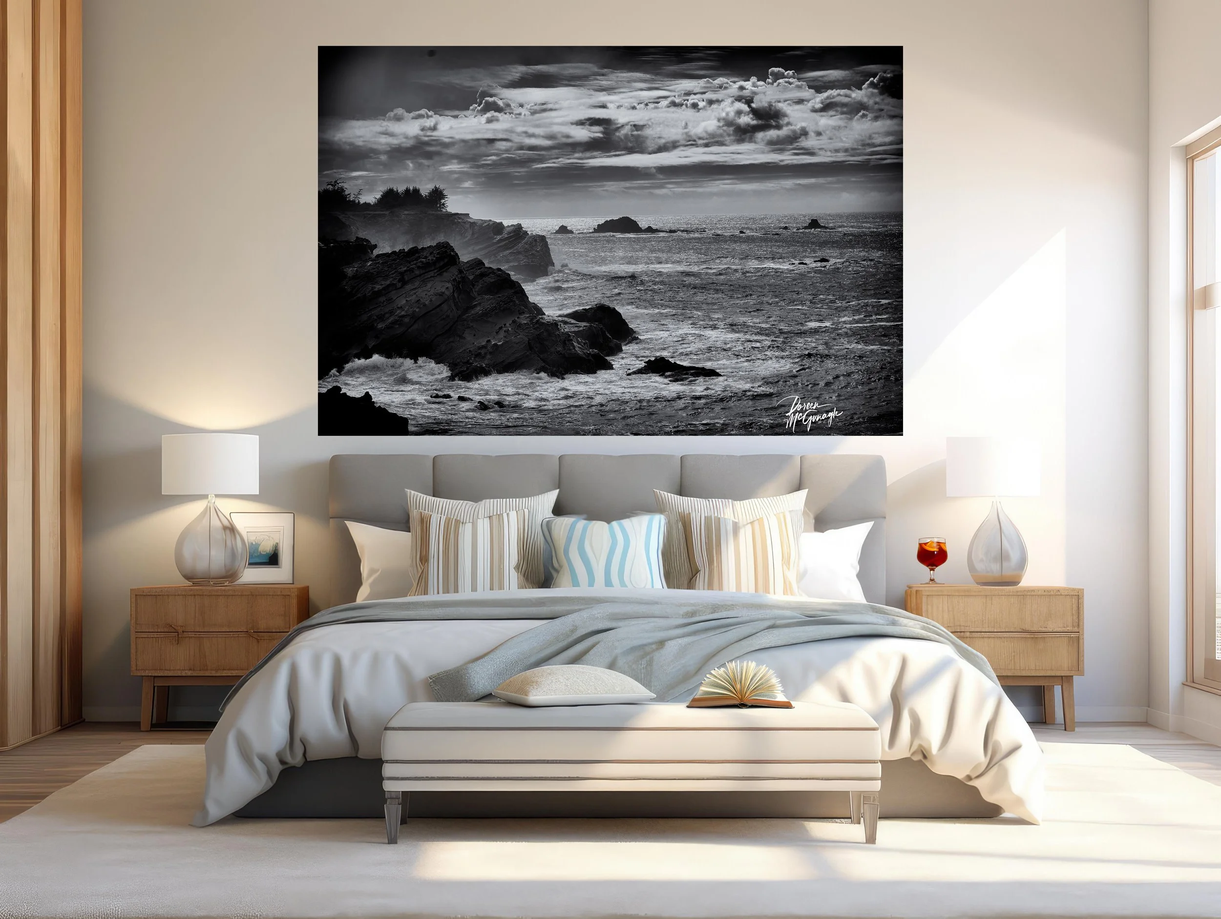 Image 2 of 4
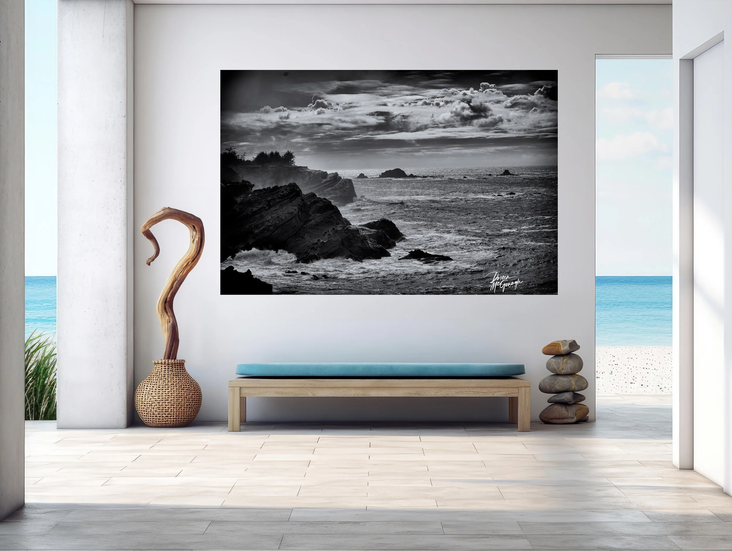 Image 3 of 4
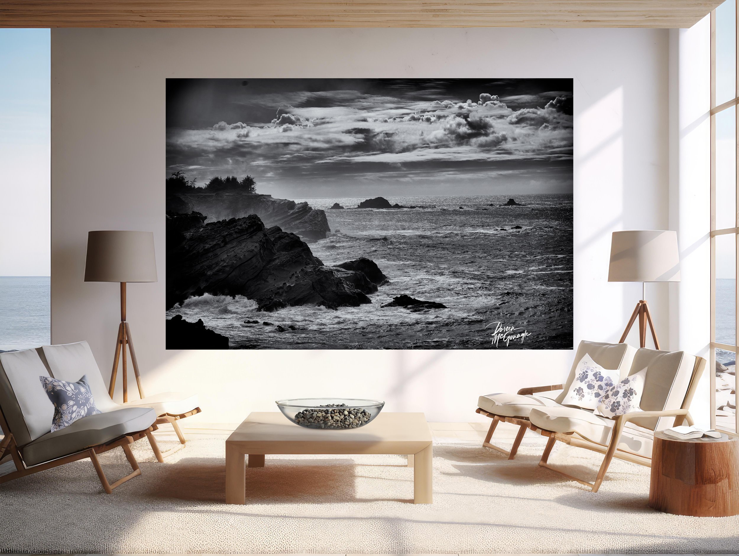 Image 4 of 4