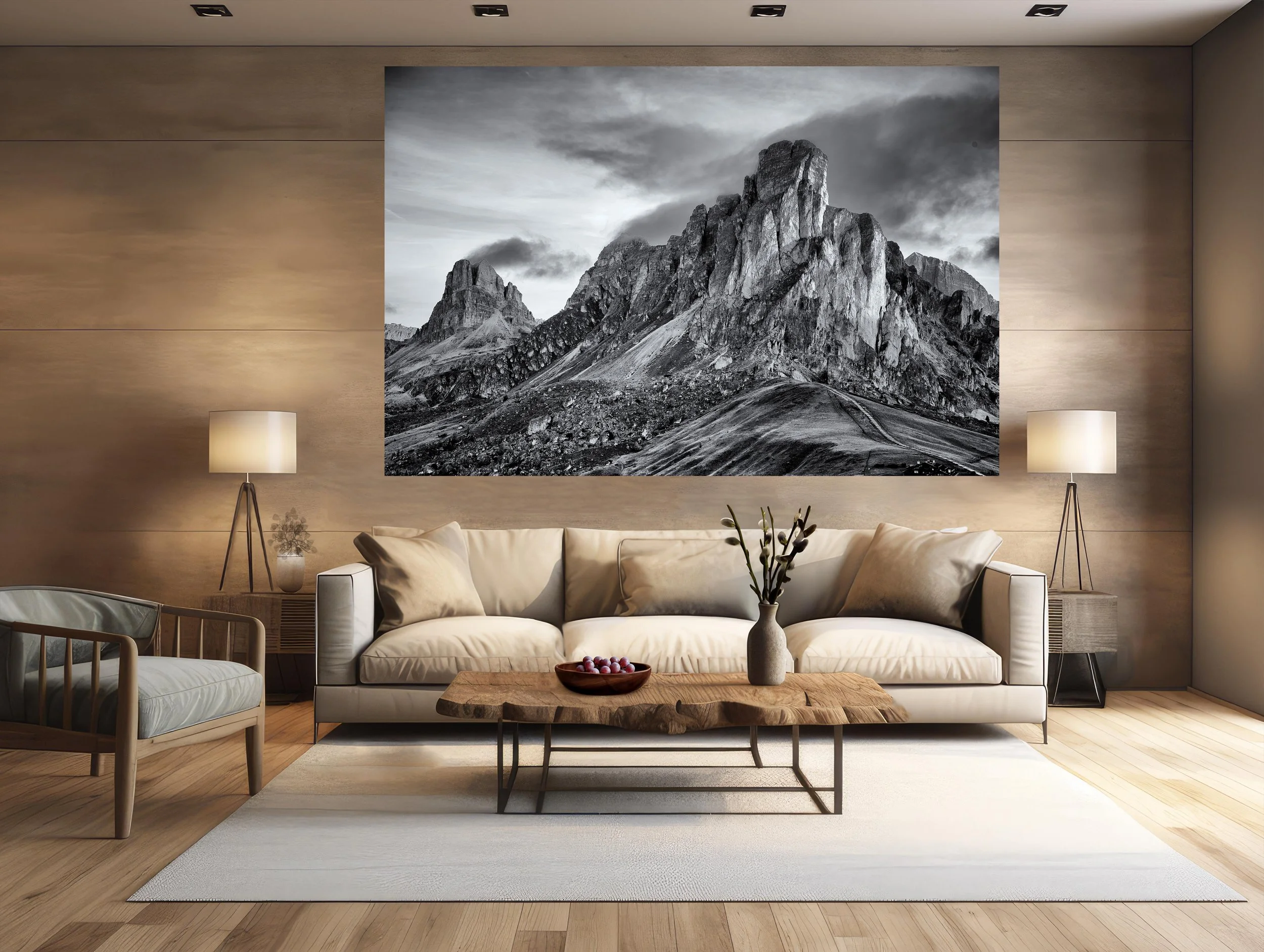
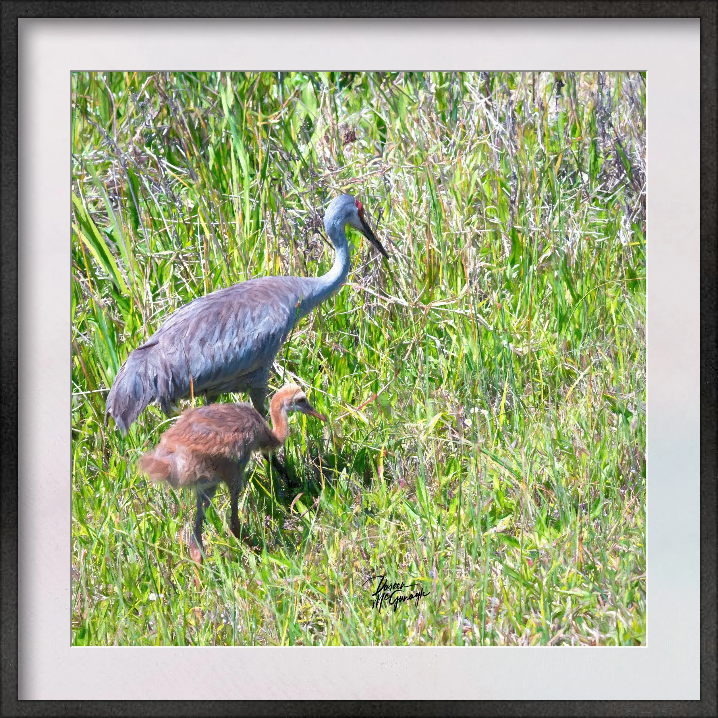
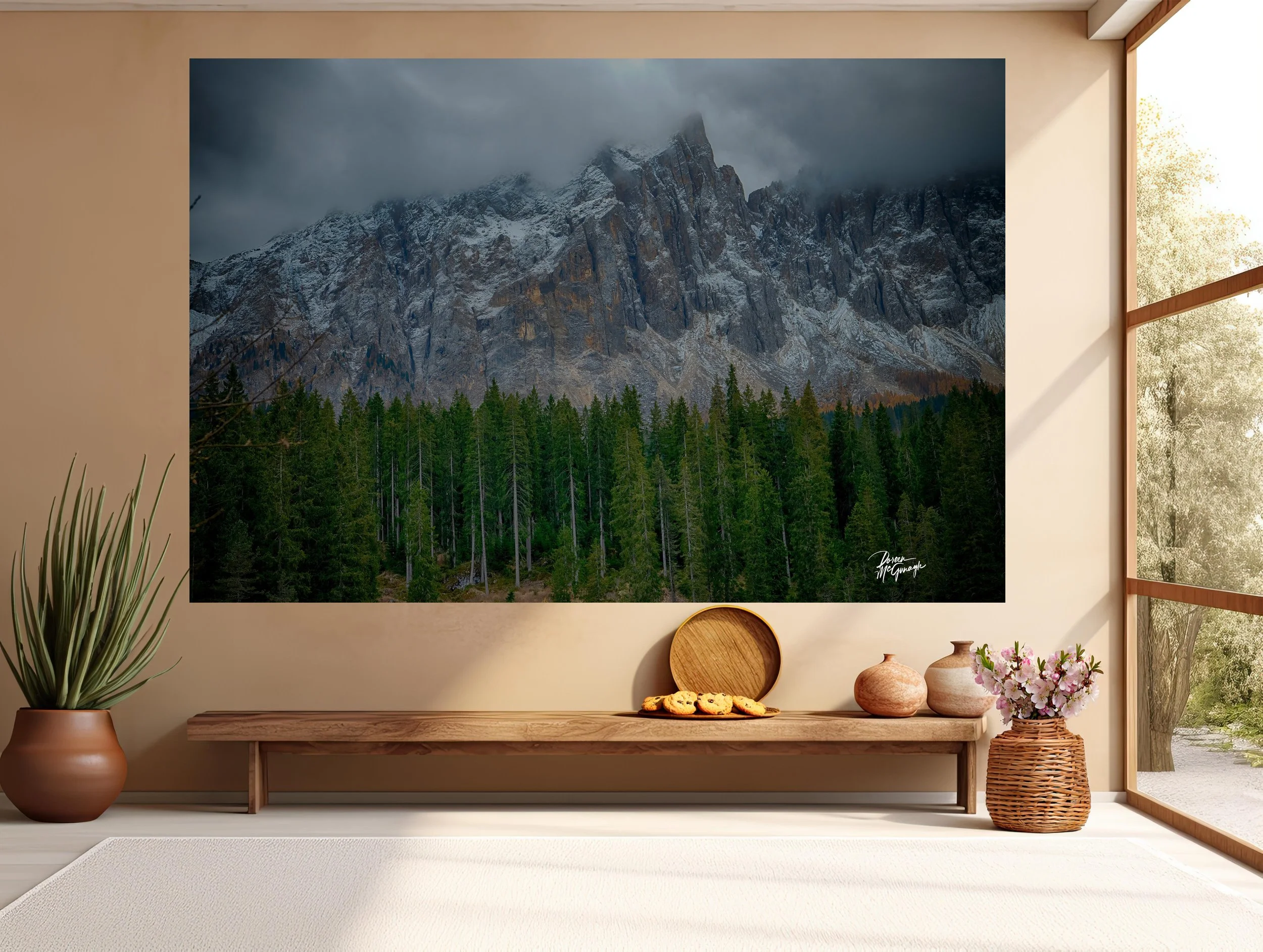
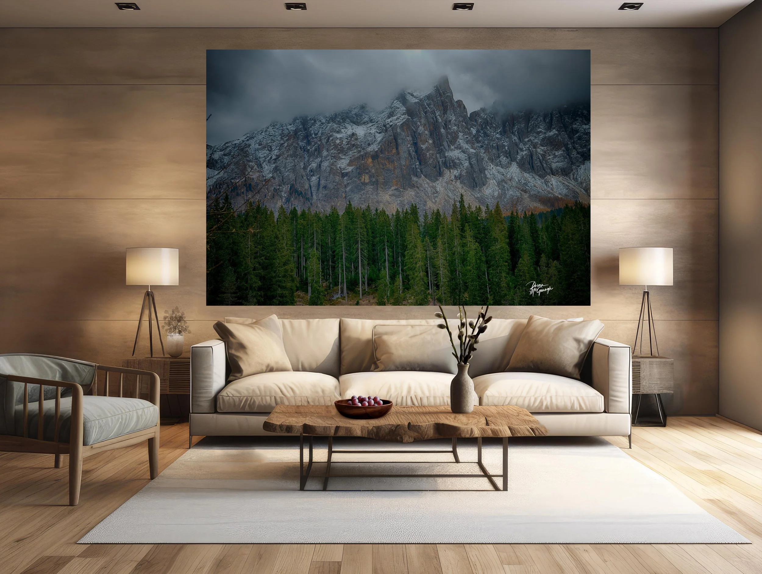
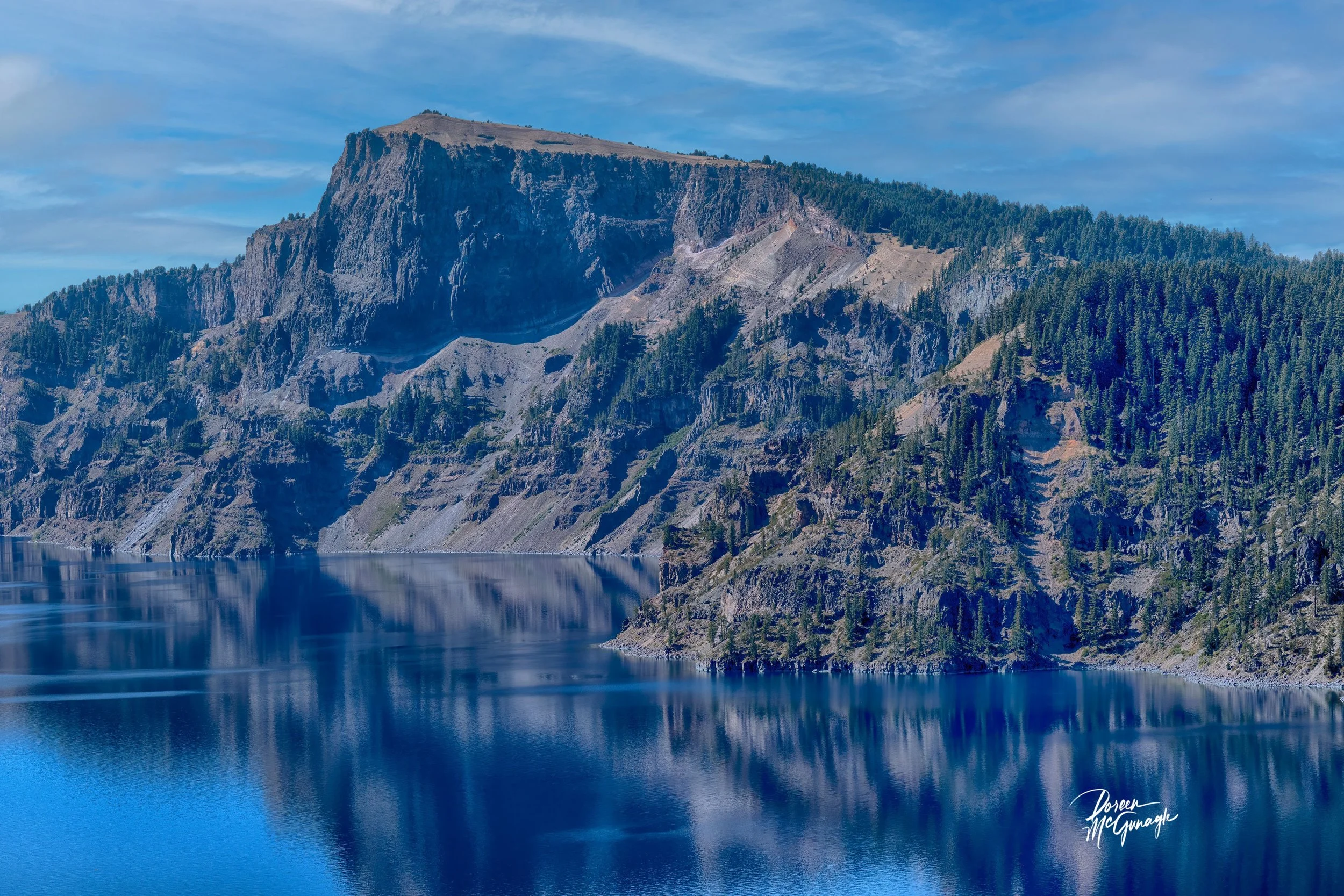
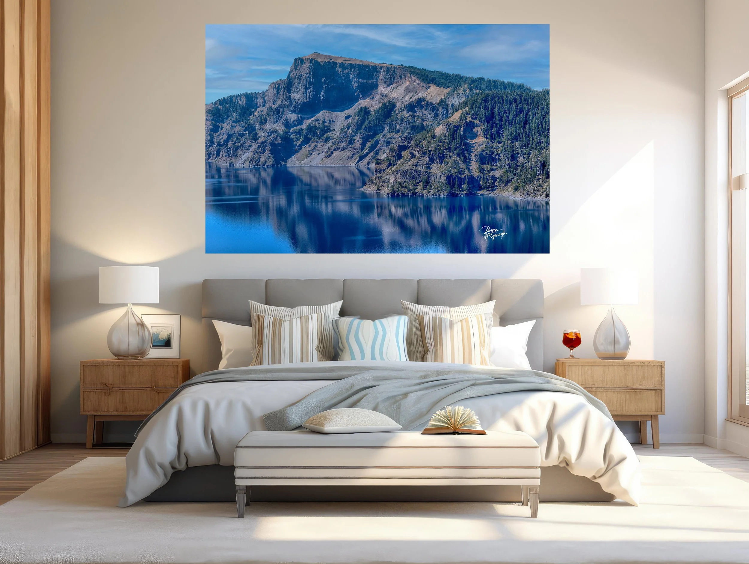
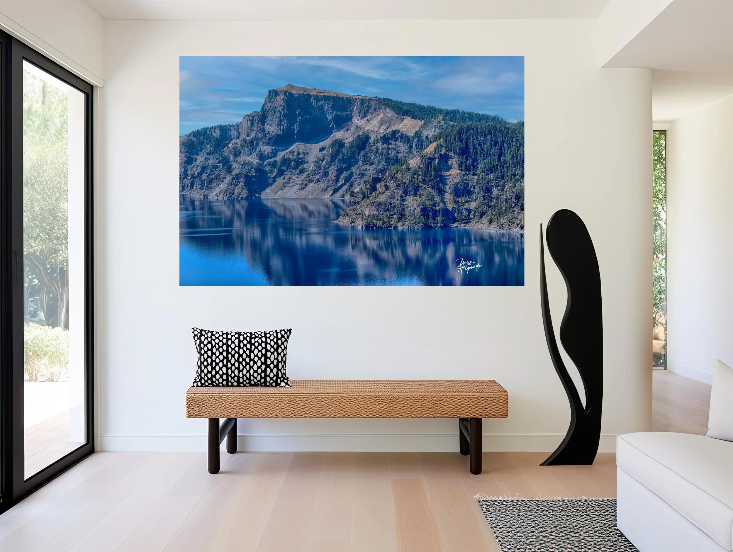
CO061-26 Taylor Park c2025
Large Wall Art, Fine Art Photography, Limited Edition 20
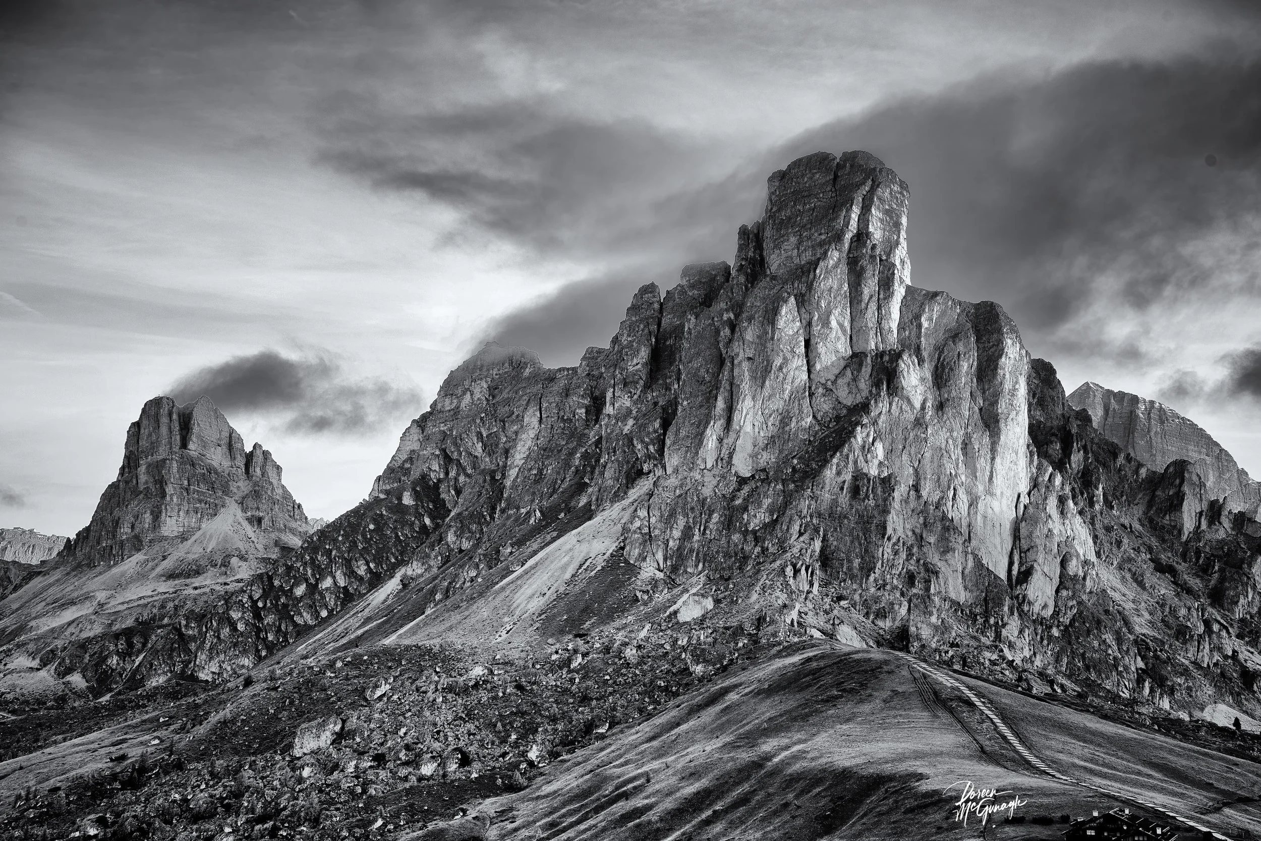
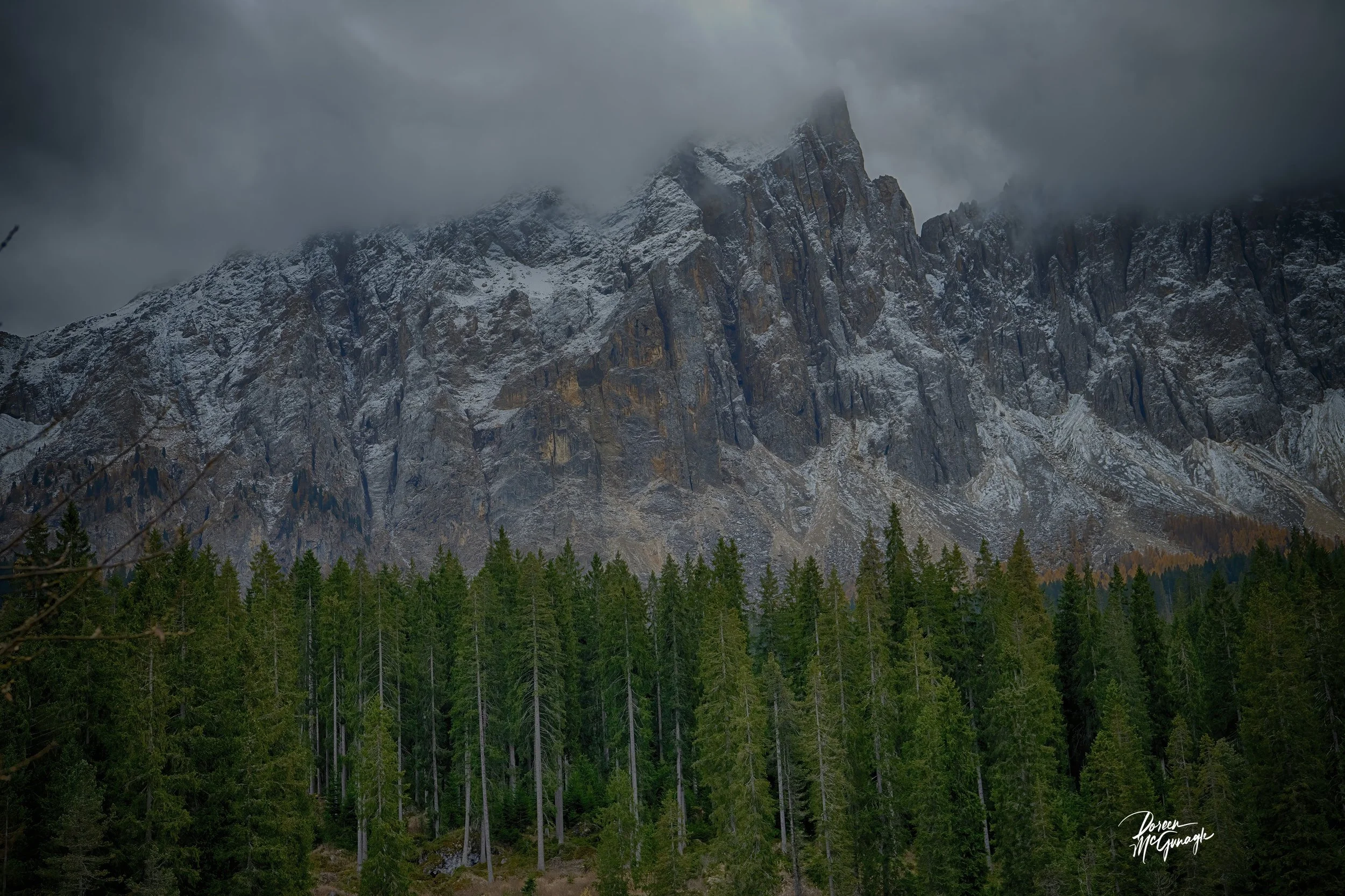
You don’t just hang this piece—you set the ambiance. Silent Greens of Taylor’s Reach turns a room into open country calm: an airy field woven with nuanced greens, soft browns, and gray-blue foliage; a reflective waterway anchoring the foreground; a strong band of pines; and distant, quiet mountains beneath a mottled, cool sky. The mood is spacious, grounded, and restorative—perfect when you want a focal point that steadies the whole room.
Studio notes — the story behind the piece
This work began with a long look across a valley just after the wind settled. The light was even and cool, the kind that lets greens show their full range—from fresh moss to deep spruce. The stream held a mirror’s edge; the pines read as a single, confident line; the peaks sat with quiet authority. In the studio, layered passes built that feeling: slow glazes for depth in the field, crisp strokes to define the tree line, and softened transitions in the sky to keep the atmosphere breathing. What I felt—stillness with vitality—is the heartbeat of this painting.
From “art” to ambiance: how it transforms your space
Designers speak in the language of focal points, colour palettes, and bringing the outside in. This piece answers all three.
Focal point: The reflective waterway draws first glance, then releases the eye through the meadow to the pine band and mountains. It naturally organizes a room—ideal above a sofa, mantel, credenza, or bed.
Colour palette: A tapestry of moss, sage, and evergreen with notes of soft umber and gray-blue. Cool sky tones and the dark pine line ground the composition. Together they set a biophilic palette that calms without feeling cold.
Bringing the outside in: Foreground reflection → middle-distance pines → far mountains → open sky creates true visual depth—the interior equivalent of opening a window.
Why the words matter
People buy the story behind the piece. The painting carries the feeling; these words share where, light, and mood—so it becomes more than décor. It becomes a place you can step into whenever you look up.
Design notes — palettes, placement, scale
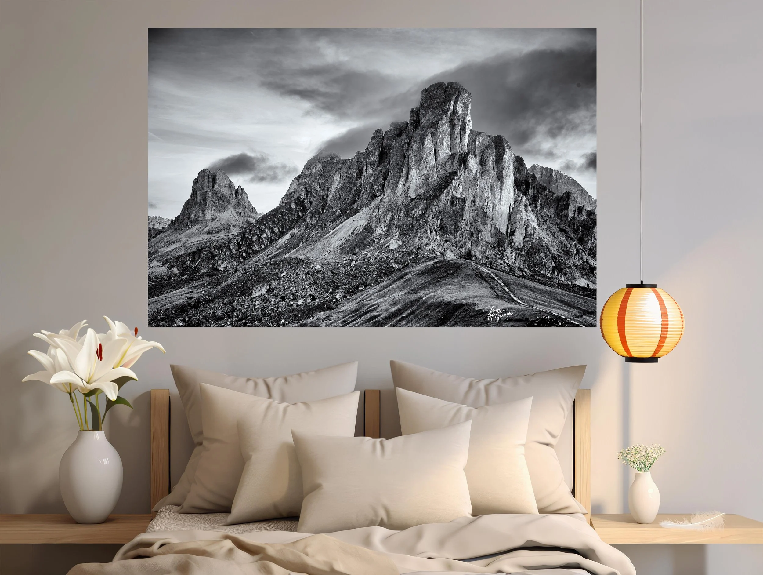
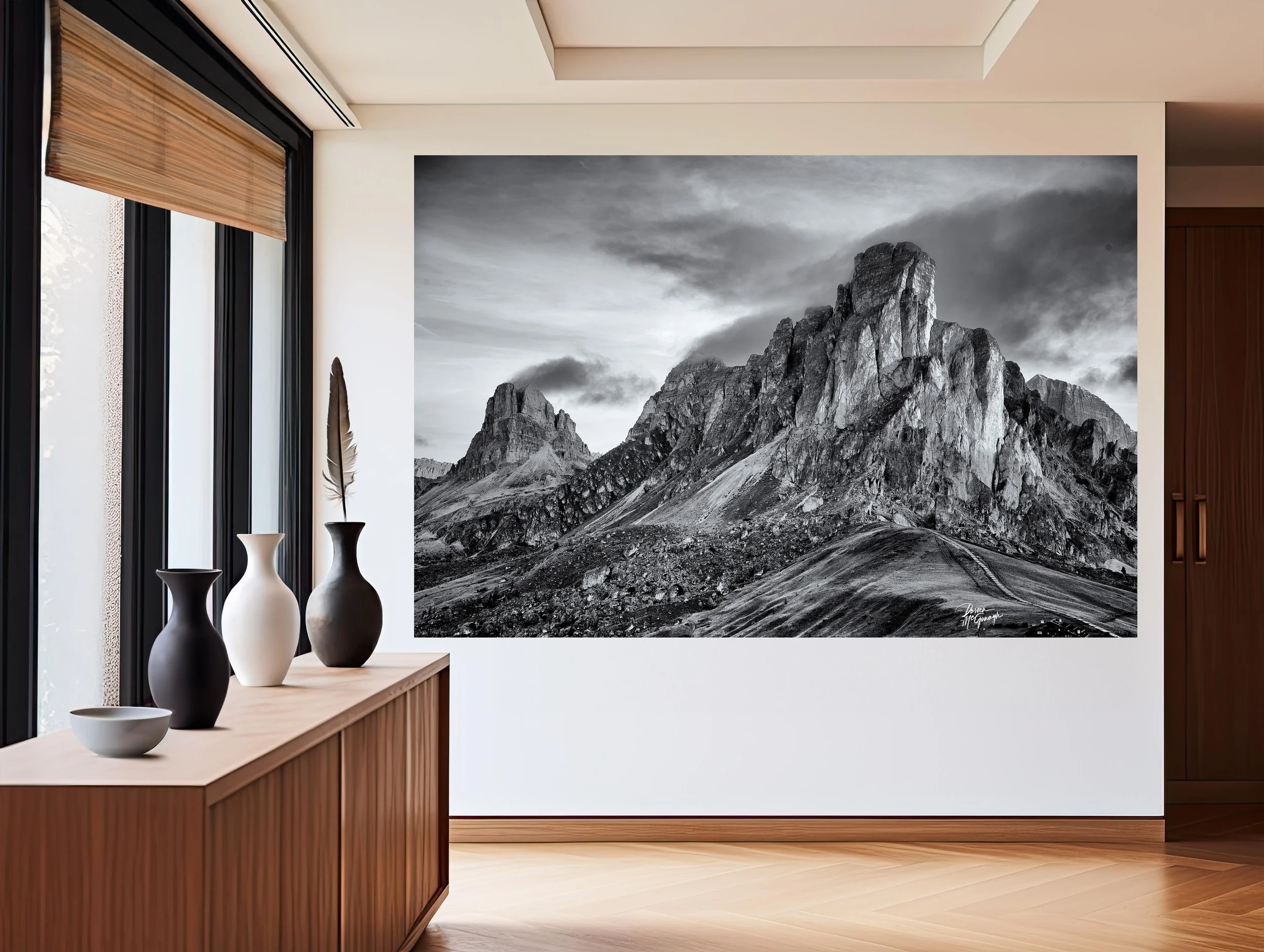
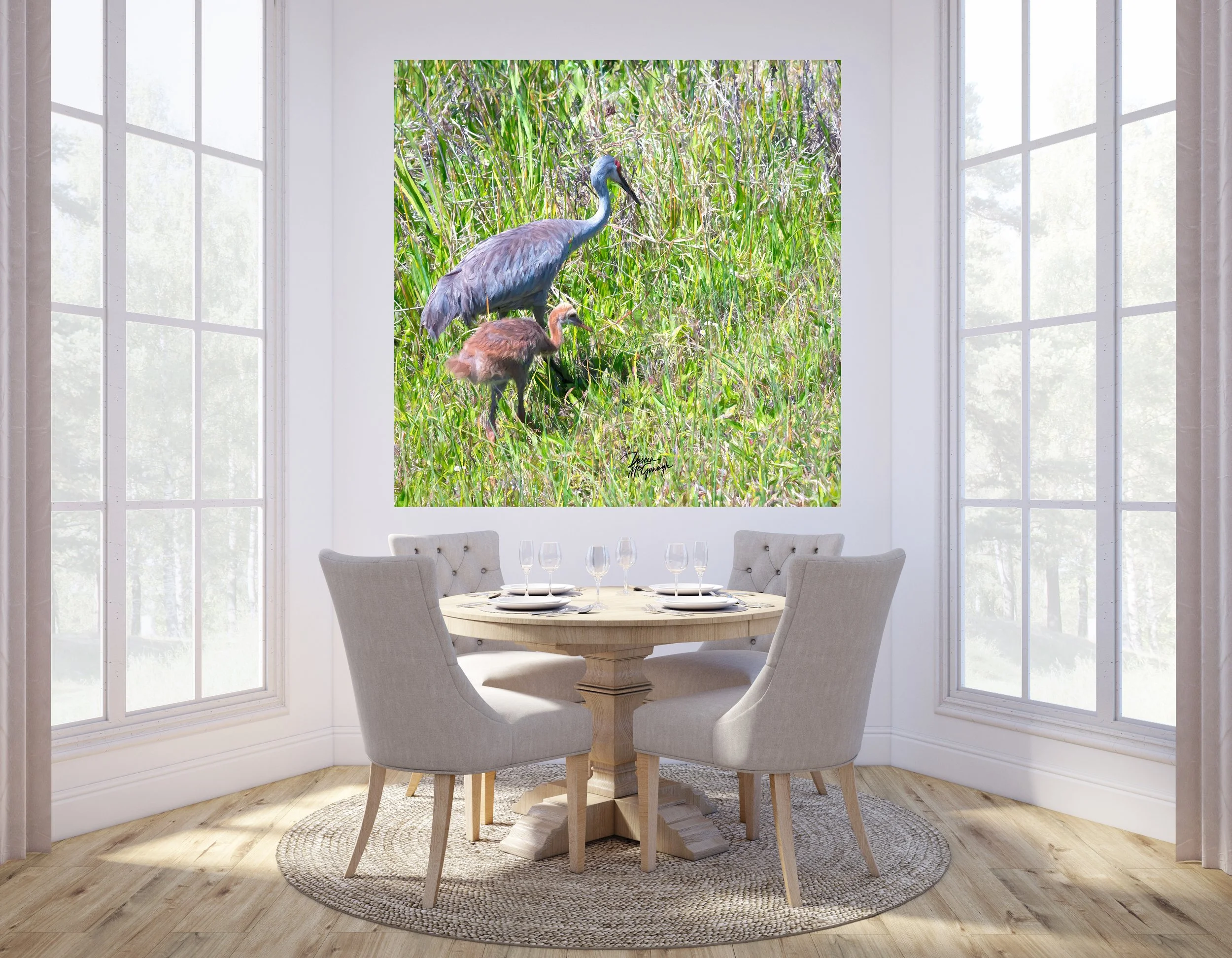
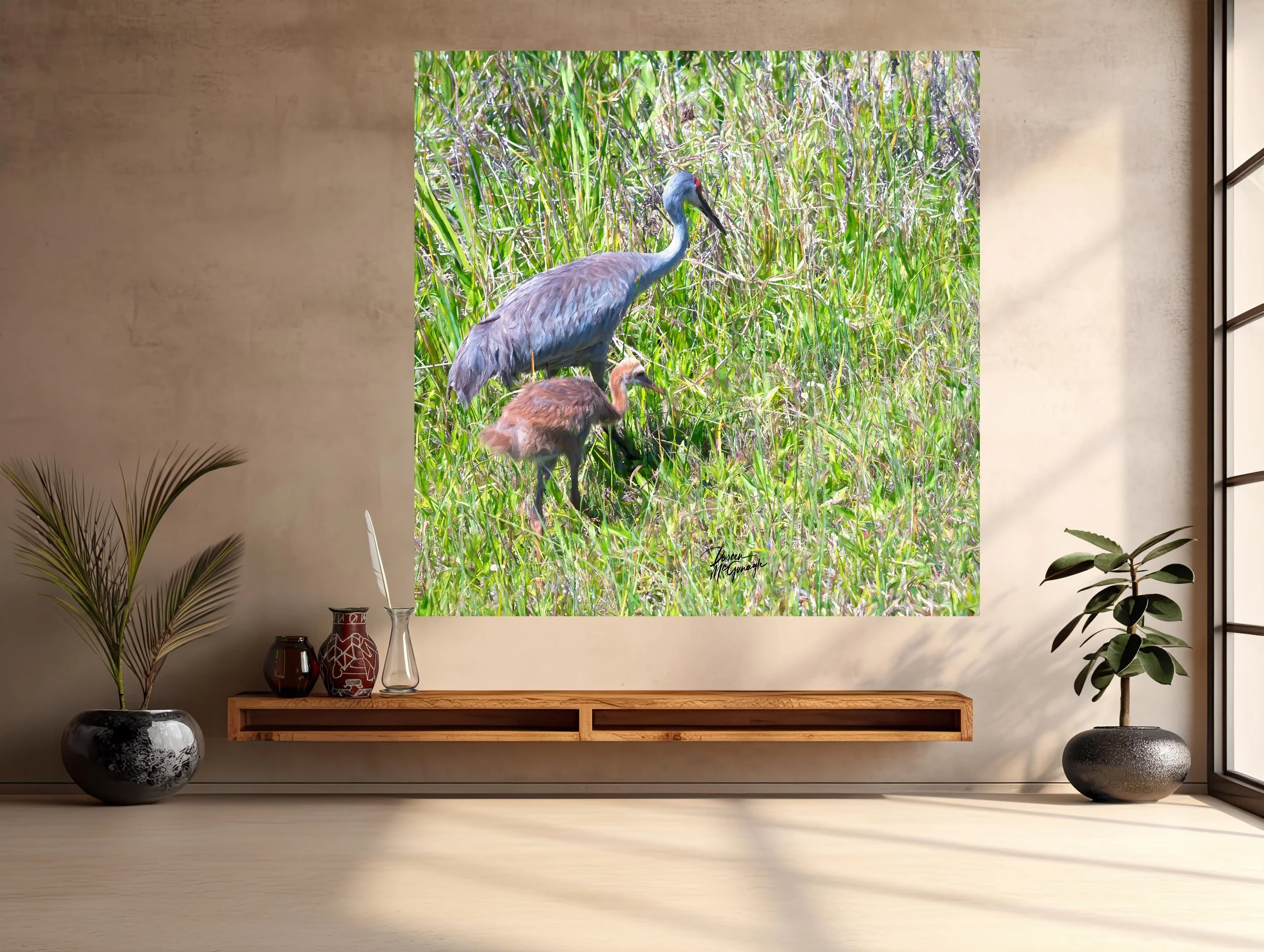
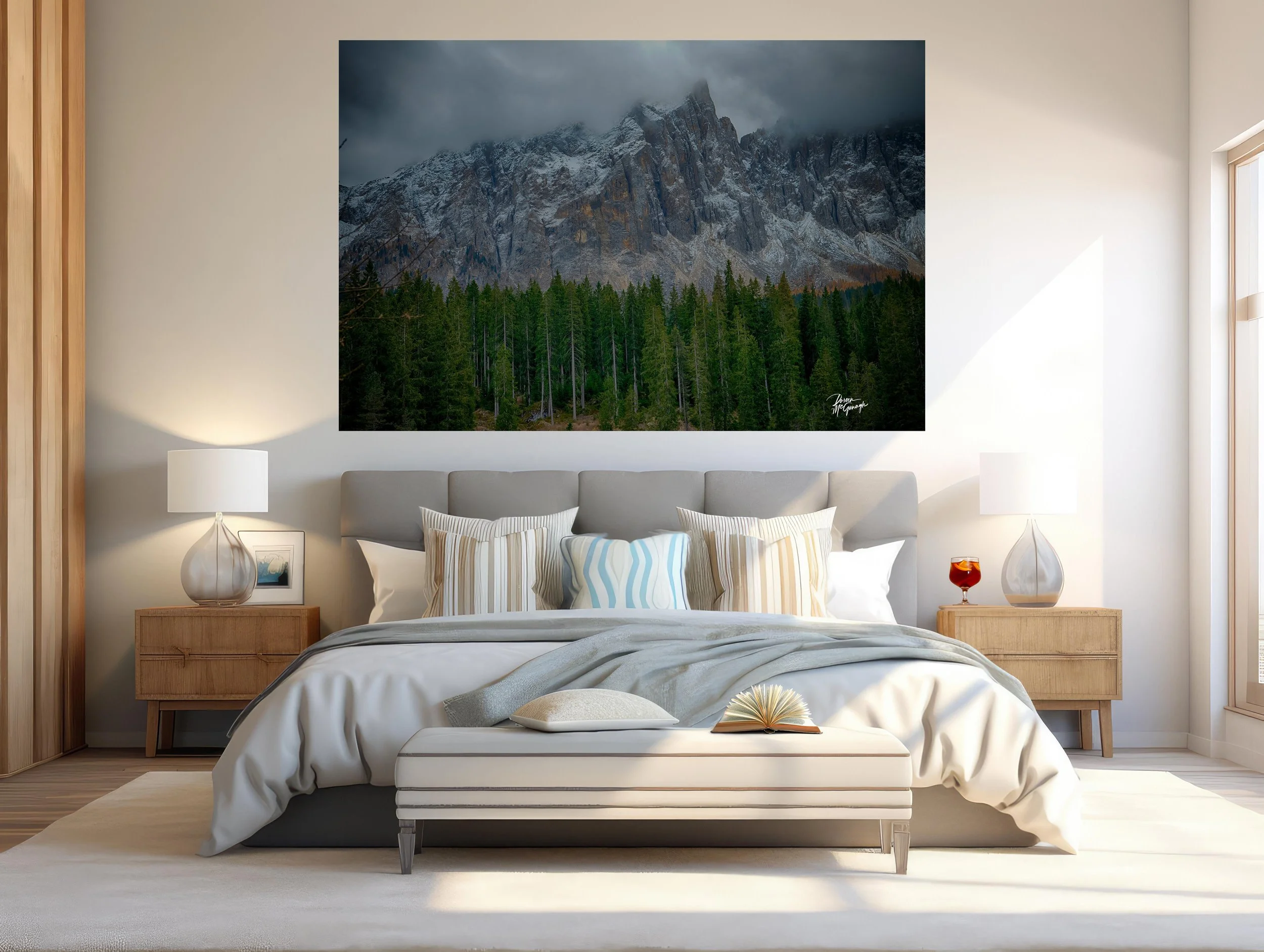
Where it sings: living-room feature wall • bedroom headboard wall • dining room opposite natural light • entry reveal • end-of-hall vista • behind a desk for focus.
Room palette ideas: walls in soft sage, warm white, or cloud grey; accents of ink/charcoal (echoing the pine line) and brushed brass or antique bronze for warmth.
Materials: oiled oak or walnut, ash, linen and wool boucle, rattan, honed travertine/soapstone, ceramic stoneware, blackened steel.
Scale guidance: mid sizes create a contemplative anchor; statement sizes turn the work into the centrepiece that sets the room’s rhythm.
Lighting tip: a dimmable picture light at 2700–3000K deepens greens and reveals layered brushwork after dark.
Craft & presentation
Limited-edition fine art print produced to museum standards for fidelity and longevity. Choose the finish that best supports your ambiance:
Canvas Pro (matte, painterly): preserves the sense of layered brushwork and keeps glare low—perfect for cozy, textural interiors.
Acrylic (luminous, high-gloss): amplifies depth and clarity; reflections in the waterway and cool sky tones feel dimensional—ideal for modern, light-filled spaces.
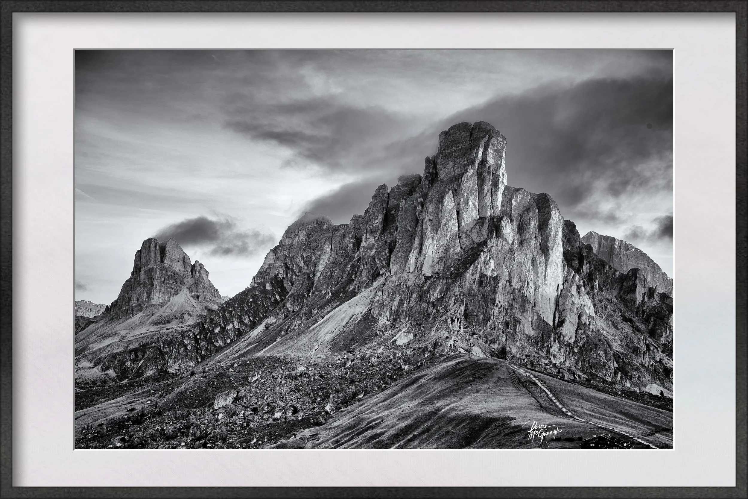
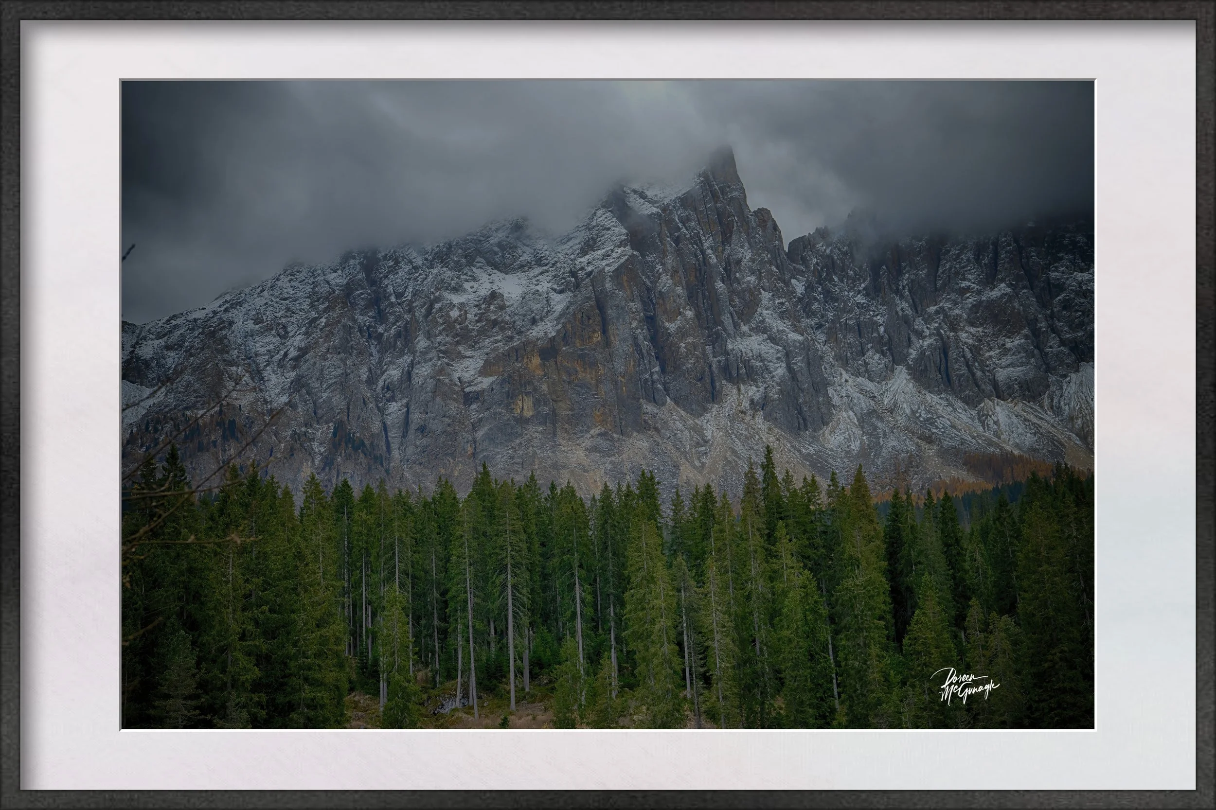
Optional floating frames, handmade in Italy, complete the presentation with clean lines that complement both contemporary and nature-inspired rooms. Each piece includes a signed Certificate of Authenticity.
Conservation heartbeat
Fields, streams, pine forests, and mountain watersheds work together—habitat, carbon sink, and freshwater corridor in one view. Presenting them with clarity is an invitation to value what endures.
Giveback
A portion of proceeds from this artwork supports Global Voices for Nature Foundation Inc., funding education and conservation initiatives that protect the landscapes and wildlife that inspire this work.
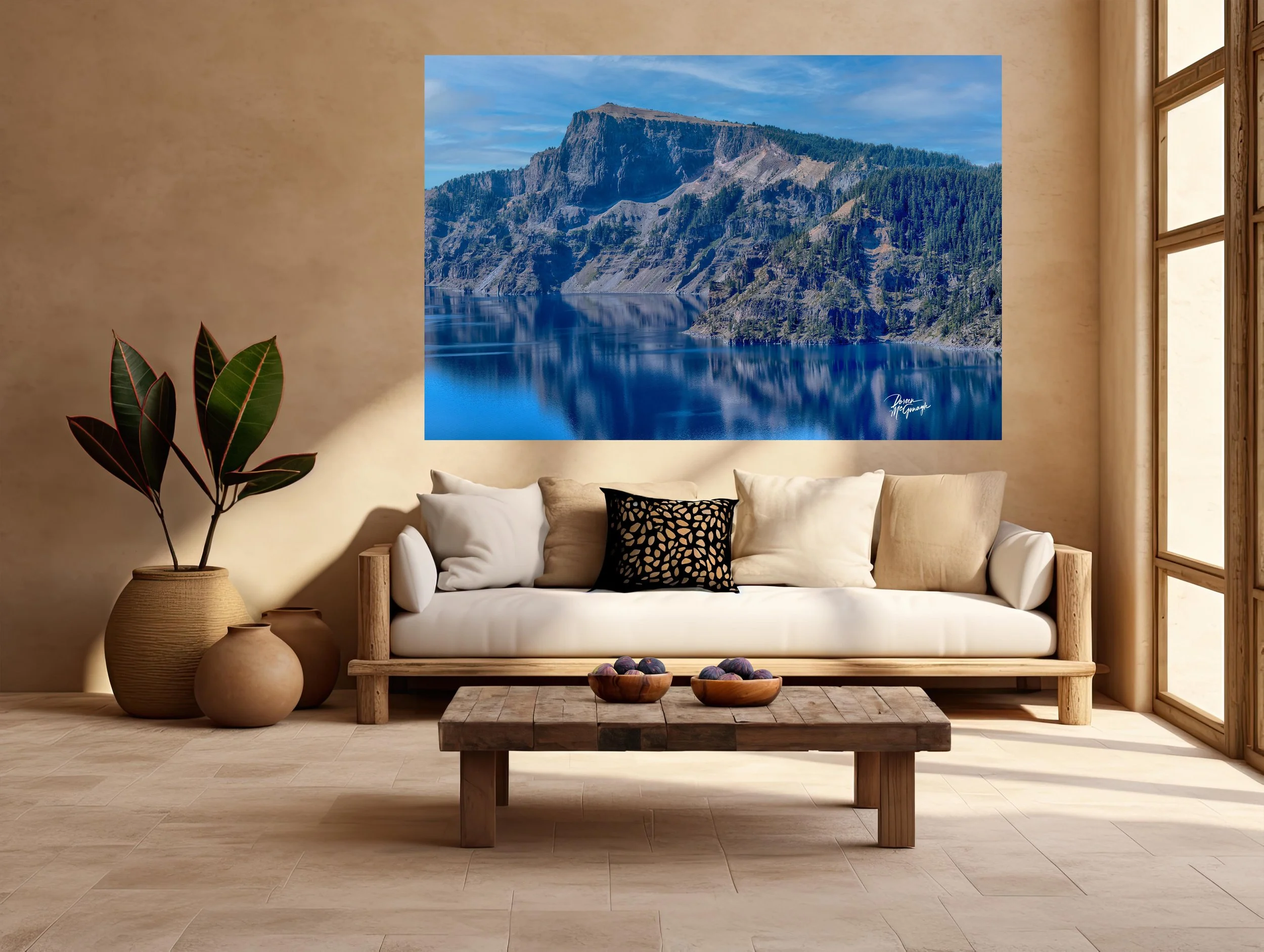
CO061-26 Taylor Park c2025
Large Wall Art, Fine Art Photography, Limited Edition 20
You don’t just hang this piece—you set the ambiance. Silent Greens of Taylor’s Reach turns a room into open country calm: an airy field woven with nuanced greens, soft browns, and gray-blue foliage; a reflective waterway anchoring the foreground; a strong band of pines; and distant, quiet mountains beneath a mottled, cool sky. The mood is spacious, grounded, and restorative—perfect when you want a focal point that steadies the whole room.
Studio notes — the story behind the piece
This work began with a long look across a valley just after the wind settled. The light was even and cool, the kind that lets greens show their full range—from fresh moss to deep spruce. The stream held a mirror’s edge; the pines read as a single, confident line; the peaks sat with quiet authority. In the studio, layered passes built that feeling: slow glazes for depth in the field, crisp strokes to define the tree line, and softened transitions in the sky to keep the atmosphere breathing. What I felt—stillness with vitality—is the heartbeat of this painting.
From “art” to ambiance: how it transforms your space
Designers speak in the language of focal points, colour palettes, and bringing the outside in. This piece answers all three.
Focal point: The reflective waterway draws first glance, then releases the eye through the meadow to the pine band and mountains. It naturally organizes a room—ideal above a sofa, mantel, credenza, or bed.
Colour palette: A tapestry of moss, sage, and evergreen with notes of soft umber and gray-blue. Cool sky tones and the dark pine line ground the composition. Together they set a biophilic palette that calms without feeling cold.
Bringing the outside in: Foreground reflection → middle-distance pines → far mountains → open sky creates true visual depth—the interior equivalent of opening a window.
Why the words matter
People buy the story behind the piece. The painting carries the feeling; these words share where, light, and mood—so it becomes more than décor. It becomes a place you can step into whenever you look up.
Design notes — palettes, placement, scale
Where it sings: living-room feature wall • bedroom headboard wall • dining room opposite natural light • entry reveal • end-of-hall vista • behind a desk for focus.
Room palette ideas: walls in soft sage, warm white, or cloud grey; accents of ink/charcoal (echoing the pine line) and brushed brass or antique bronze for warmth.
Materials: oiled oak or walnut, ash, linen and wool boucle, rattan, honed travertine/soapstone, ceramic stoneware, blackened steel.
Scale guidance: mid sizes create a contemplative anchor; statement sizes turn the work into the centrepiece that sets the room’s rhythm.
Lighting tip: a dimmable picture light at 2700–3000K deepens greens and reveals layered brushwork after dark.
Craft & presentation
Limited-edition fine art print produced to museum standards for fidelity and longevity. Choose the finish that best supports your ambiance:
Canvas Pro (matte, painterly): preserves the sense of layered brushwork and keeps glare low—perfect for cozy, textural interiors.
Acrylic (luminous, high-gloss): amplifies depth and clarity; reflections in the waterway and cool sky tones feel dimensional—ideal for modern, light-filled spaces.
Optional floating frames, handmade in Italy, complete the presentation with clean lines that complement both contemporary and nature-inspired rooms. Each piece includes a signed Certificate of Authenticity.
Conservation heartbeat
Fields, streams, pine forests, and mountain watersheds work together—habitat, carbon sink, and freshwater corridor in one view. Presenting them with clarity is an invitation to value what endures.
Giveback
A portion of proceeds from this artwork supports Global Voices for Nature Foundation Inc., funding education and conservation initiatives that protect the landscapes and wildlife that inspire this work.
 Image 1 of 4
 Image 2 of 4
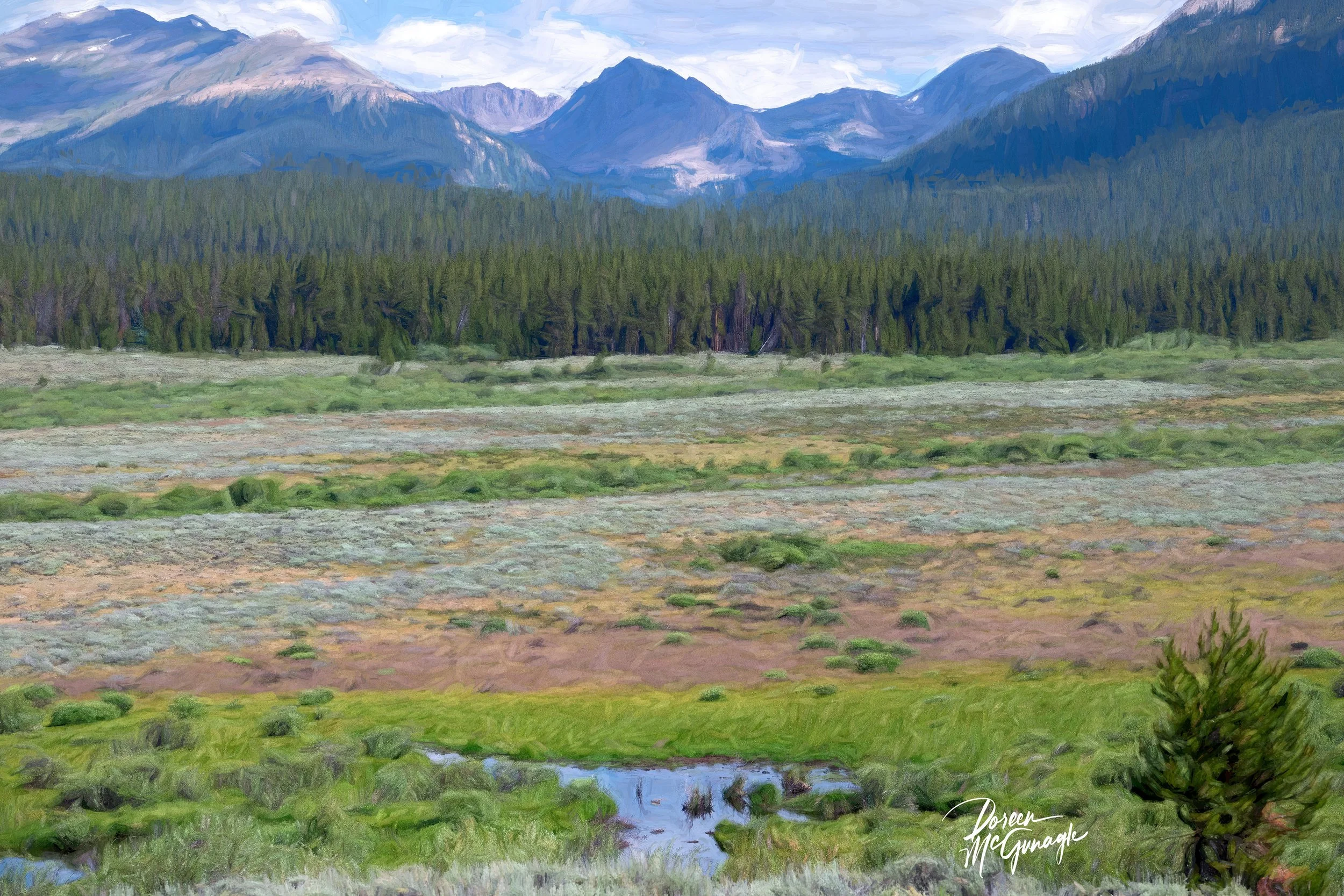 Image 3 of 4
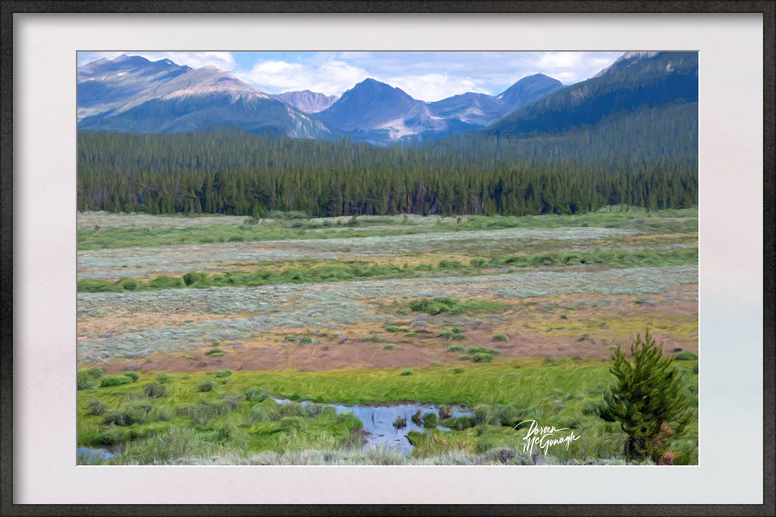 Image 4 of 4