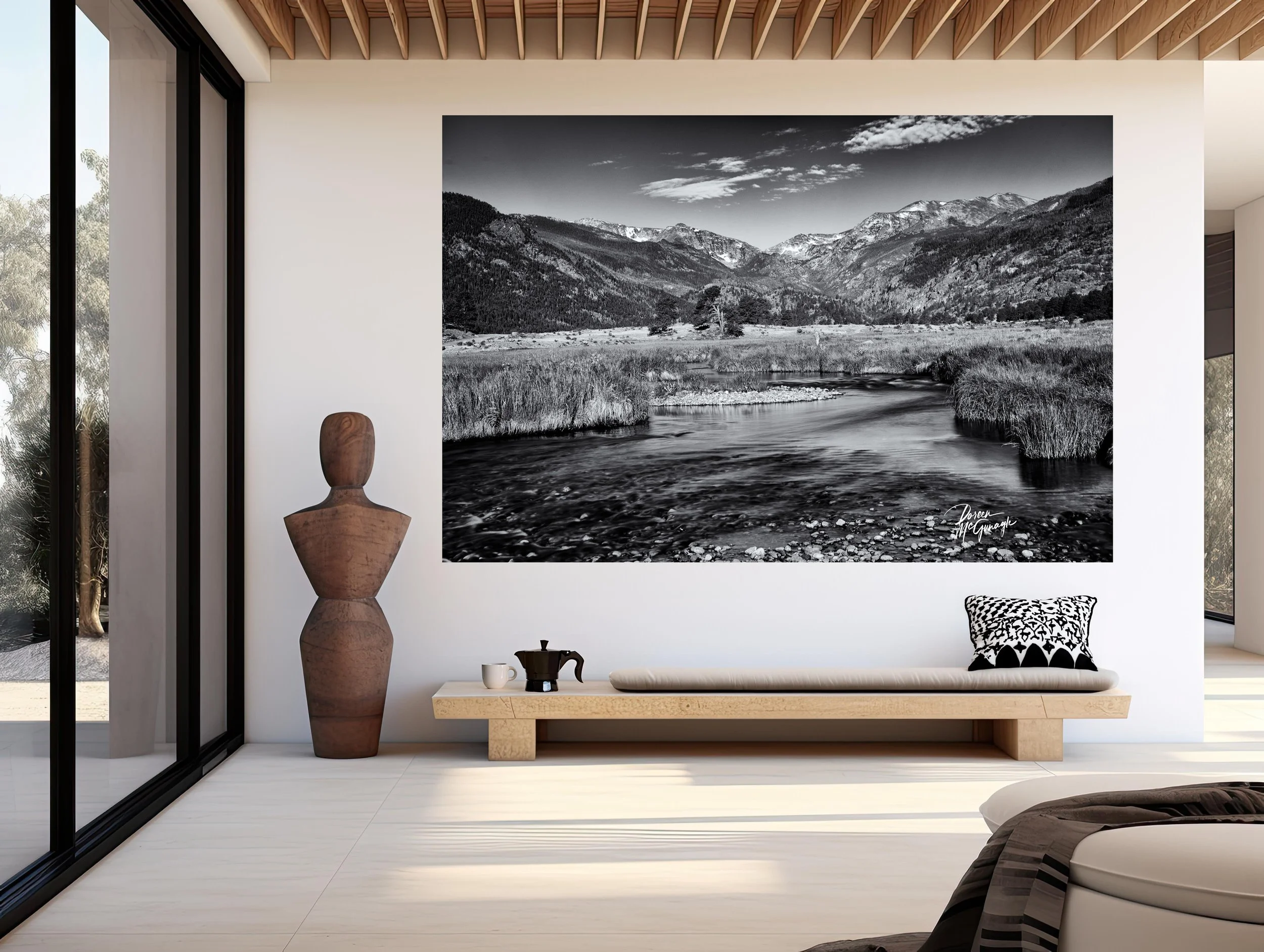
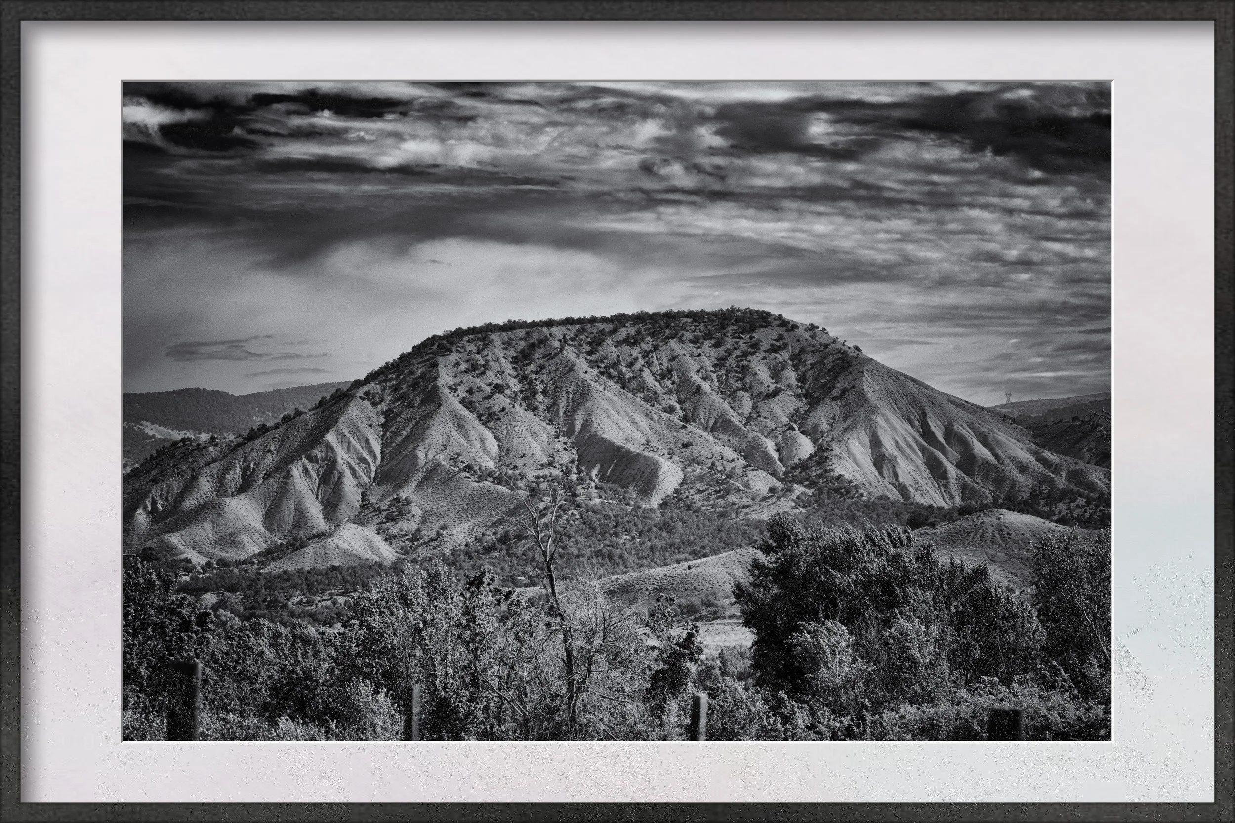
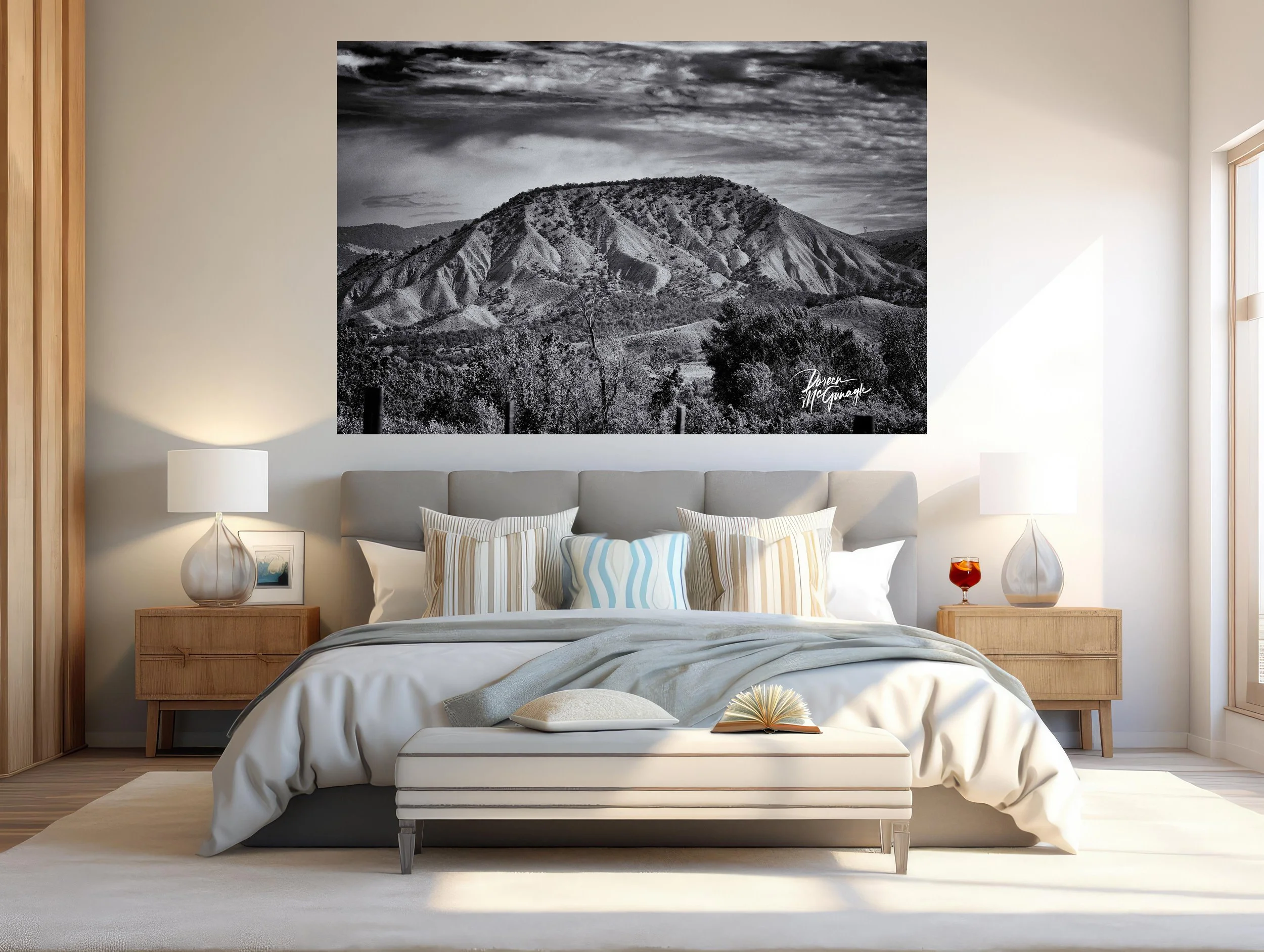
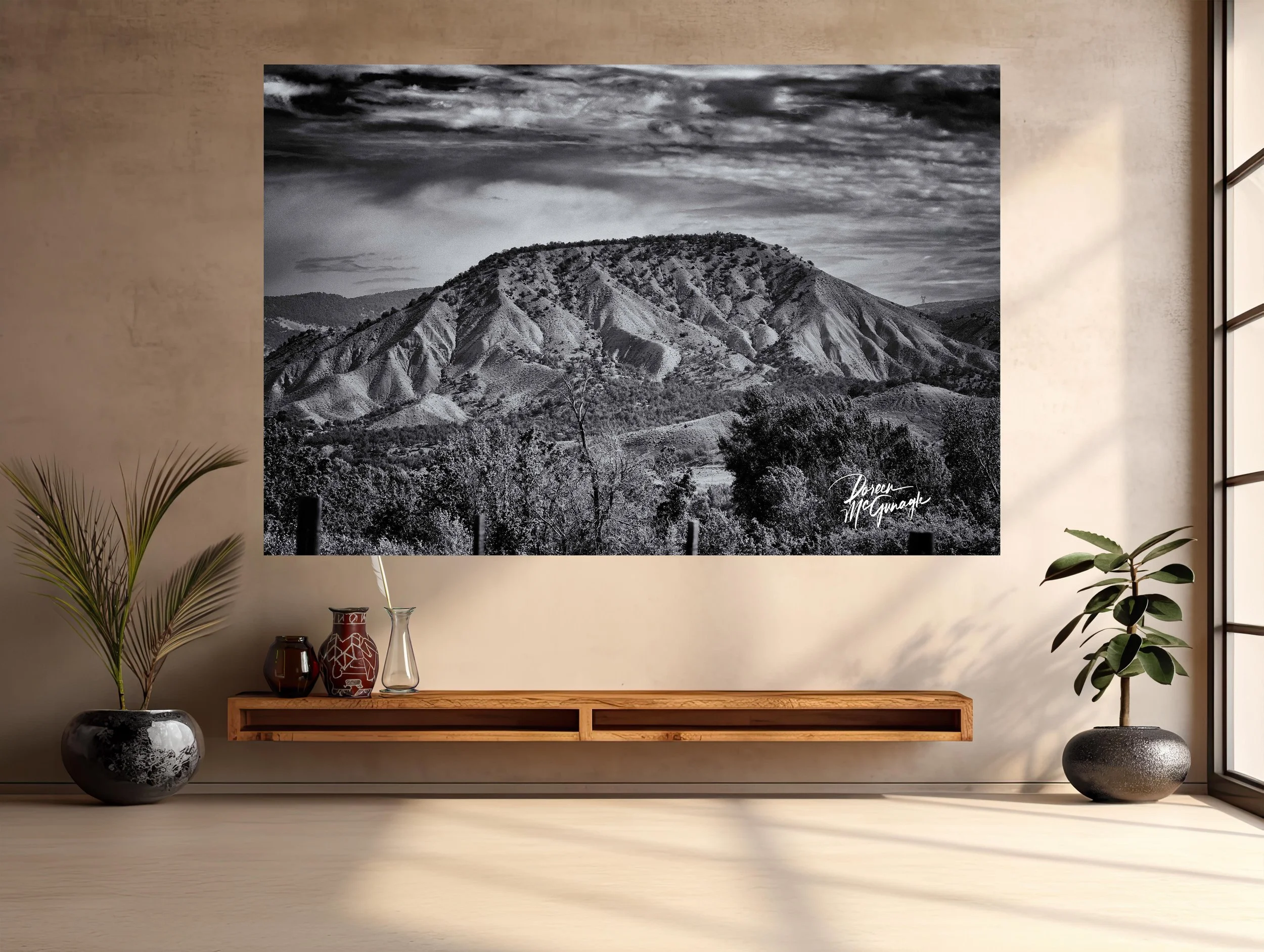
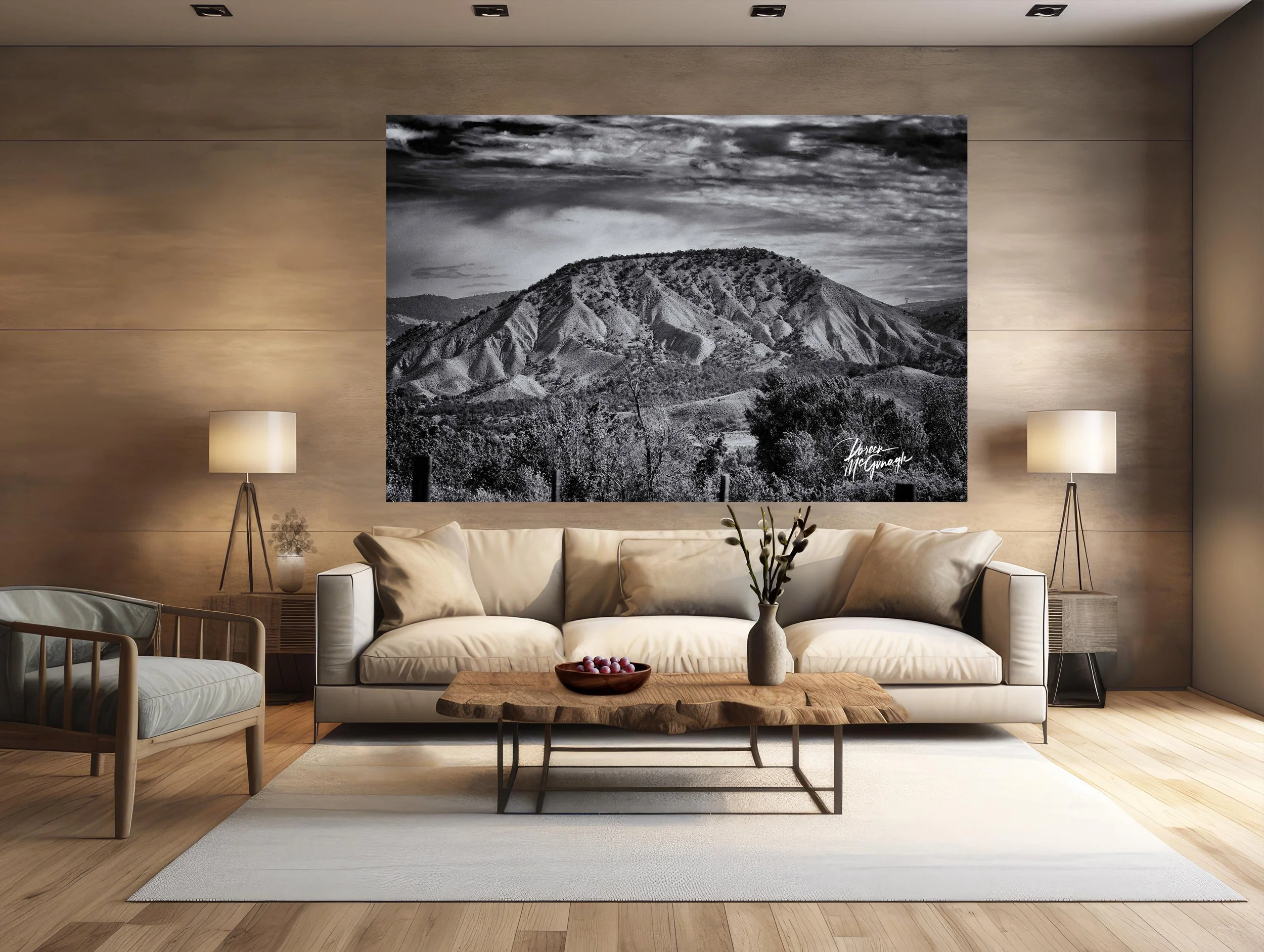
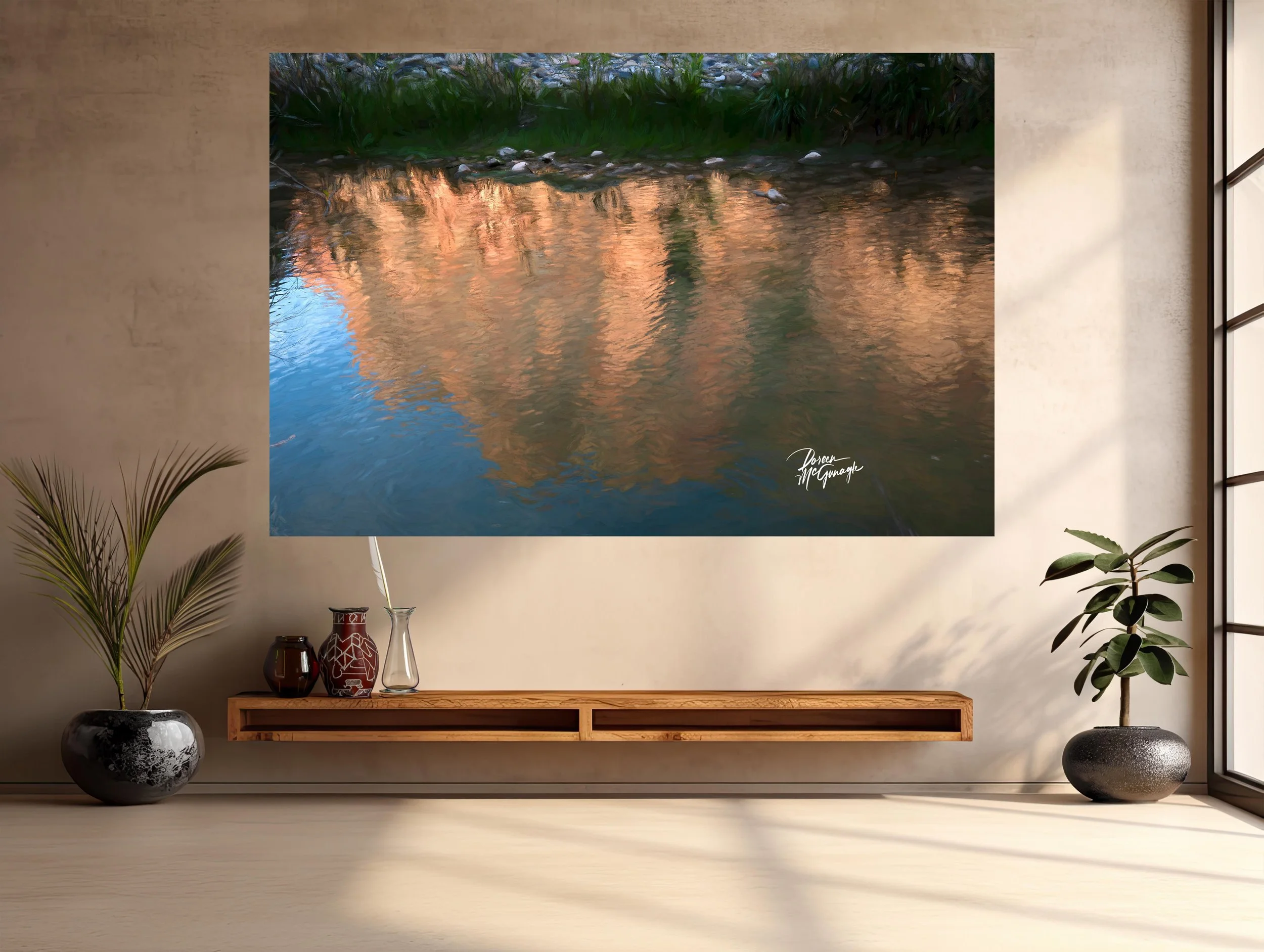
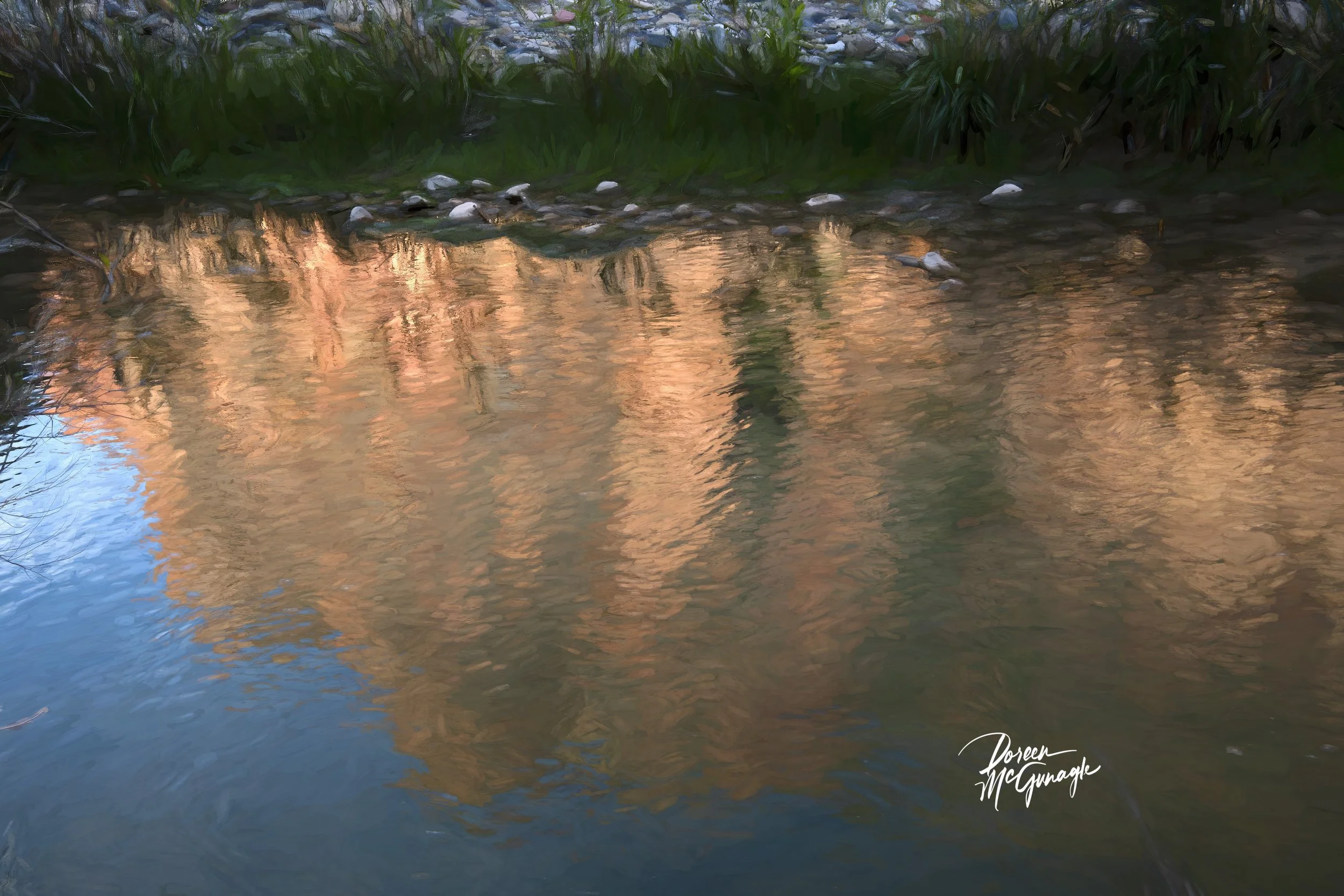
Large Wall Art, Fine Art Photography
OR 4558-84 CLMP c2025 | Oregon Coast | Limited Edition 20
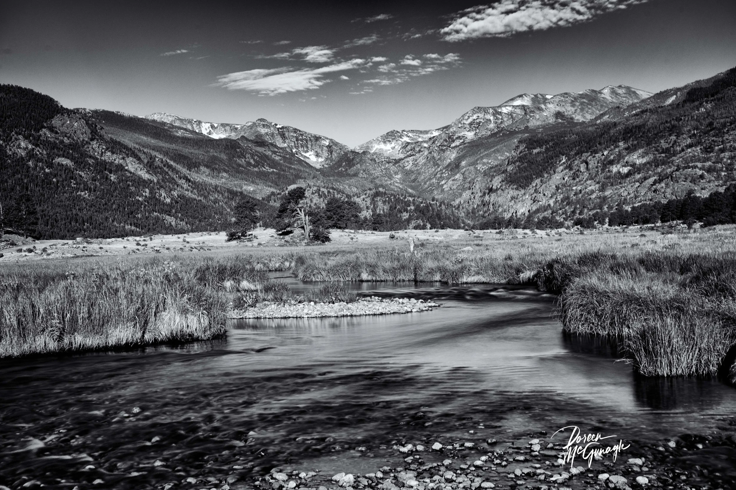
You don’t just hang this piece—you set the atmosphere. Veil of Storm and Stone brings the coast’s living power into your room: turbulent waves driving against a rugged rock line, spray lifting into the air like lace, and a charged sky pressing low. Texture does the talking—chiselled basalt, wind-stippled water, fine salt mist—so the space feels dramatic yet composed, energy without chaos.
Field notes — the story behind the image
I worked on the edge of a passing front, when barometric pressure drops and the ocean speaks in long, deliberate pulses. Gusts came in sets; between them, I timed the exposure to hold motion with detail—the strike of a wave, the peel of white water, the seam where water darkens before impact. What I felt most was resilience: rock receiving force, sea resetting, sky closing and opening like a curtain. That rhythm is the heartbeat of this photograph and the rooms it inhabits.
From “art” to ambiance: how it transforms your space
Designers speak in the language of focal points, colour palettes, and bringing the outside in. This piece delivers on all three.
Focal point: The collision line—where wave meets stone—becomes the room’s anchor. Your eye lands on the bright spray, then travels along rock contours and up into the cloud field. It’s an effortless centrepiece above a sofa, mantel, credenza, or headboard.
Colour palette: Deep ocean blues/teals, slate and charcoal, wet-stone pewter, with highlights of sea foam white and storm-sky graphite. A refined, coastal palette that pairs beautifully with natural woods and matte metals.
Bringing the outside in: Foreground surge → rock rampart → horizon band → storm ceiling creates true depth—the visual equivalent of opening a window to weather.
Why the words matter
People buy the story as much as the photograph. The image carries the feeling; these words share the where, light, and mood—so the work becomes more than décor. It becomes a place to return to: strength meeting motion, again and again.
Design notes — placement, materials, scale
Where it sings: living-room feature wall • dining wall opposite natural light • entry reveal • media room needing a bold, calm anchor • behind a desk for focused presence.
Room palette ideas: walls in cloud grey or warm white; accents in indigo/navy, sea-glass teal, and grounded matte black/charcoal; a touch of brushed nickel or blackened steel for a maritime note.
Materials: oiled walnut or oak, ash, linen and wool boucle, rattan, honed soapstone/slate, ceramic stoneware, blackened steel.
Scale guidance: mid sizes deliver a contemplative anchor; statement sizes turn the piece into the centrepiece that sets the room’s rhythm.
Lighting tip: a dimmable picture light at 2700–3000K deepens blues, crisps white spray, and reveals micro-texture in the rock after dark.
Craft & presentation
Limited-edition fine art print produced to museum standards for fidelity and longevity. Choose the finish that best supports your ambiance:
Acrylic (luminous, high-gloss): heightens clarity and perceived depth; wave spray feels dimensional—ideal for modern, light-filled spaces.
Canvas Pro (matte, painterly): soft, low-glare presence; lends a tactile, atmospheric read—perfect for cozy, textural interiors.
Optional floating frames, handmade in Italy, complete either presentation with clean lines that complement contemporary and nature-inspired rooms. Each piece includes a signed Certificate of Authenticity.
Our commitment to the places that inspire this work
With every edition collected, a portion of the sale supports Global Voices for Nature Foundation Inc., helping fund conservation and education projects that protect coastal ecosystems—and the life shaped by them.
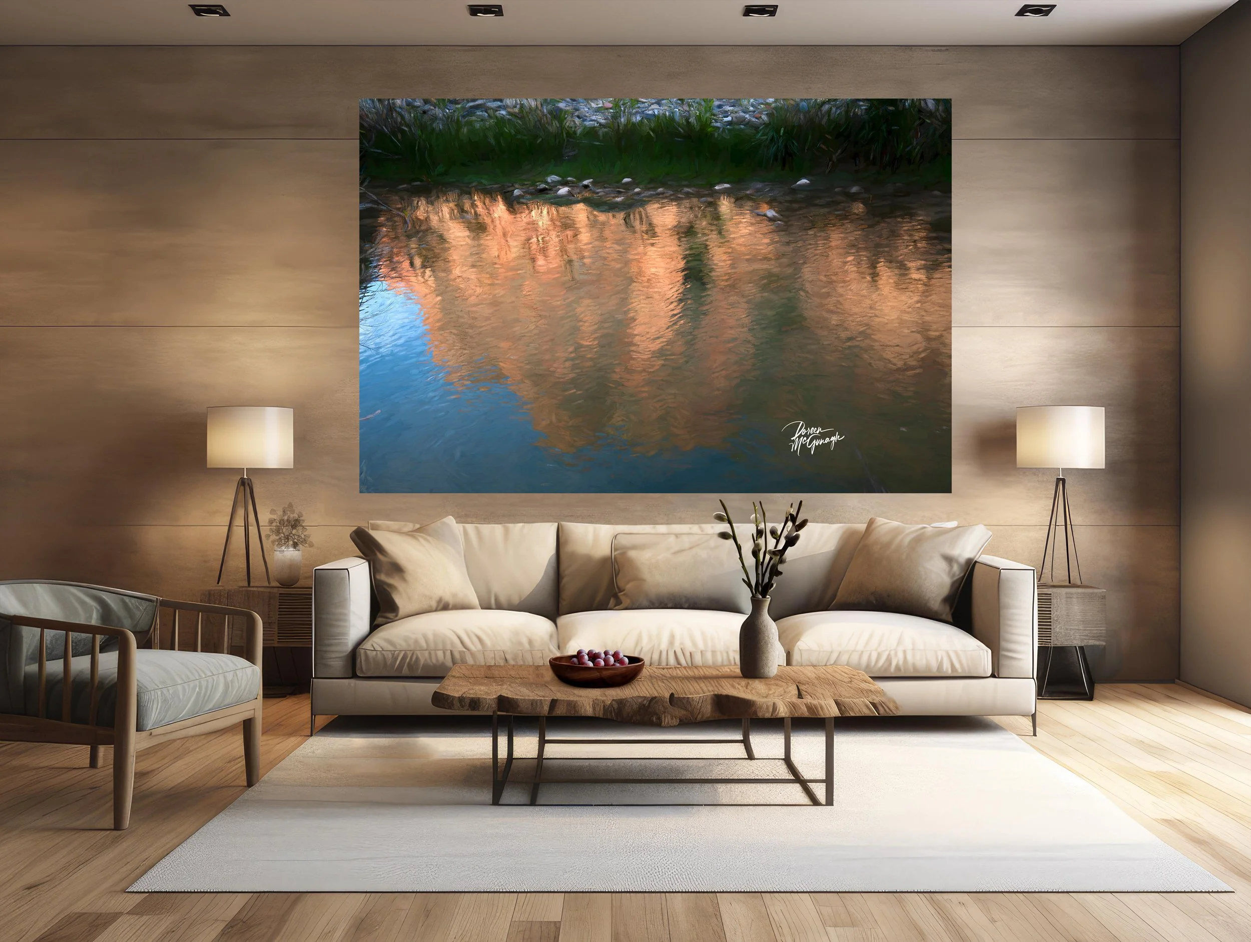
Large Wall Art, Fine Art Photography
OR 4558-84 CLMP c2025 | Oregon Coast | Limited Edition 20
You don’t just hang this piece—you set the atmosphere. Veil of Storm and Stone brings the coast’s living power into your room: turbulent waves driving against a rugged rock line, spray lifting into the air like lace, and a charged sky pressing low. Texture does the talking—chiselled basalt, wind-stippled water, fine salt mist—so the space feels dramatic yet composed, energy without chaos.
Field notes — the story behind the image
I worked on the edge of a passing front, when barometric pressure drops and the ocean speaks in long, deliberate pulses. Gusts came in sets; between them, I timed the exposure to hold motion with detail—the strike of a wave, the peel of white water, the seam where water darkens before impact. What I felt most was resilience: rock receiving force, sea resetting, sky closing and opening like a curtain. That rhythm is the heartbeat of this photograph and the rooms it inhabits.
From “art” to ambiance: how it transforms your space
Designers speak in the language of focal points, colour palettes, and bringing the outside in. This piece delivers on all three.
Focal point: The collision line—where wave meets stone—becomes the room’s anchor. Your eye lands on the bright spray, then travels along rock contours and up into the cloud field. It’s an effortless centrepiece above a sofa, mantel, credenza, or headboard.
Colour palette: Deep ocean blues/teals, slate and charcoal, wet-stone pewter, with highlights of sea foam white and storm-sky graphite. A refined, coastal palette that pairs beautifully with natural woods and matte metals.
Bringing the outside in: Foreground surge → rock rampart → horizon band → storm ceiling creates true depth—the visual equivalent of opening a window to weather.
Why the words matter
People buy the story as much as the photograph. The image carries the feeling; these words share the where, light, and mood—so the work becomes more than décor. It becomes a place to return to: strength meeting motion, again and again.
Design notes — placement, materials, scale
Where it sings: living-room feature wall • dining wall opposite natural light • entry reveal • media room needing a bold, calm anchor • behind a desk for focused presence.
Room palette ideas: walls in cloud grey or warm white; accents in indigo/navy, sea-glass teal, and grounded matte black/charcoal; a touch of brushed nickel or blackened steel for a maritime note.
Materials: oiled walnut or oak, ash, linen and wool boucle, rattan, honed soapstone/slate, ceramic stoneware, blackened steel.
Scale guidance: mid sizes deliver a contemplative anchor; statement sizes turn the piece into the centrepiece that sets the room’s rhythm.
Lighting tip: a dimmable picture light at 2700–3000K deepens blues, crisps white spray, and reveals micro-texture in the rock after dark.
Craft & presentation
Limited-edition fine art print produced to museum standards for fidelity and longevity. Choose the finish that best supports your ambiance:
Acrylic (luminous, high-gloss): heightens clarity and perceived depth; wave spray feels dimensional—ideal for modern, light-filled spaces.
Canvas Pro (matte, painterly): soft, low-glare presence; lends a tactile, atmospheric read—perfect for cozy, textural interiors.
Optional floating frames, handmade in Italy, complete either presentation with clean lines that complement contemporary and nature-inspired rooms. Each piece includes a signed Certificate of Authenticity.
Our commitment to the places that inspire this work
With every edition collected, a portion of the sale supports Global Voices for Nature Foundation Inc., helping fund conservation and education projects that protect coastal ecosystems—and the life shaped by them.
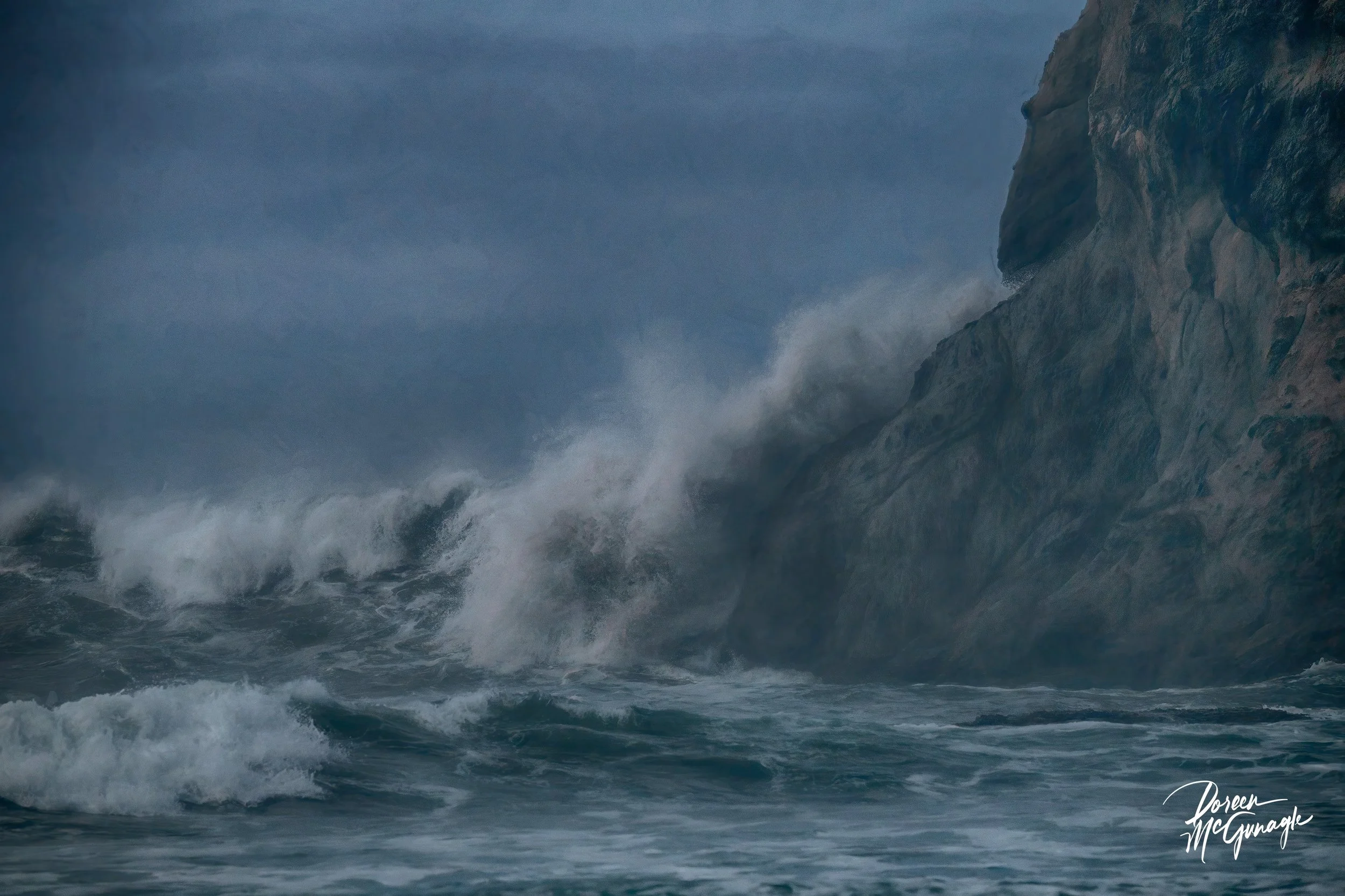 Image 1 of 4
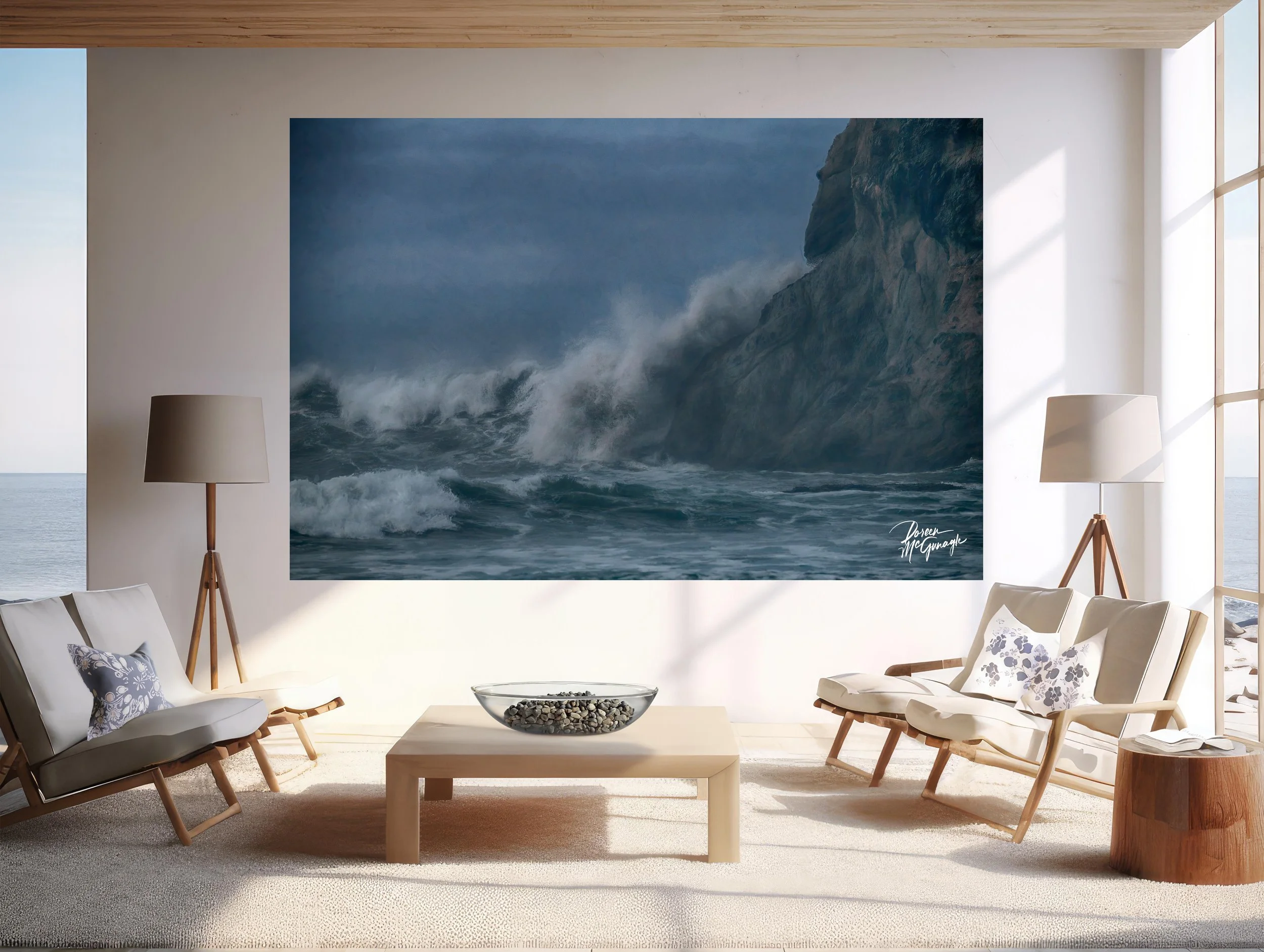 Image 2 of 4
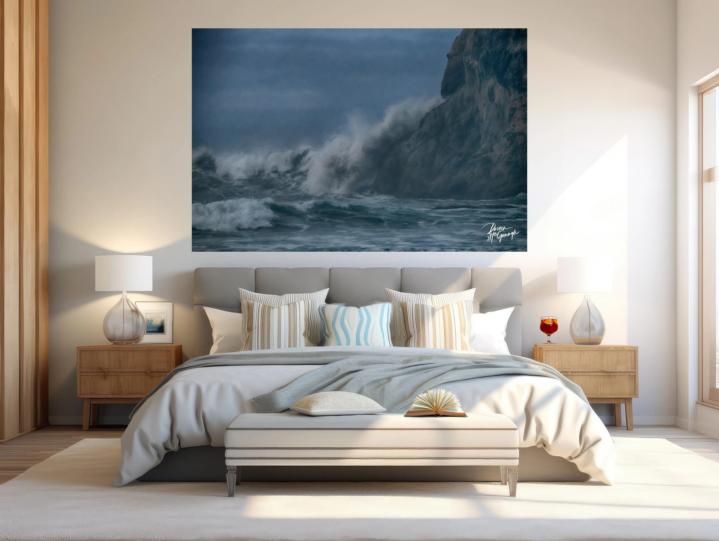 Image 3 of 4
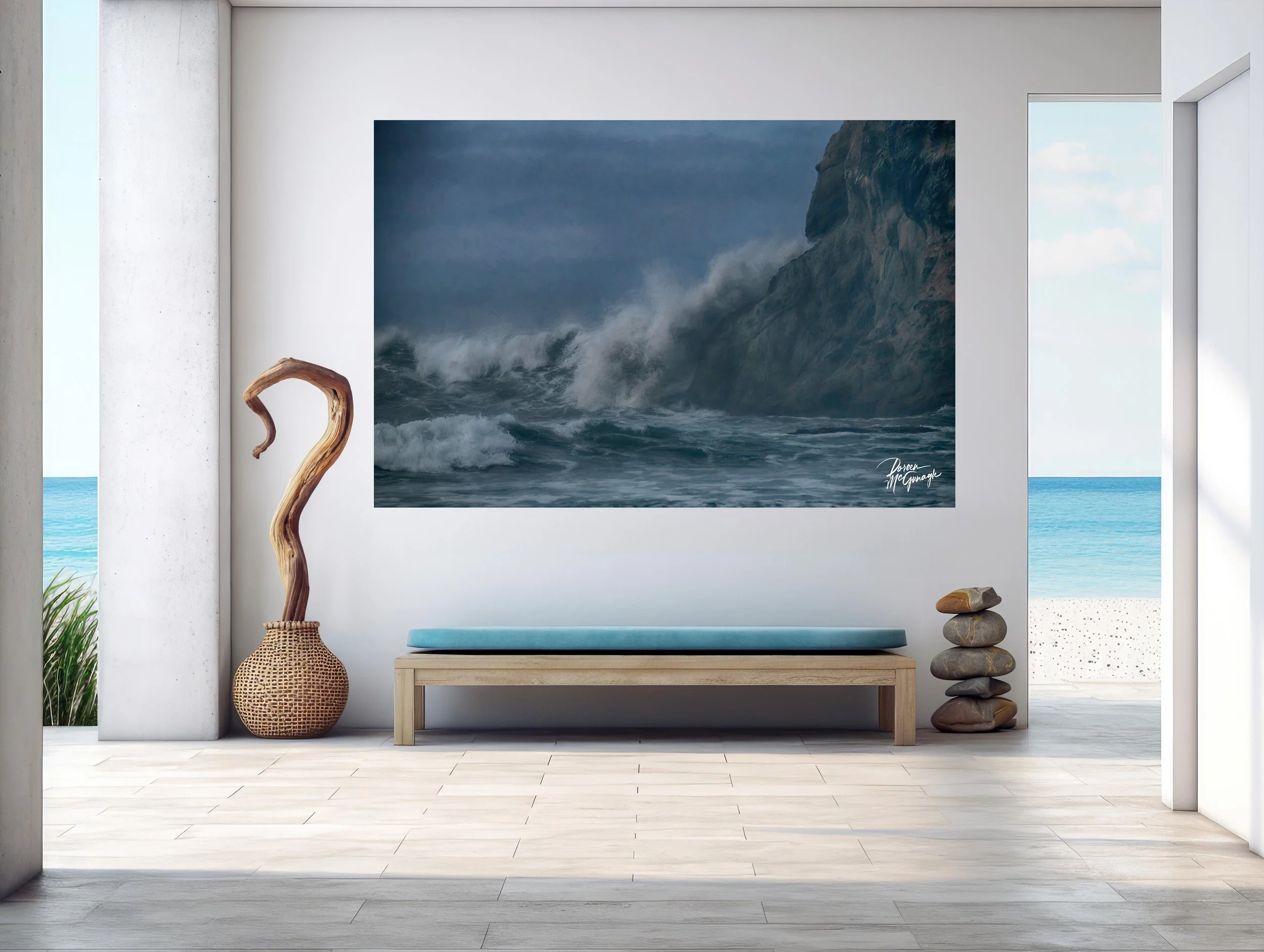 Image 4 of 4