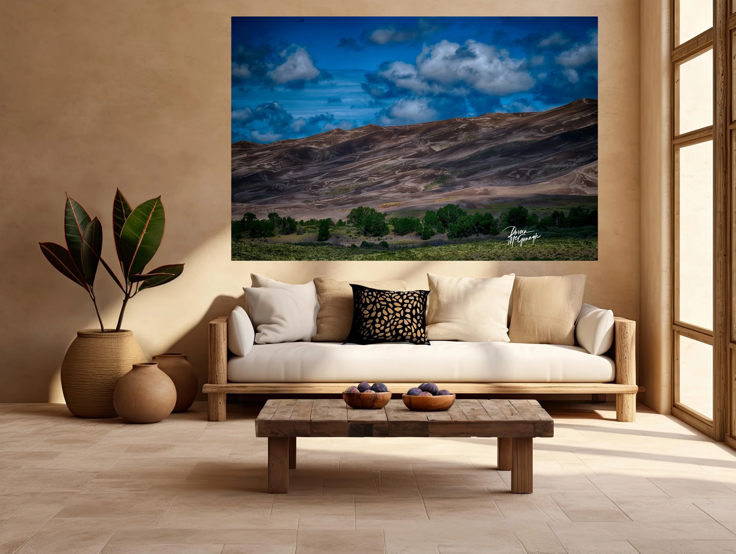
CO1039-33 Yellow Beacon on Sapphire Shores Gunnison National Park c2025
Large Wall Art, Fine Art Photography, Limited Edition 20
You don’t just hang this piece—you set the ambiance. Yellow Beacon on Sapphire Shores turns a room into living color: vertical spikes of sapphire-blue wildflowers rising from layered greens, interrupted by a single, luminous yellow bloom that becomes the quiet center of the scene. Tactile petal textures and leaf sheen are rendered with refined clarity, so the space feels fresh, uplifting, and grounded—energy without noise.
Field notes — the story behind the image
I made this photograph in gentle morning light, when the breeze moved in slow intervals. The blue blossoms read cool and calm; the lone yellow flower caught a brighter note, like a small signal lamp in the meadow. Working close and low, I followed the details—fine veins in petals, soft specular highlights on leaves—waiting for the wind to pause so the “beacon” could stand steady. What I felt most was balance: a modest subject carrying surprising presence.
From “art” to ambiance: how it transforms your space
Designers speak in the language of focal points, colour palettes, and bringing the outside in. This piece answers all three.
Focal point: The solitary yellow bloom claims first glance, then releases the eye into layered blues and greens. It naturally organizes a room—ideal above a sofa, mantel, credenza, or headboard.
Colour palette: Cobalt/indigo (sapphire) and garden greens (moss, sage, fern) with a precise butter yellow accent; grounded by stone grey and linen white. Calm base, joyful spark—easy to echo with a single vase or cushion.
Bringing the outside in: Close botanical detail → soft depth behind creates true visual space—the indoor equivalent of opening a window to a waking field.
Why the words matter
People buy the story as much as the photograph. The image holds the feeling; these words share where, light, and mood—so the work becomes more than décor. It becomes a moment you can step into whenever you look up.
Design notes — palettes, placement, scale
Where it sings: living-room feature wall • bedroom centerpiece • dining wall opposite natural light • entry reveal • end-of-hall vista • behind a desk for focused calm.
Room palette ideas: walls in soft sage or warm white; accents in indigo/cobalt, buttercream, and grounded charcoal/matte black.
Materials: oiled oak or walnut, ash, linen and wool boucle, rattan, stoneware, honed travertine/soapstone, brushed brass or blackened steel.
Scale guidance: mid sizes create a contemplative anchor; statement sizes turn the work into the centrepiece that sets the room’s rhythm.
Styling tip: echo the yellow once—a single stem or book spine—so the artwork remains the hero.
Lighting: a dimmable picture light at 2700–3000K keeps blues rich, greens deep, and the beacon warm after dark.
Craft & presentation
Limited-edition fine art print produced to museum standards for fidelity and longevity. Choose the finish that best supports your ambiance:
Acrylic (luminous, high-gloss): heightens clarity and depth; colours feel crisp and dimensional—excellent for modern, light-filled spaces.
Canvas Pro (matte, painterly): soft, low-glare presence; adds warmth and tactility—ideal for cozy, textural interiors.
Optional floating frames, handmade in Italy, complete either presentation with clean lines that complement contemporary and nature-inspired rooms. Each piece includes a signed Certificate of Authenticity.
Our commitment to the places that inspire this work
With every edition collected, a portion of the sale supports Global Voices for Nature Foundation Inc., helping fund conservation and education projects that keep wild habitats—and the life within them—thriving.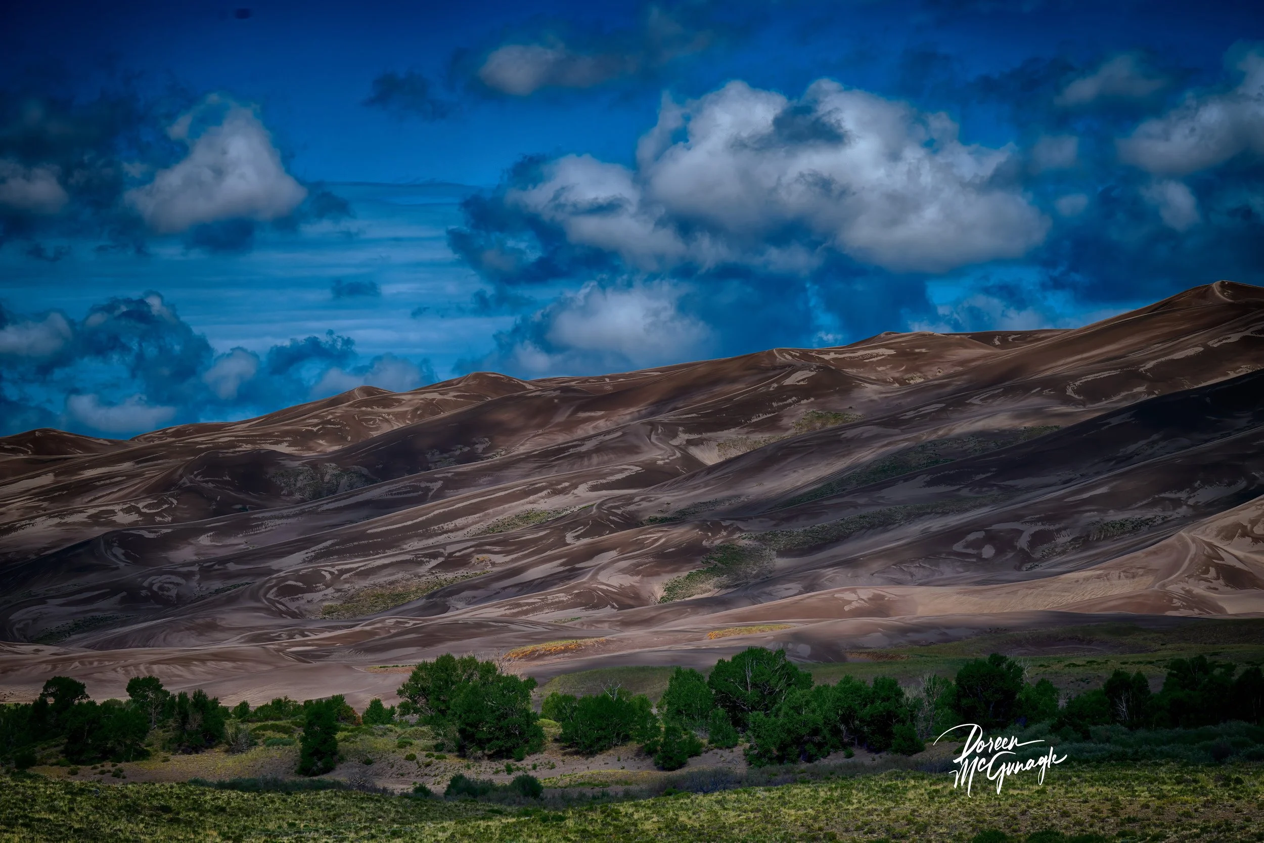
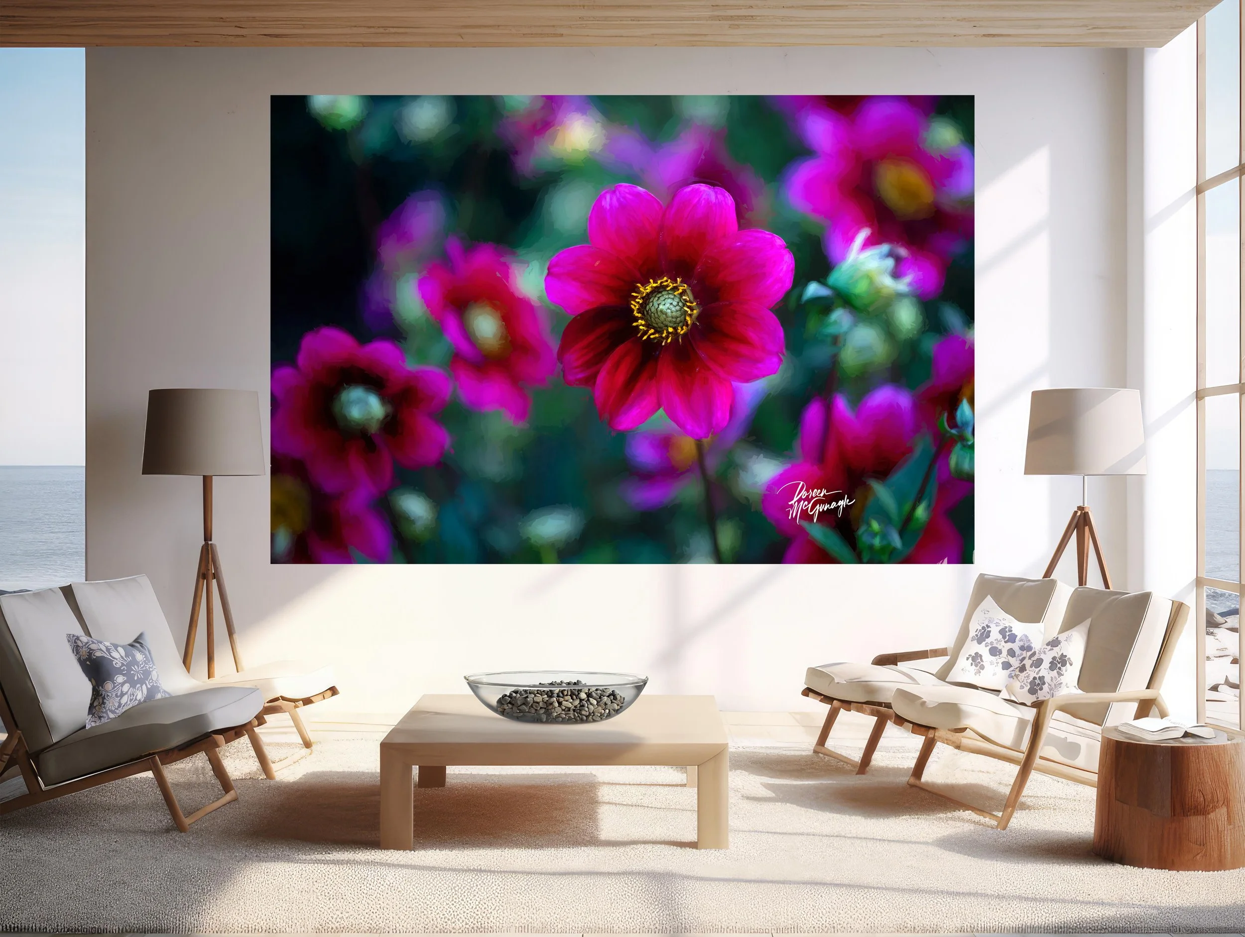
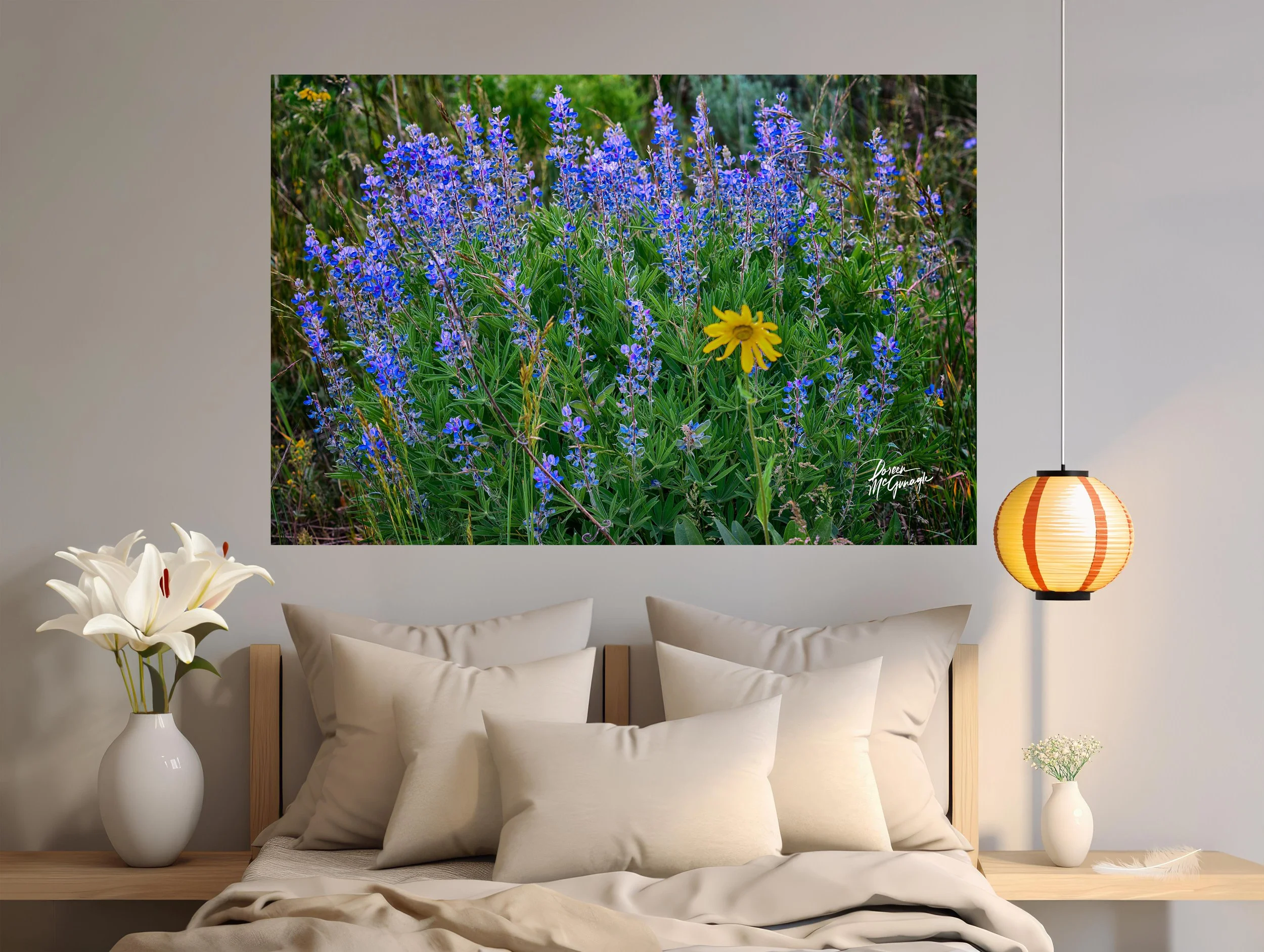 Image 1 of 5
 Image 2 of 5
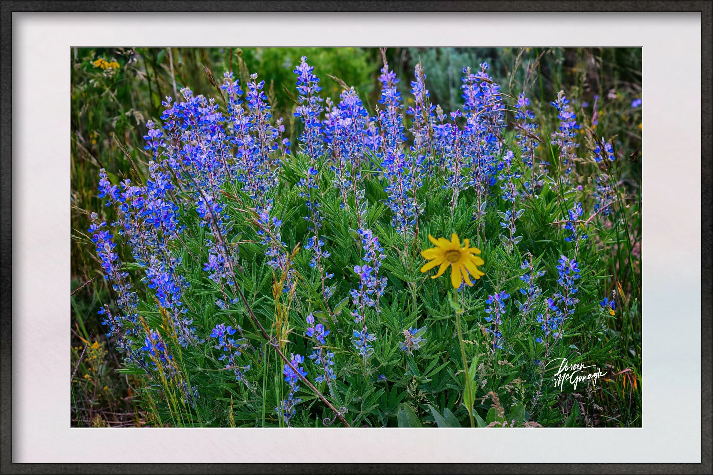 Image 3 of 5
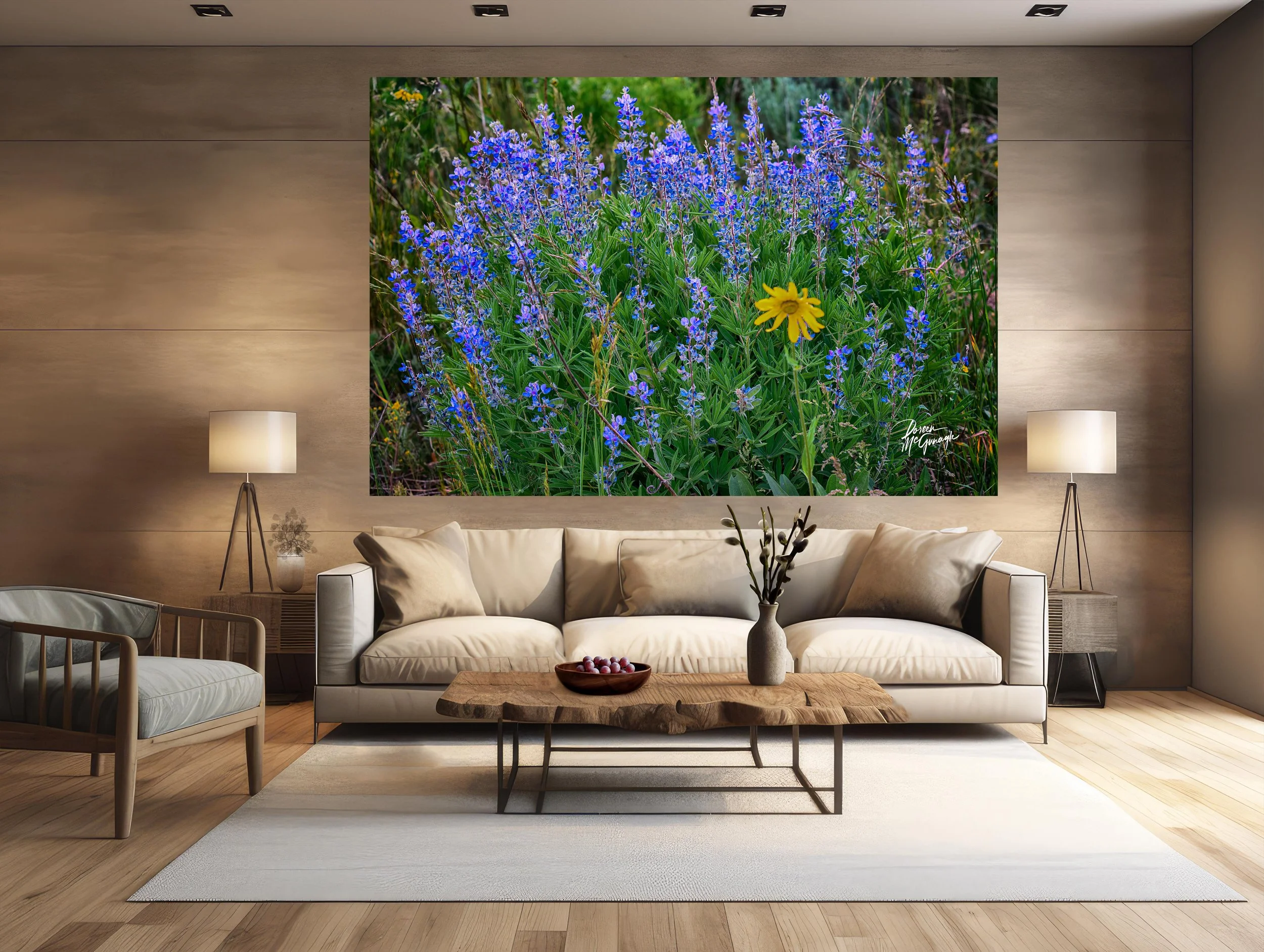 Image 4 of 5
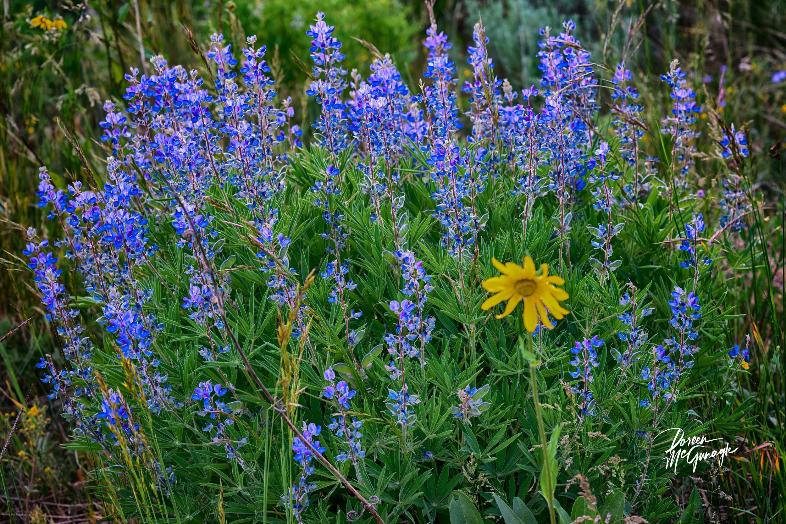 Image 5 of 5